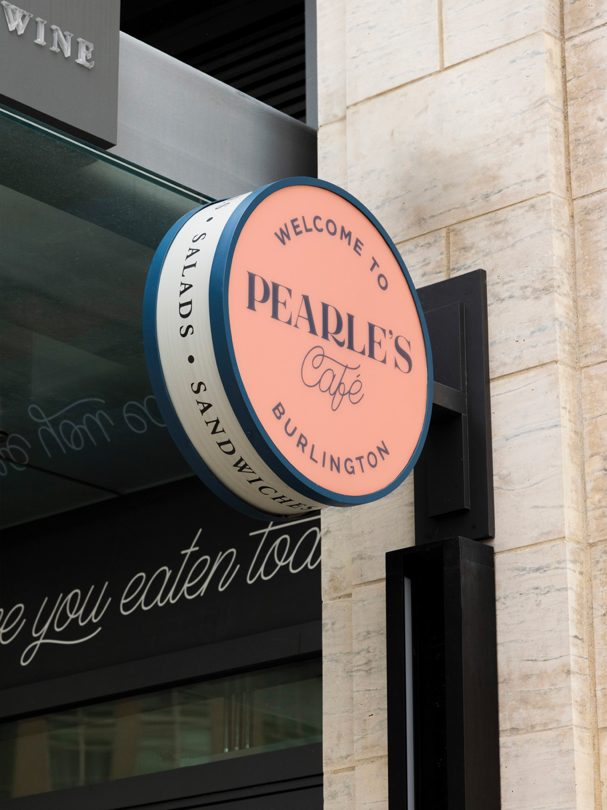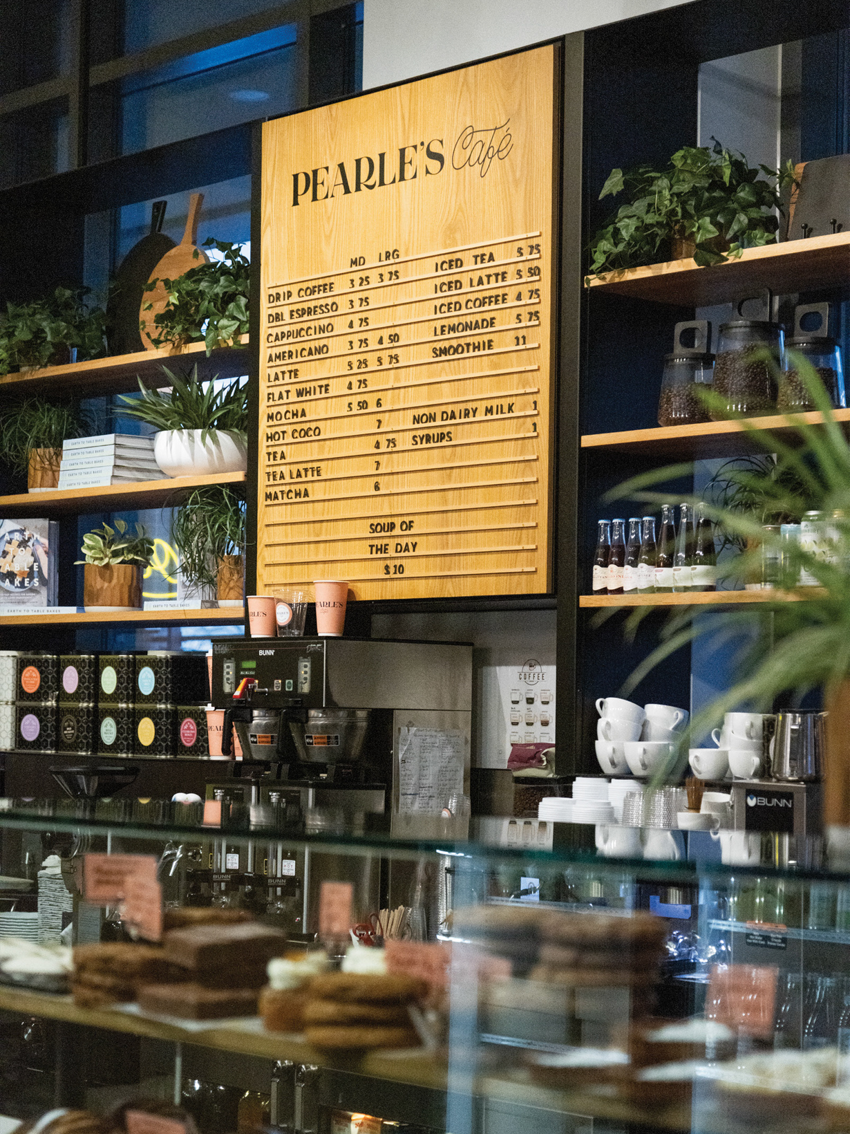

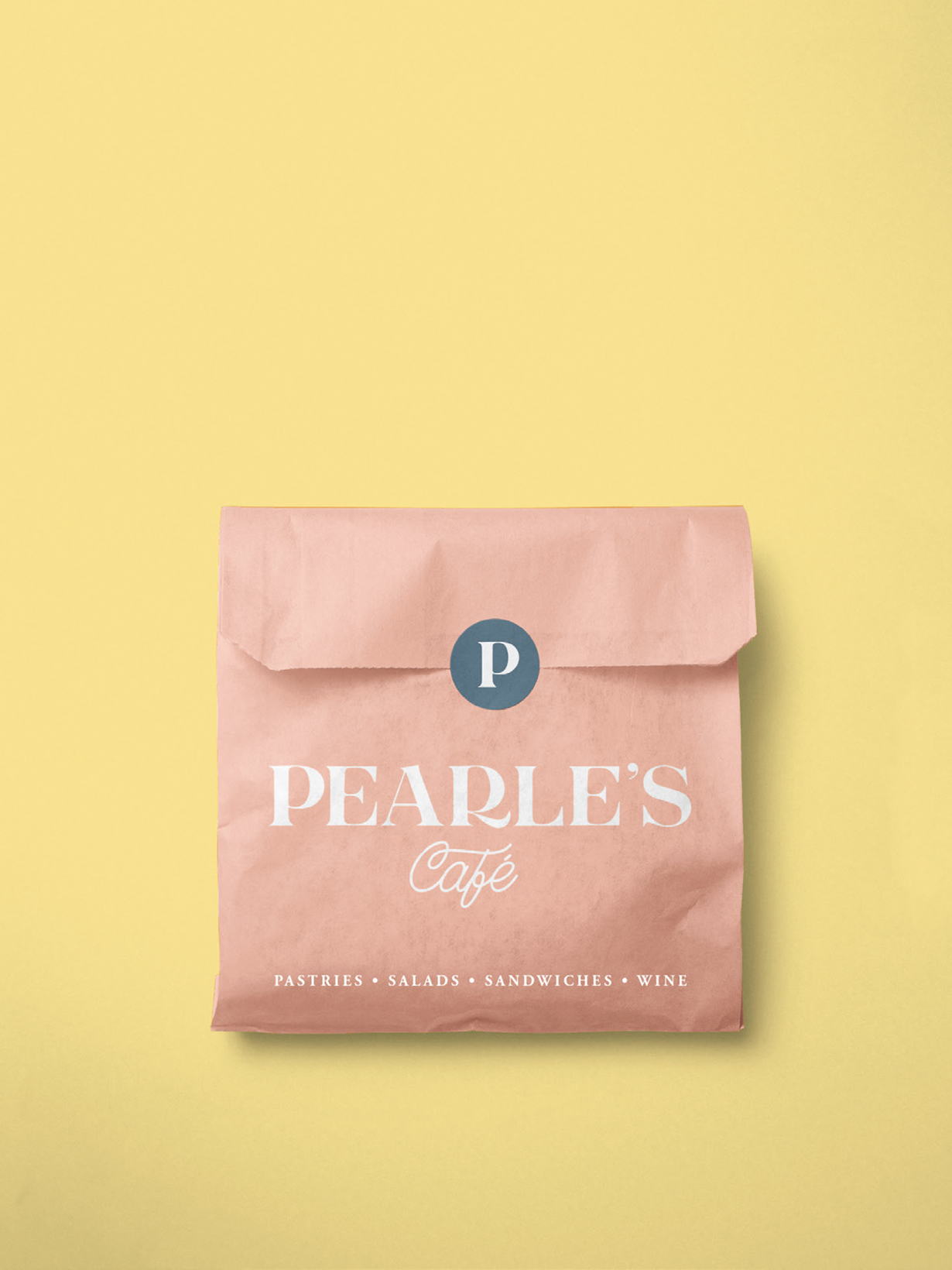
The sunrise on Lake Ontario was the inspiration for the brand’s colour story. Anchored with navy and accented with warm pops of yellow and coral, this palette felt like a natural choice for a youthful and vibrant neighbourhood coffee shop.
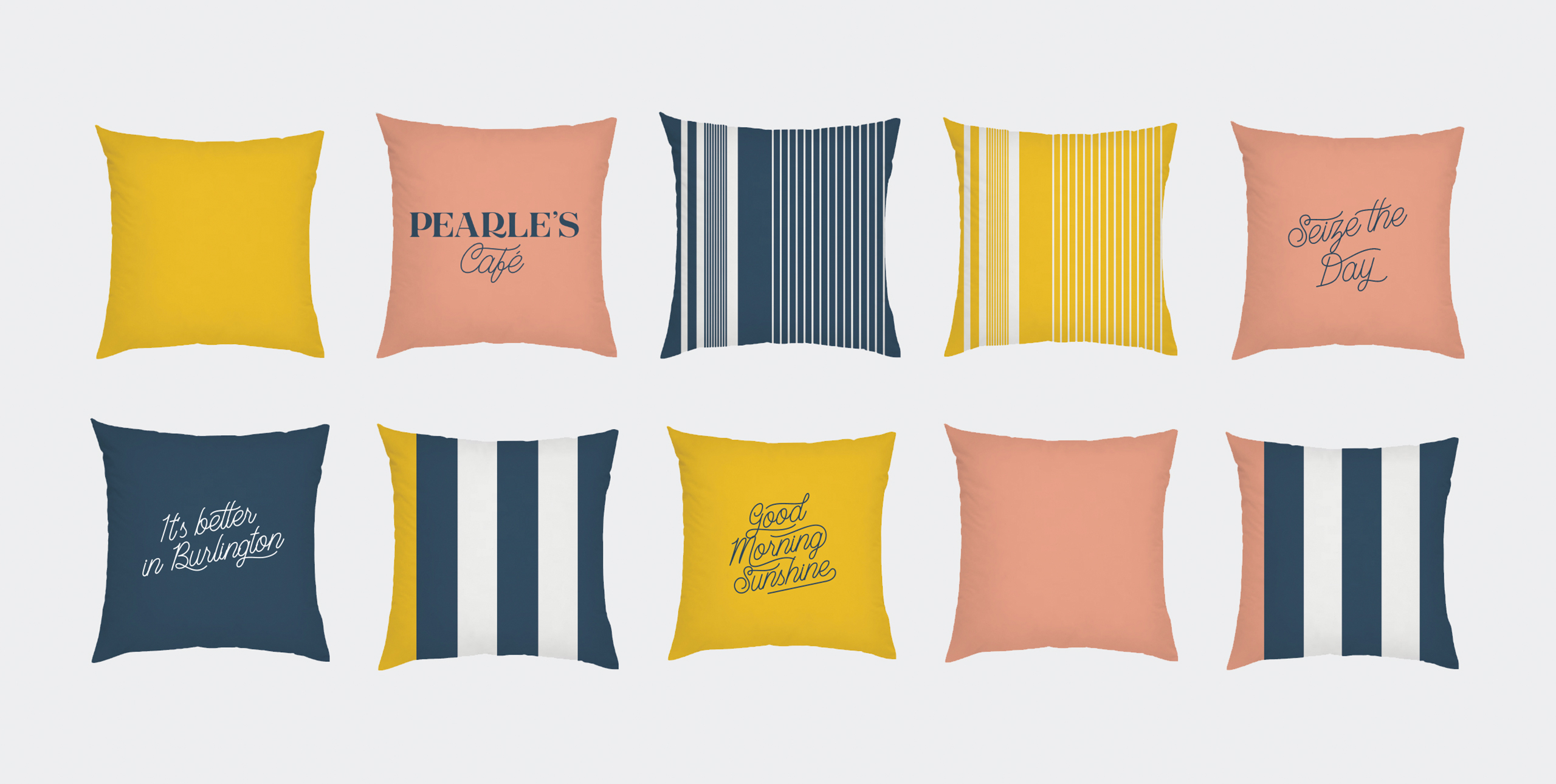

The font choices are both classic and contemporary, designed to be applied easily across a wide variety of consumer touch points, from mugs and pillows to bicycles and coffee cups.





The playful nature of the brand was applied throughout the interior space. The youthful colour palette and cheeky signage create an interesting contrast to the refined millwork and upscale product offering.
