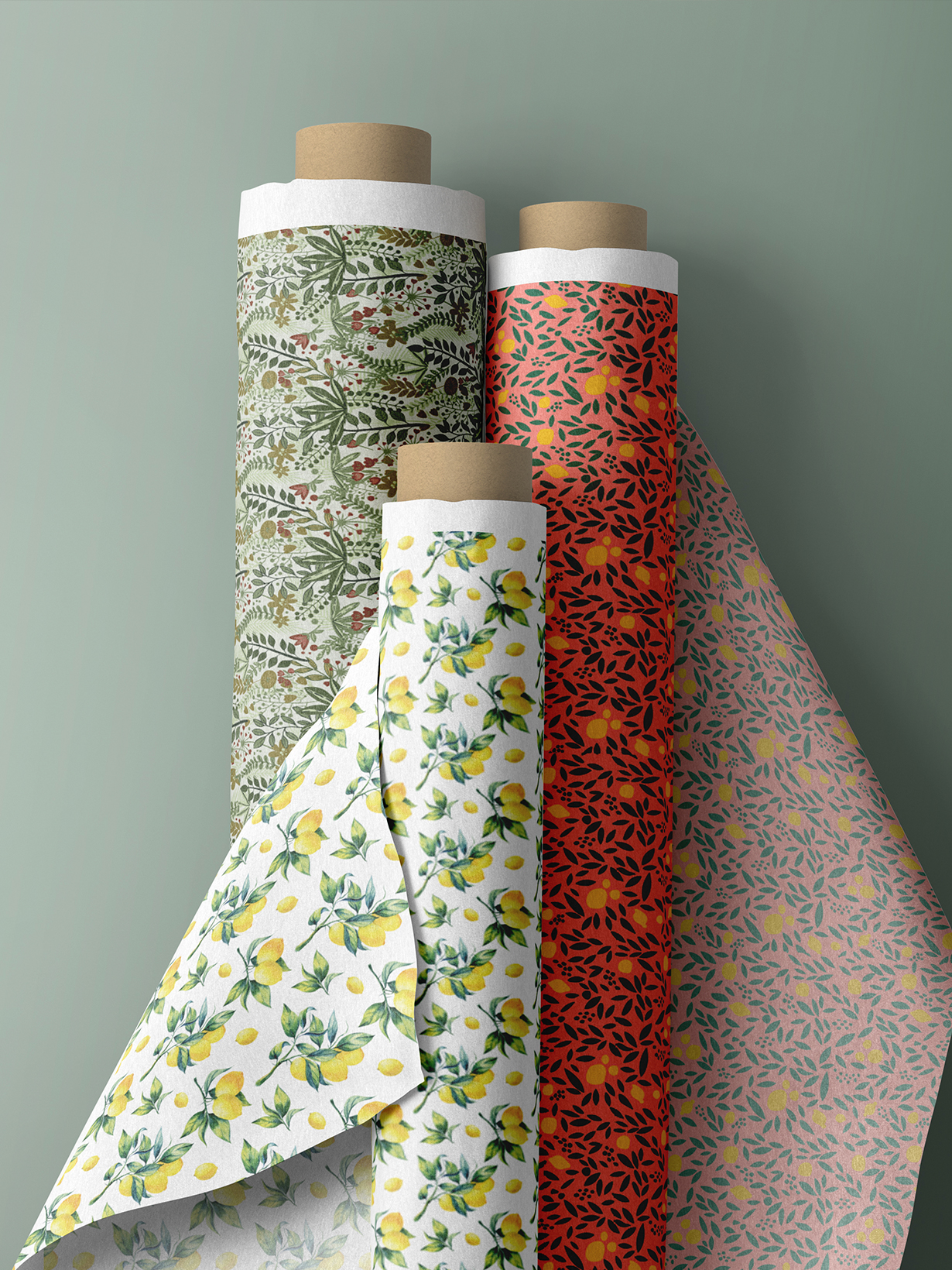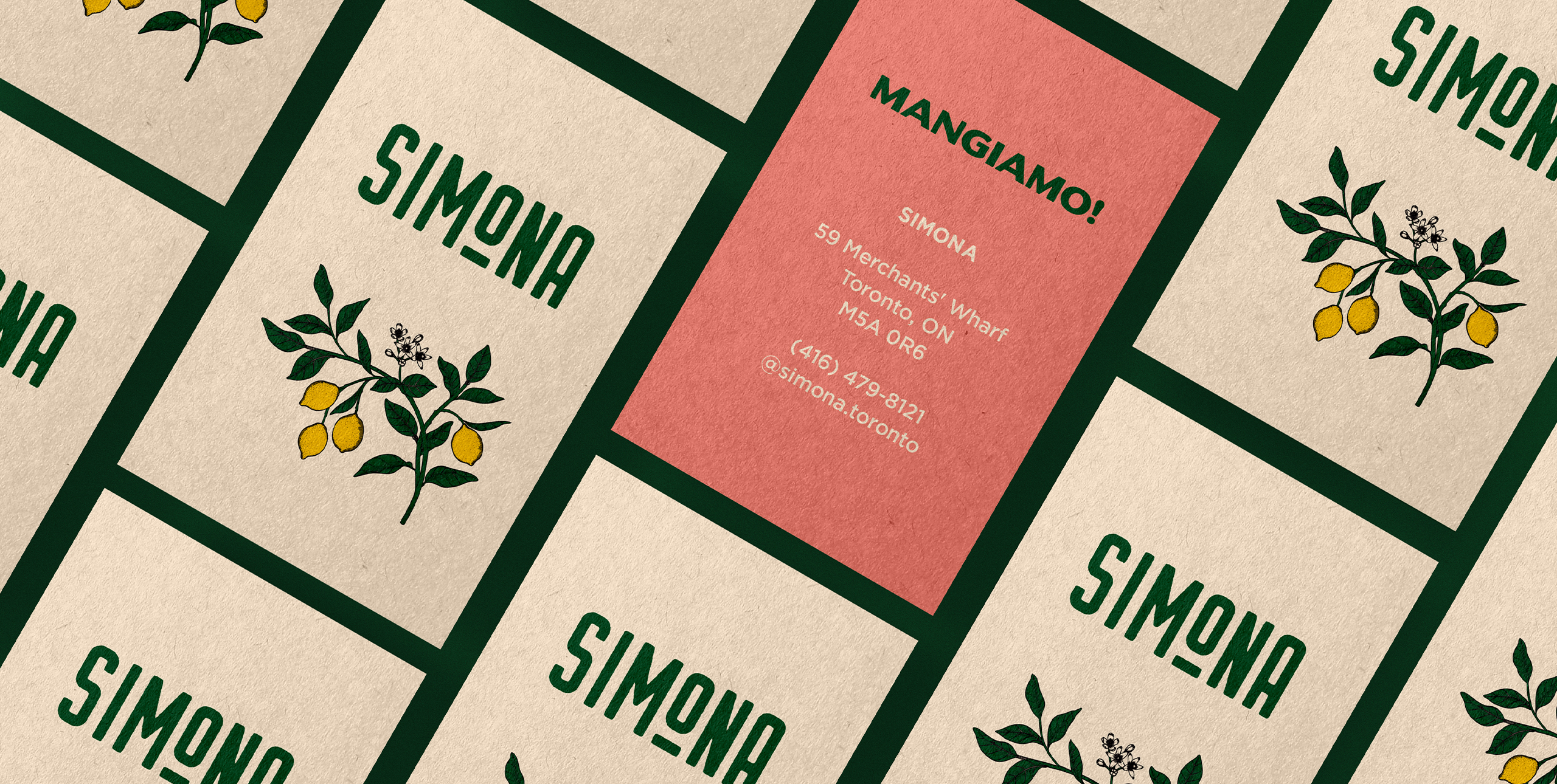
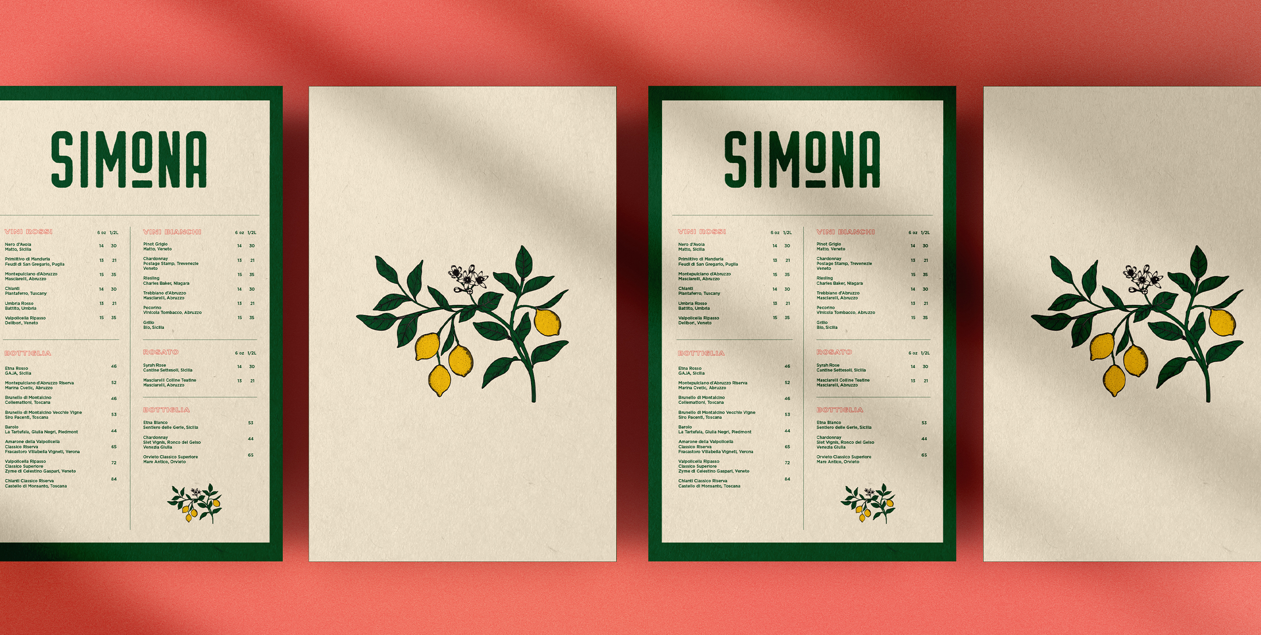
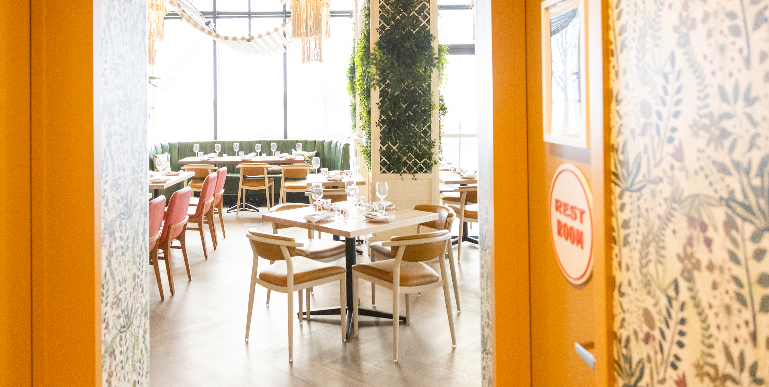
We did not want this brand to fall prey to traditional, Italian restaurant stereotypes. Rather, we sought to create a youthful vibe to complement the contemporary dishes. A series of patterns were developed to carry throughout the marketing materials and interior.

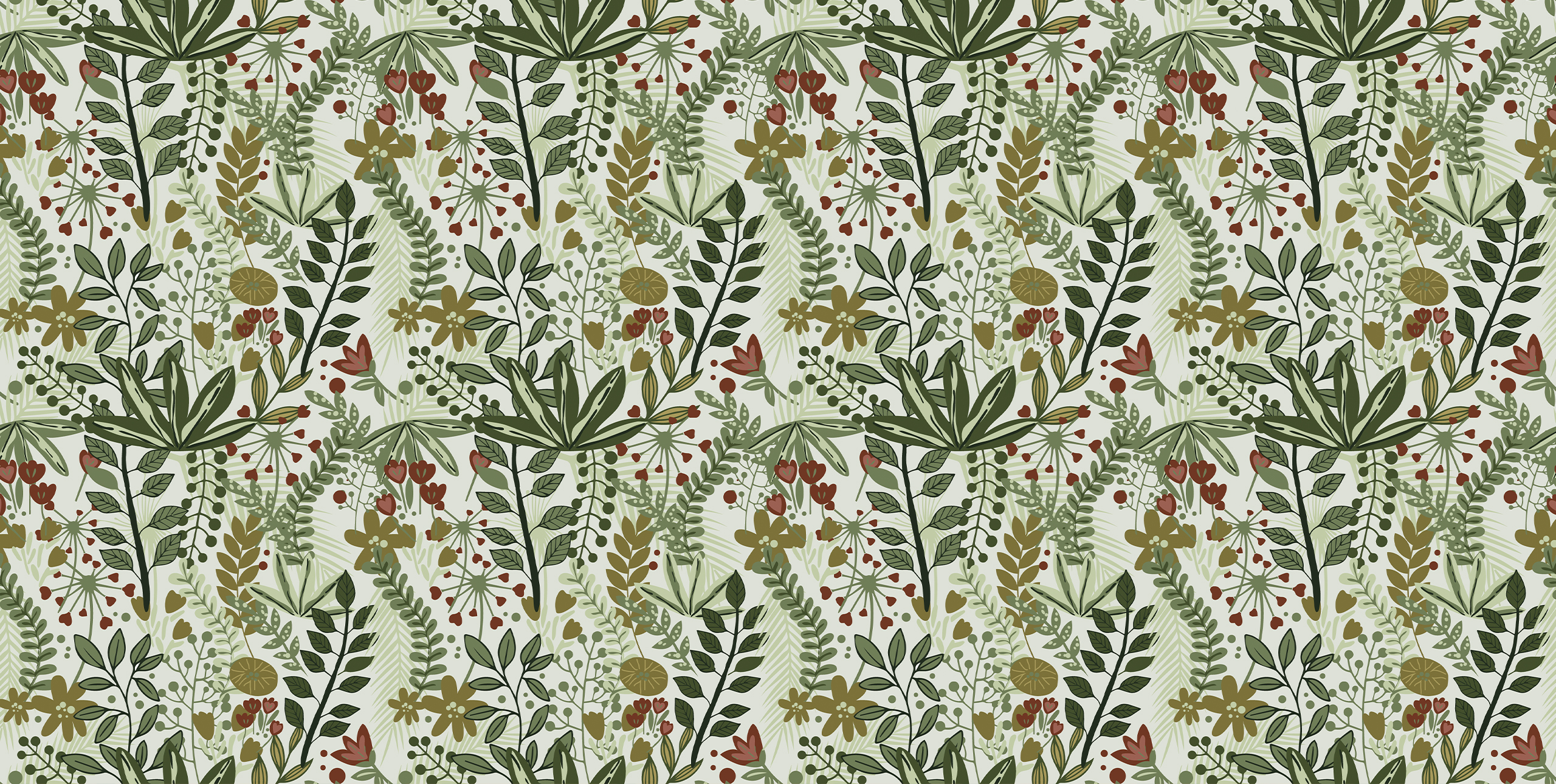
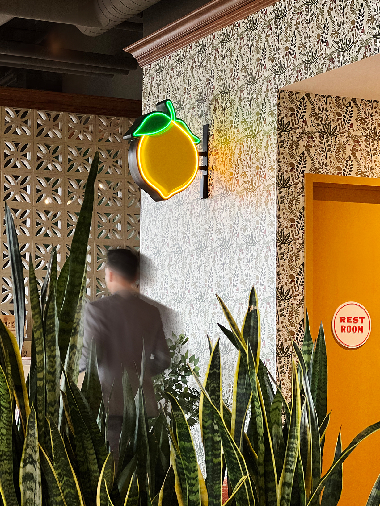
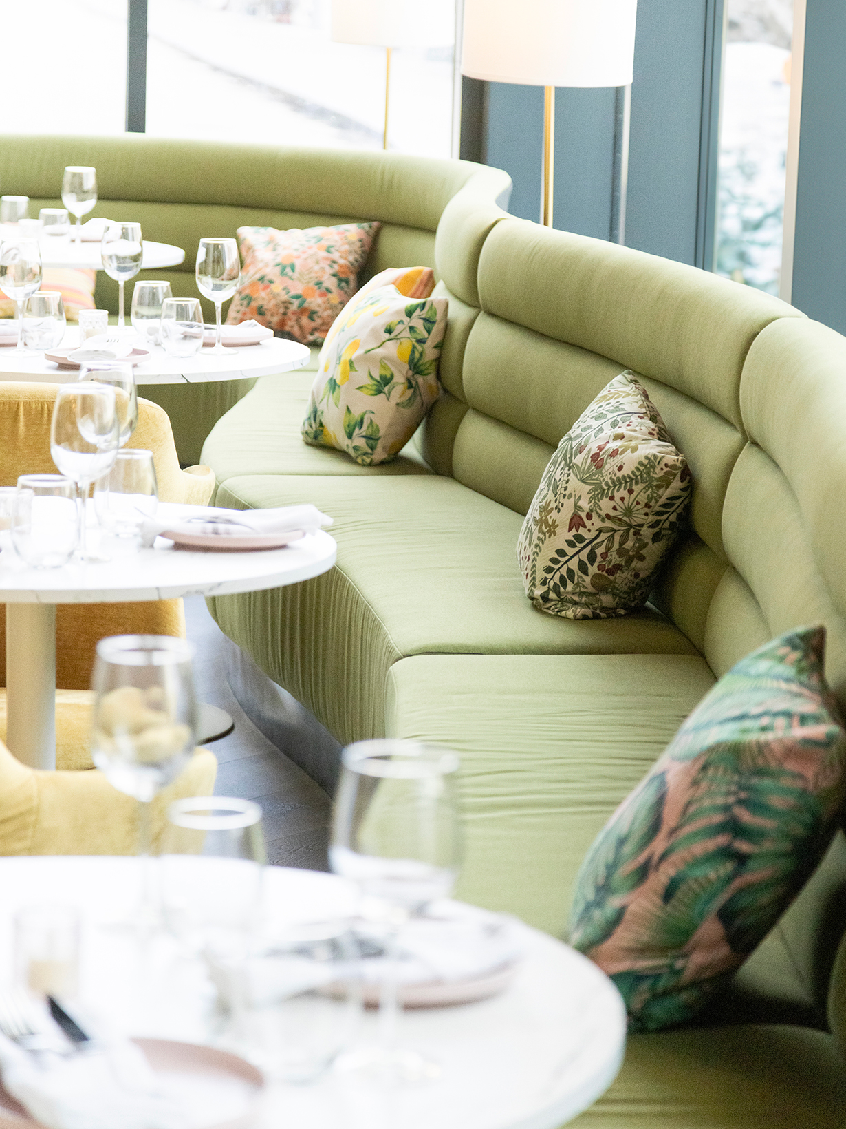
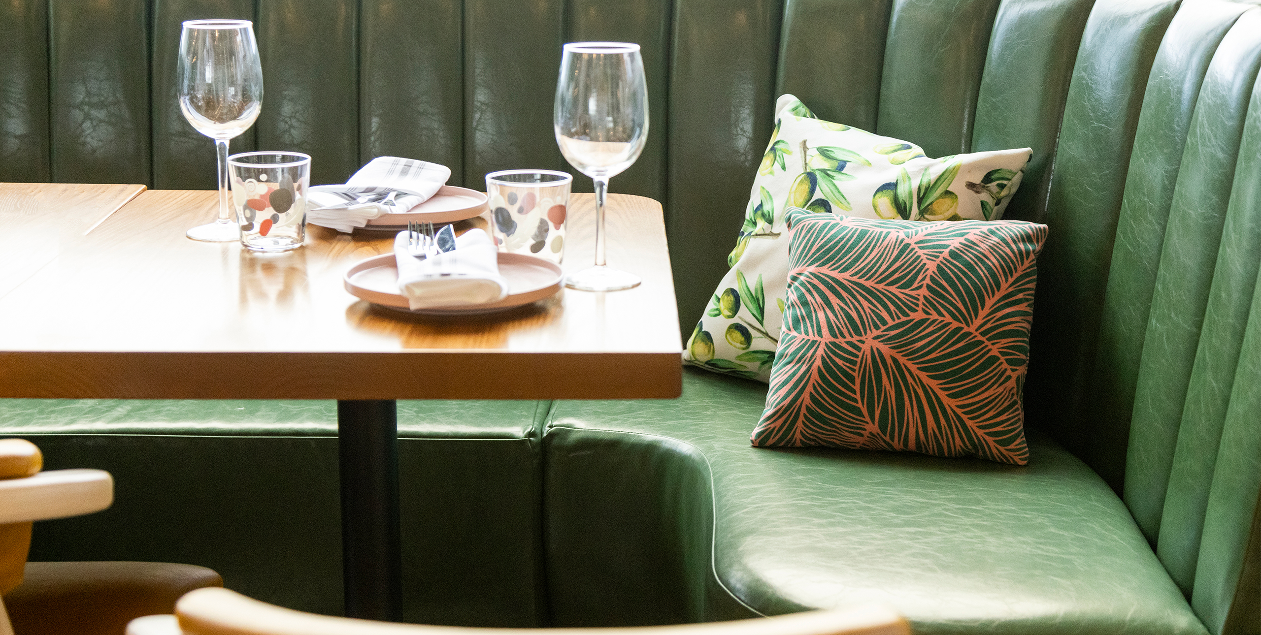
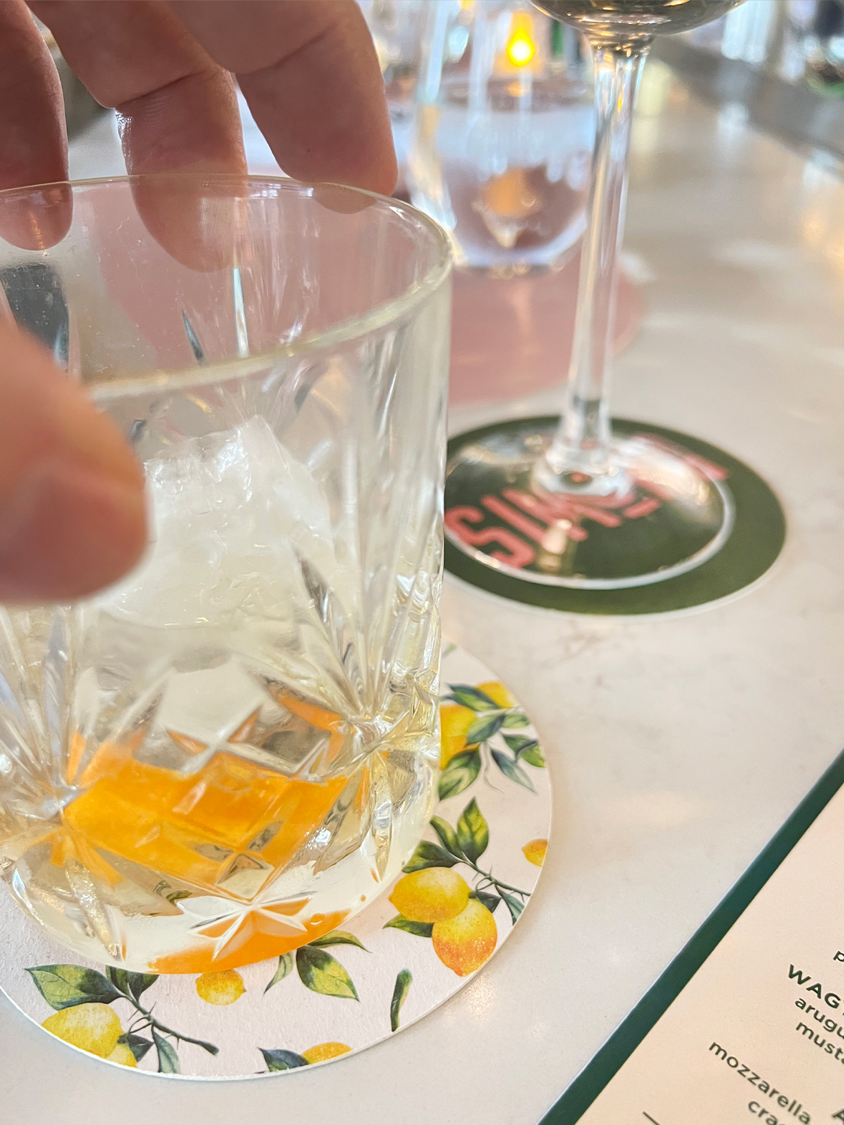
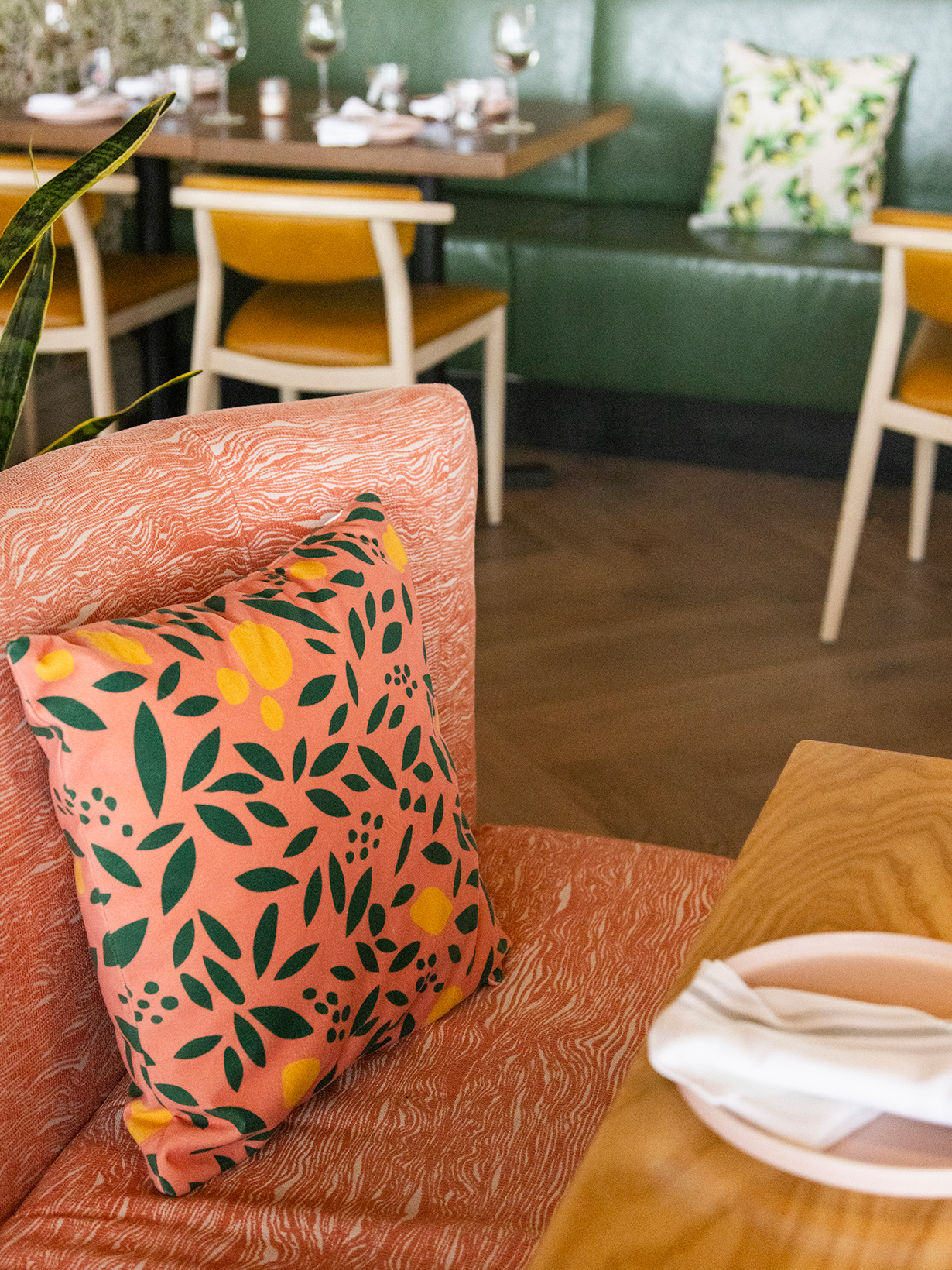
Once the prints were finalized, they were applied to wall coverings, menus, fabrics and other consumer touchpoints. This created a cohesive brand experience, ensuring the interior was not disconnected from marketing materials.
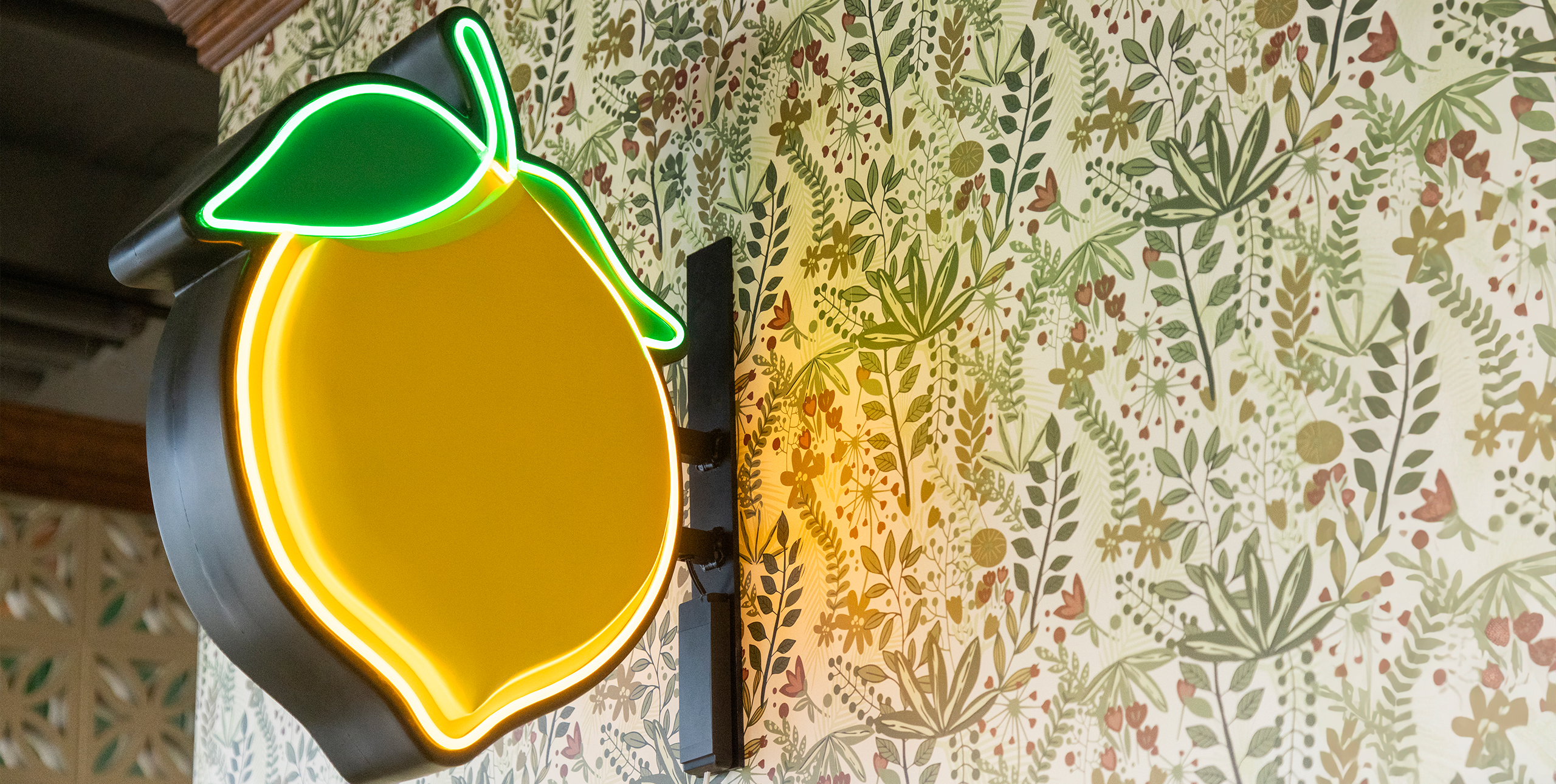
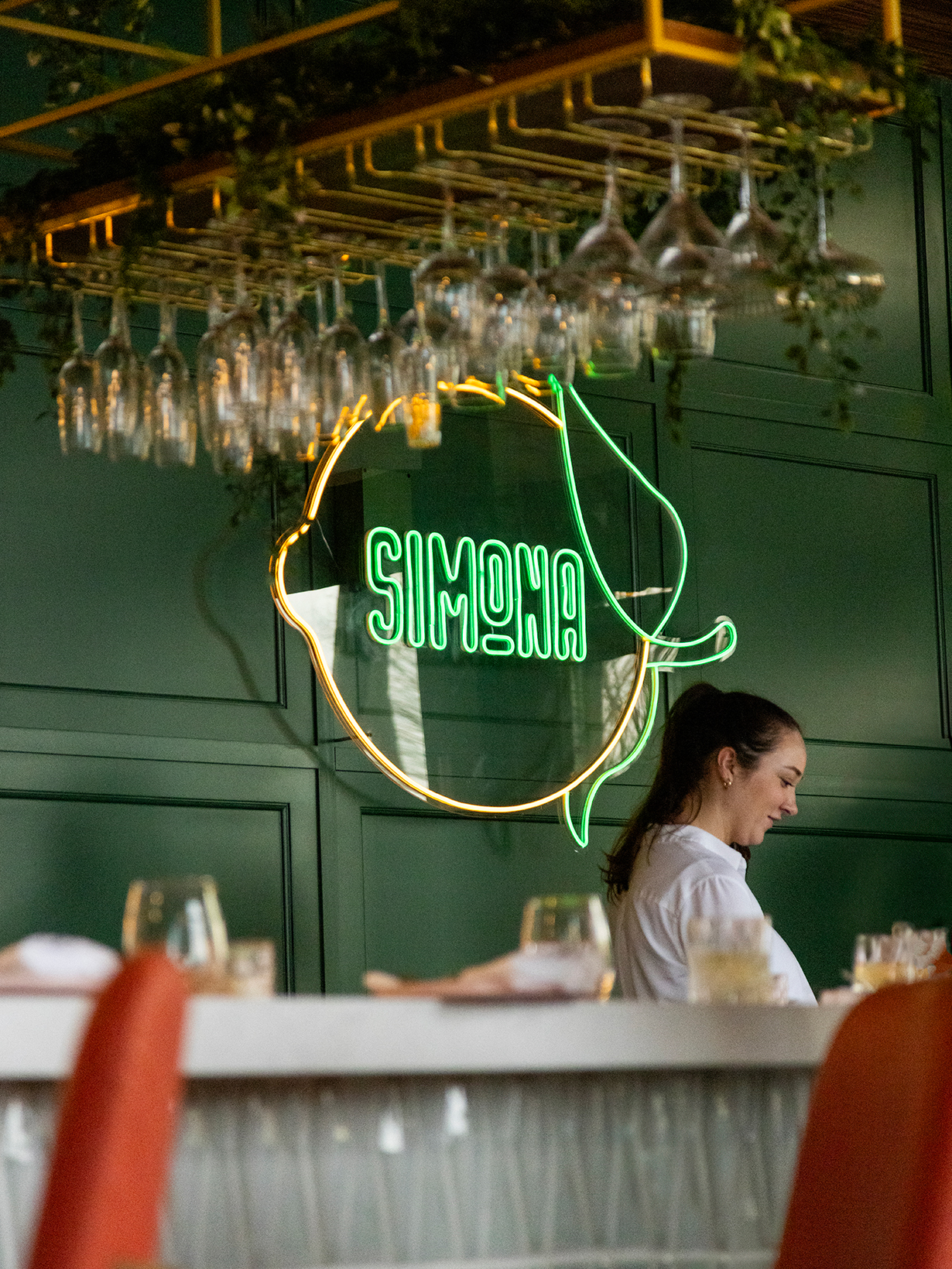
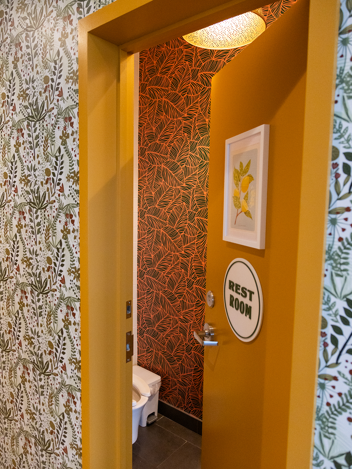
The colour palette and graphic elements, which were established at the outset of the brand strategy, were then applied to the interior space.
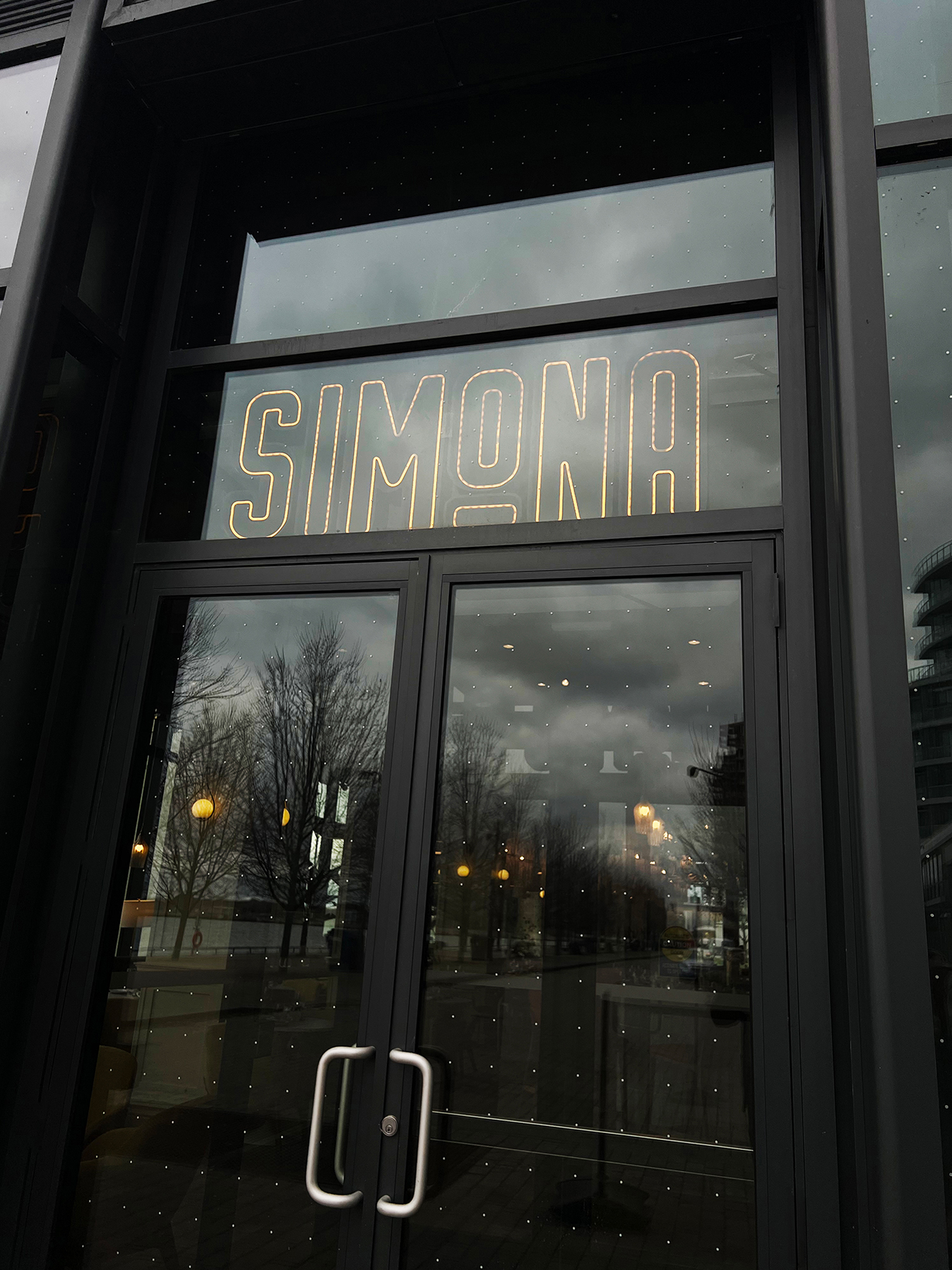
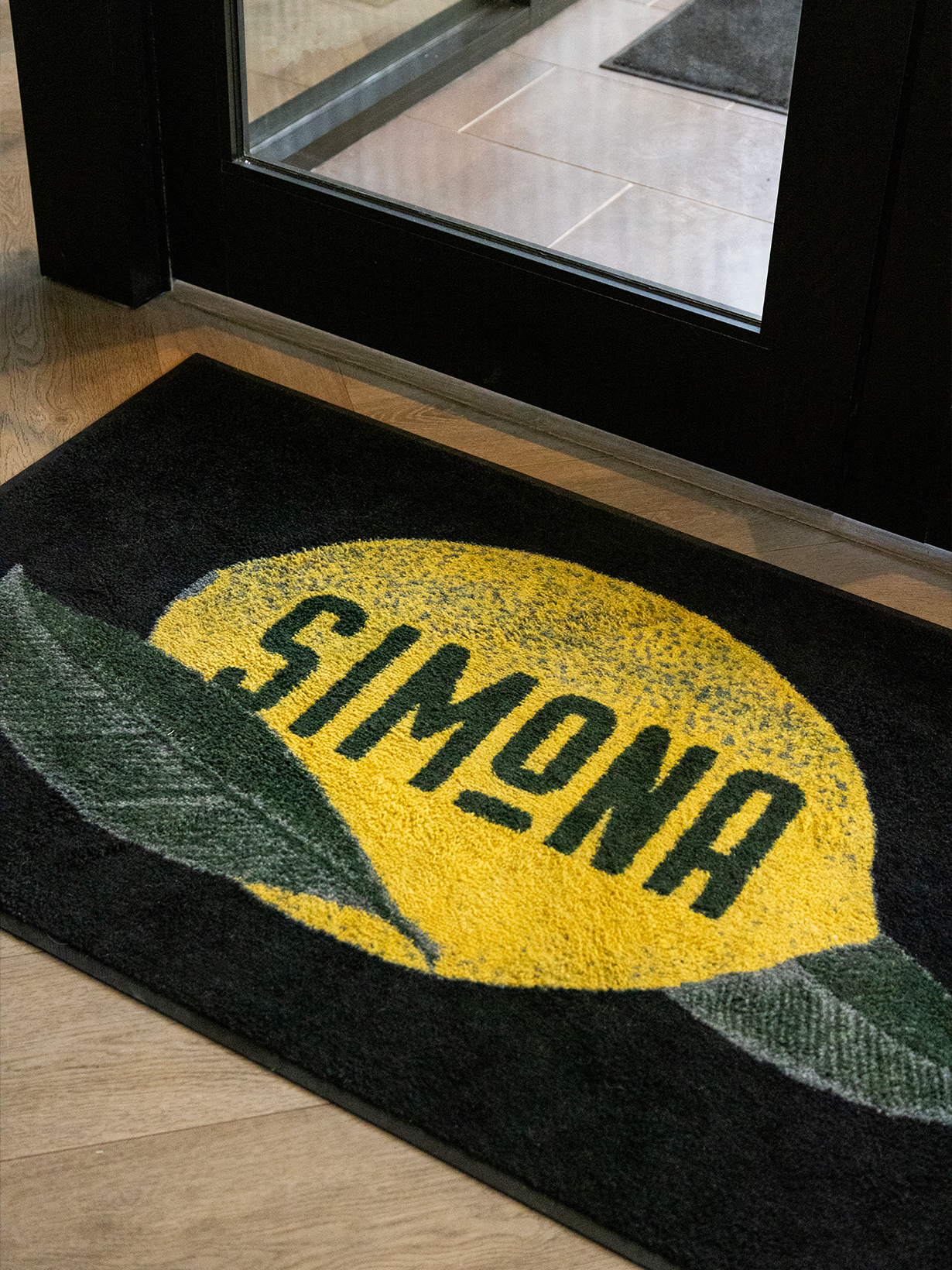
We firmly believe that guests (and staff) notice the details and these thoughtful touches can be what sets one brand experience apart from the rest.
