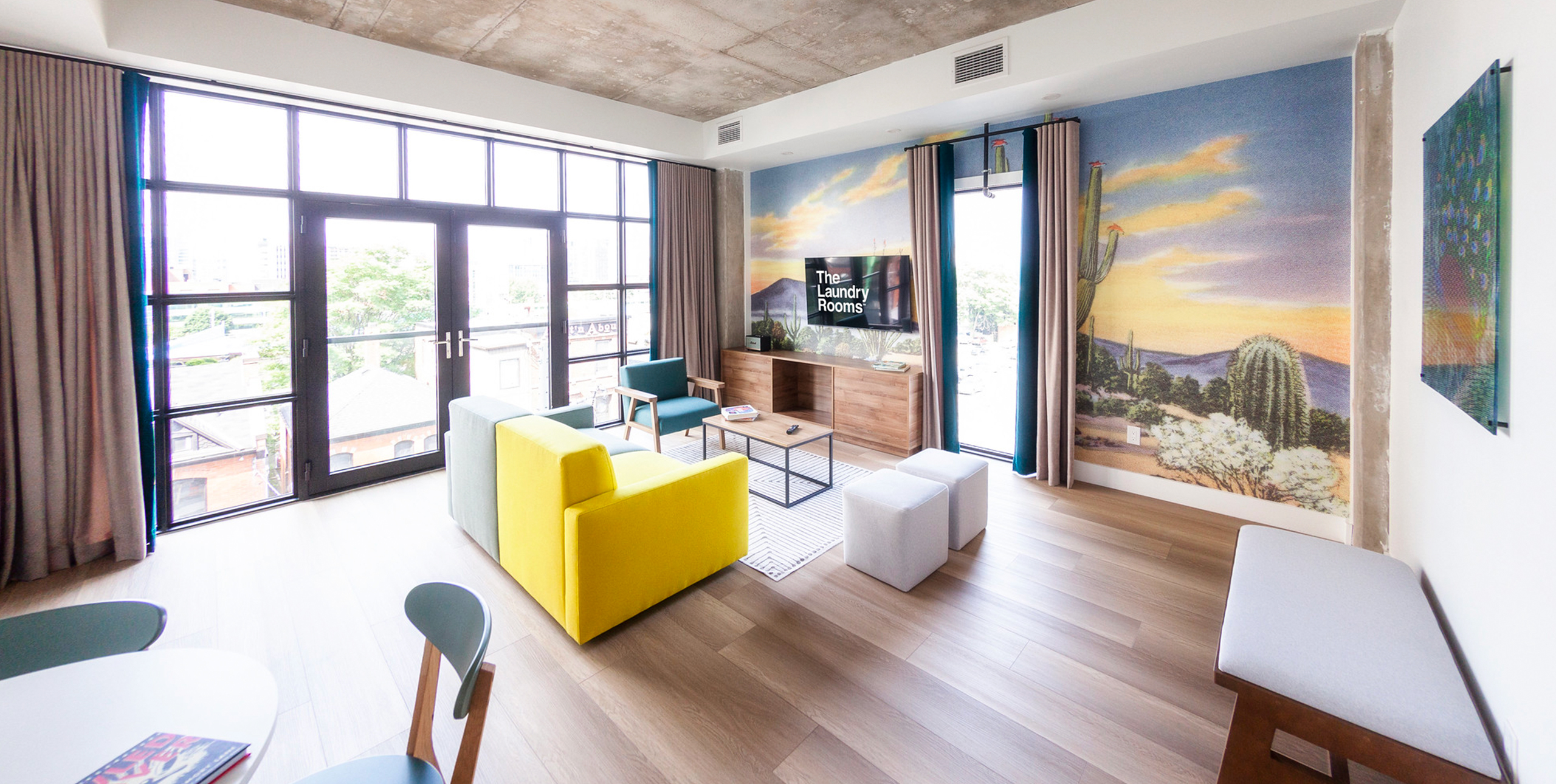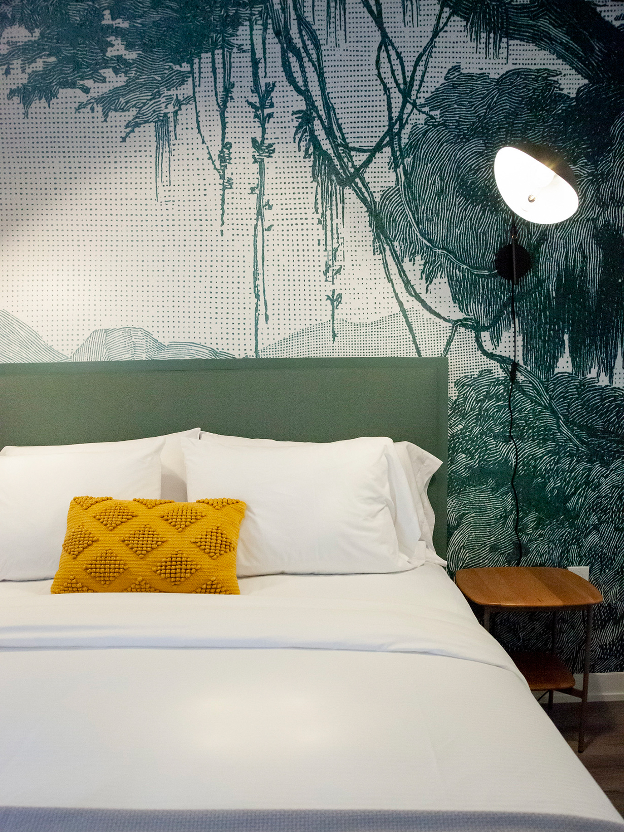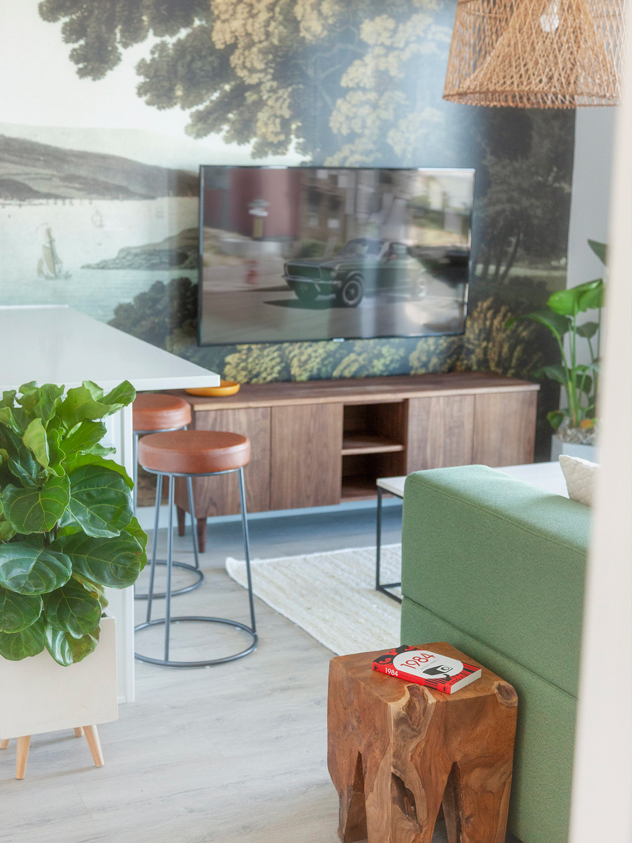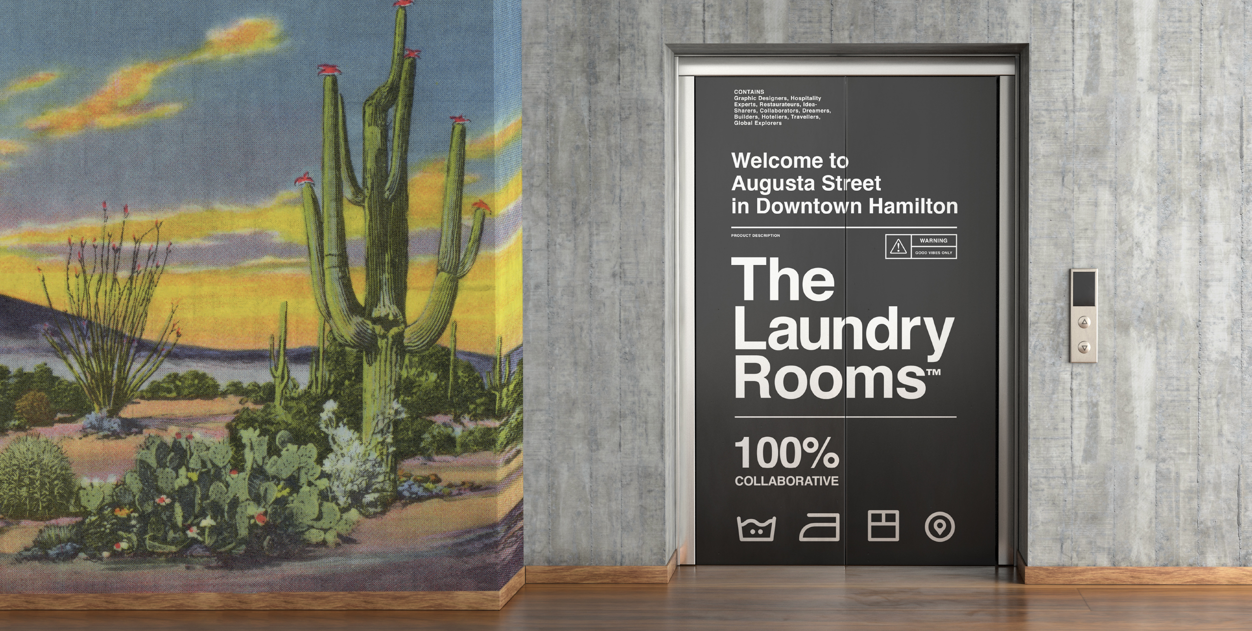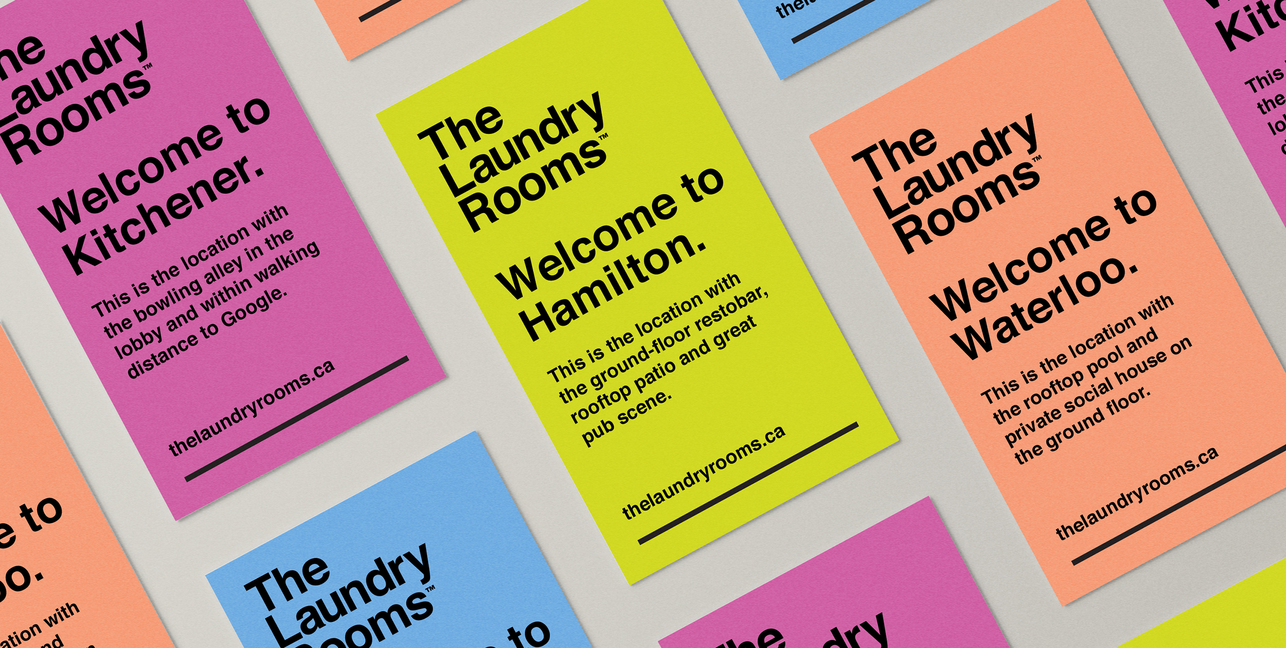
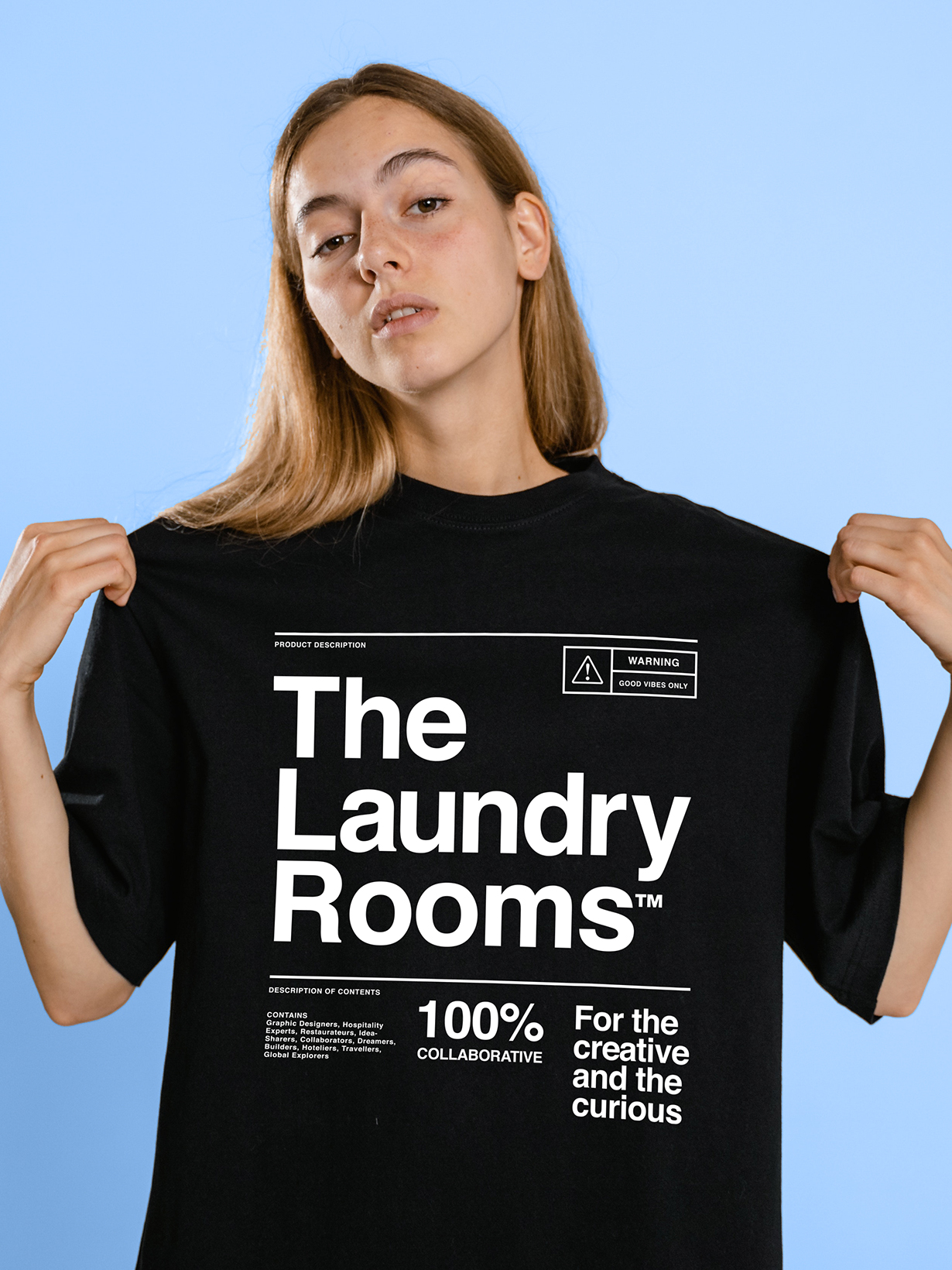
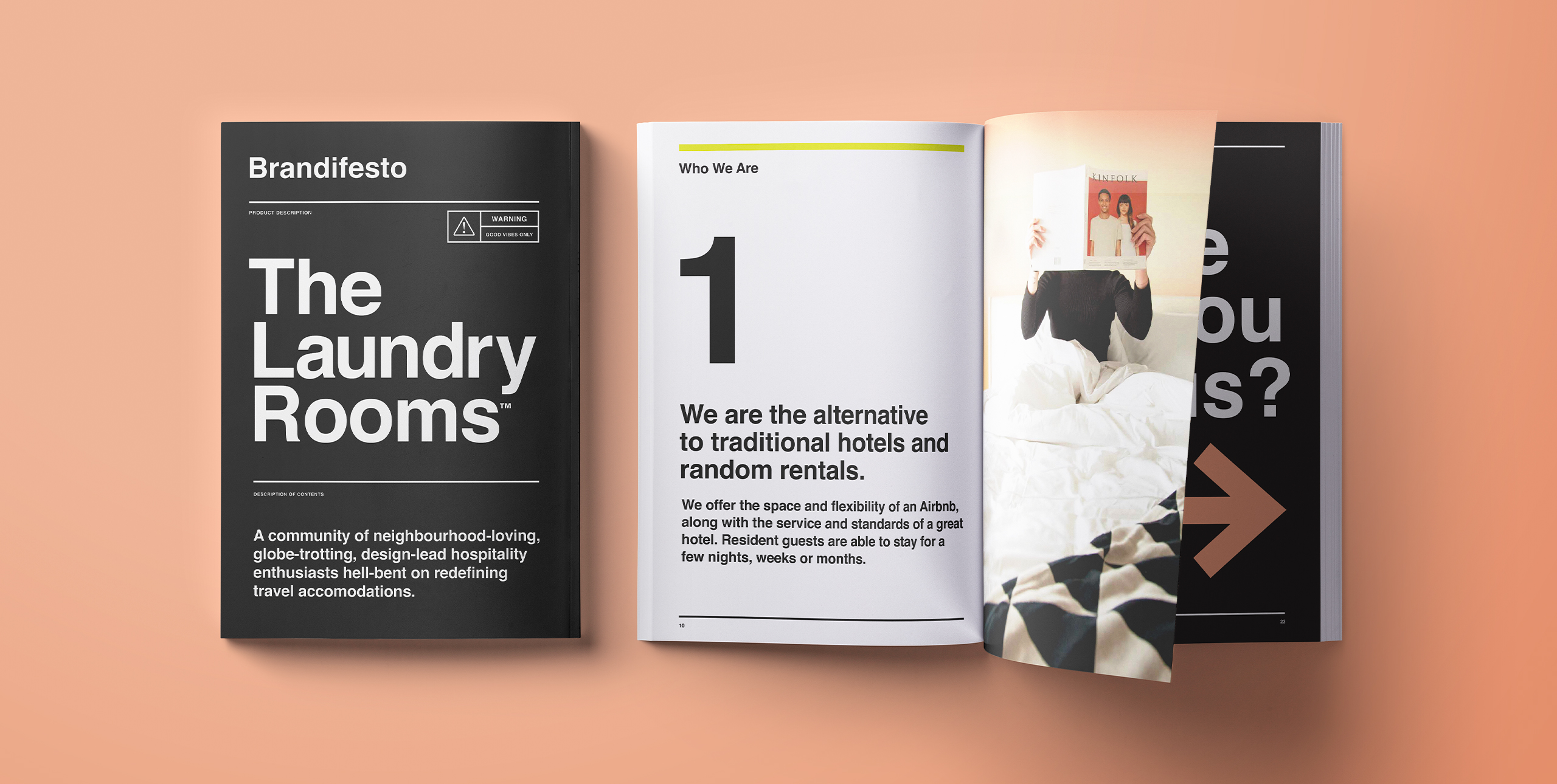
A classic, strong typeface is juxtaposed with with playful colours and patterns to create a visual identity which is polished yet youthful.
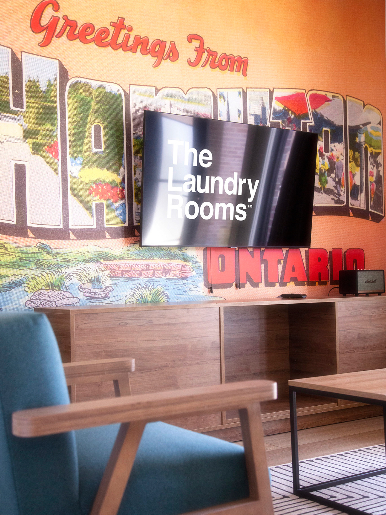
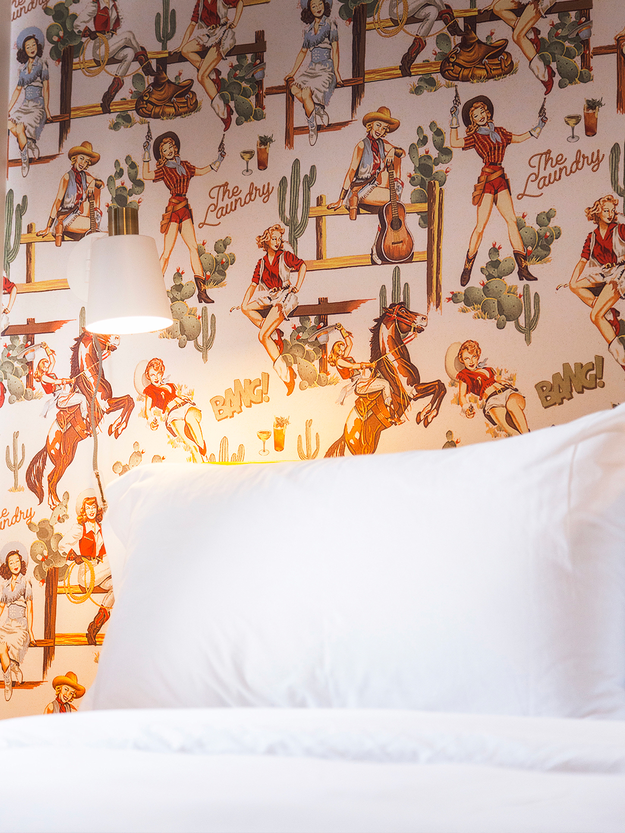
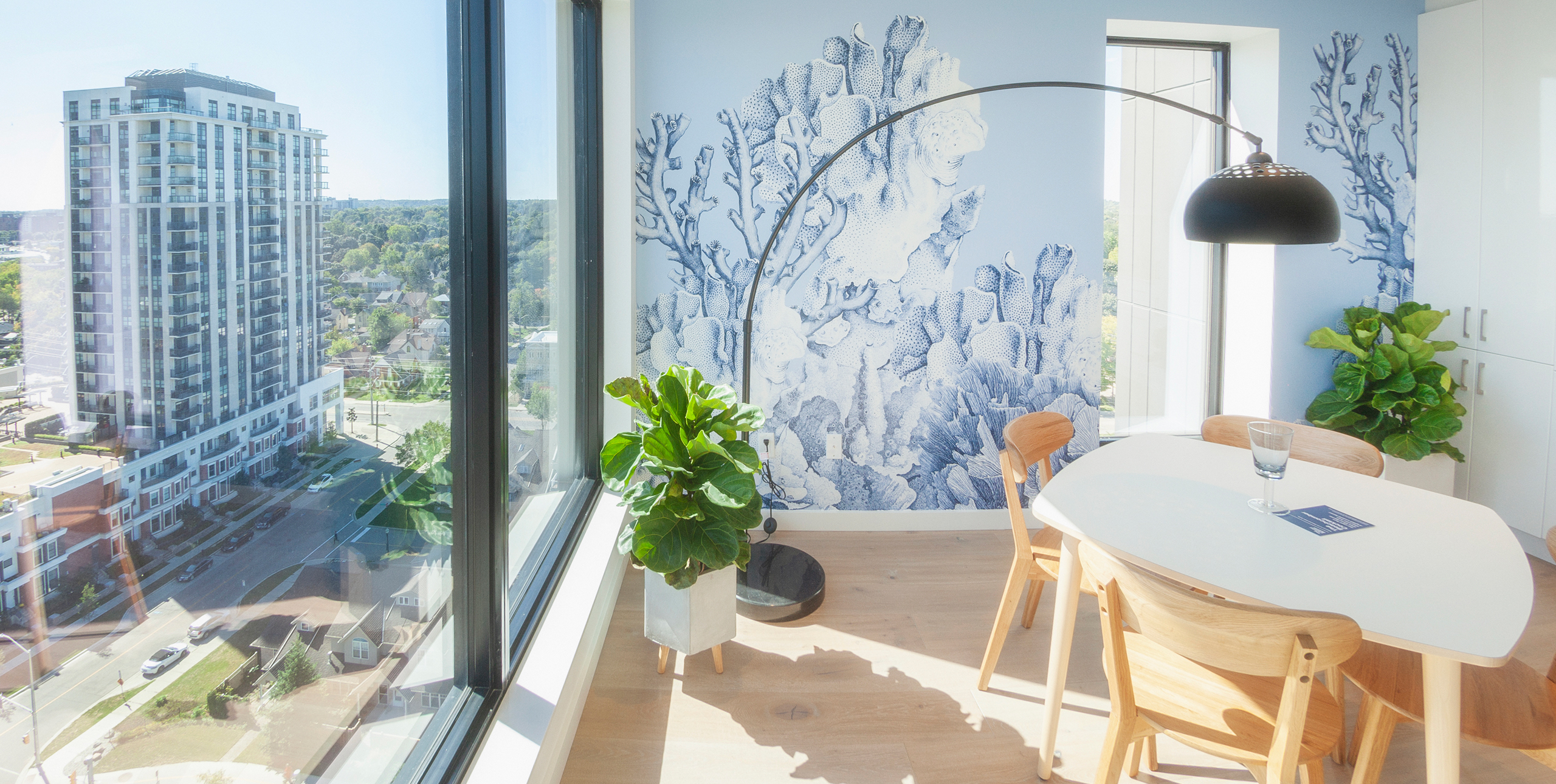


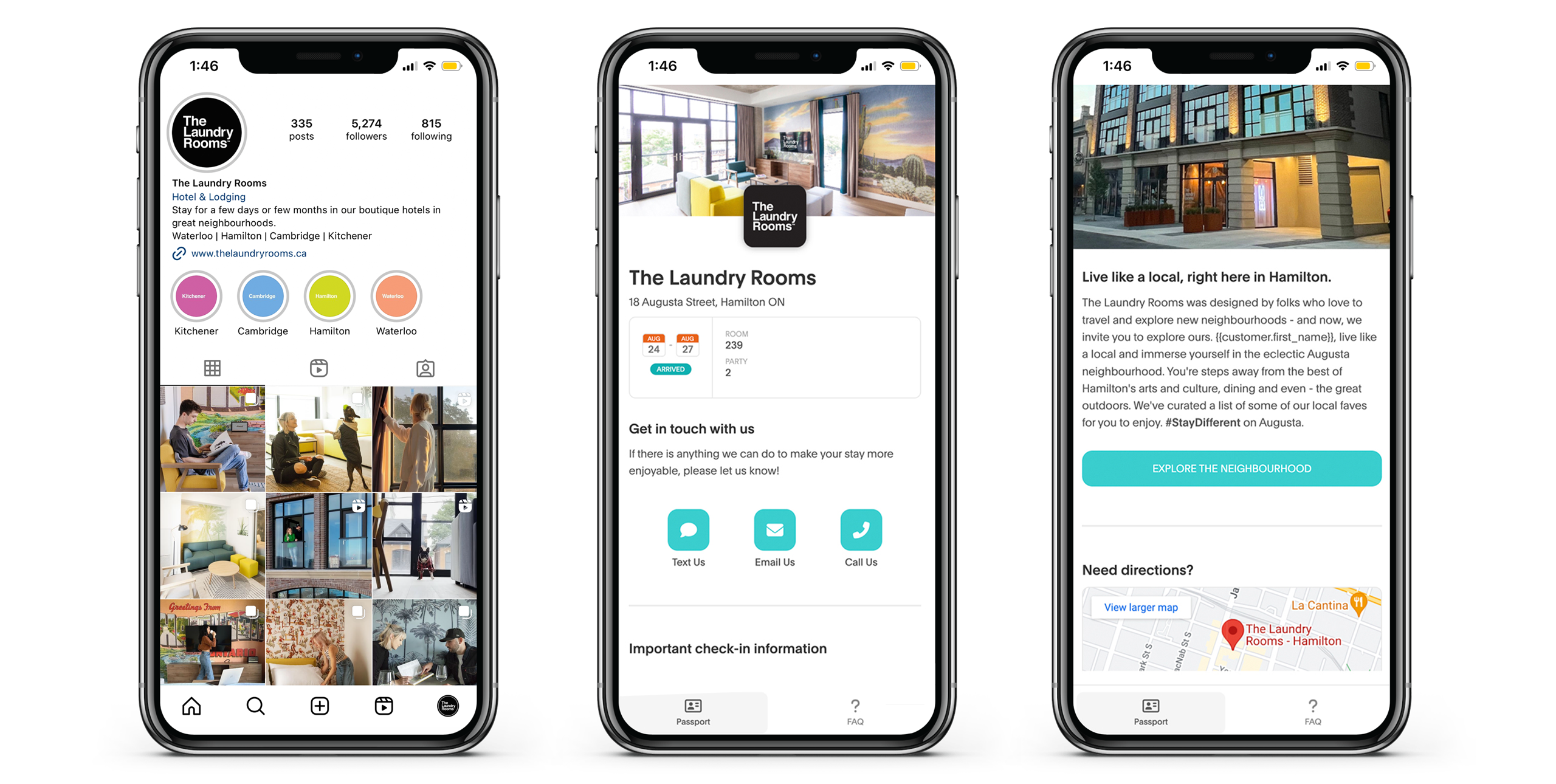
Ultimately, this brand is designed to take a back seat to the cities it calls home. Whether it’s merchandise, marketing collateral, signage, or digital messaging, every single brand touchpoint remains consistently energetic.
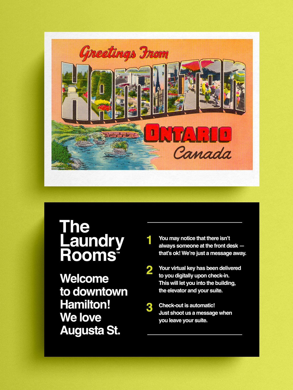

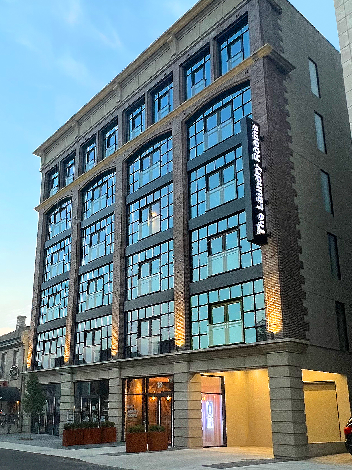
Since its inception, this brand has grown to four locations in Hamilton, Waterloo, Kitchener and Cambridge. Working collaboratively with the local communities, we continue to ensure the brand remains complimentary to the neighbourhoods in which it lives.
