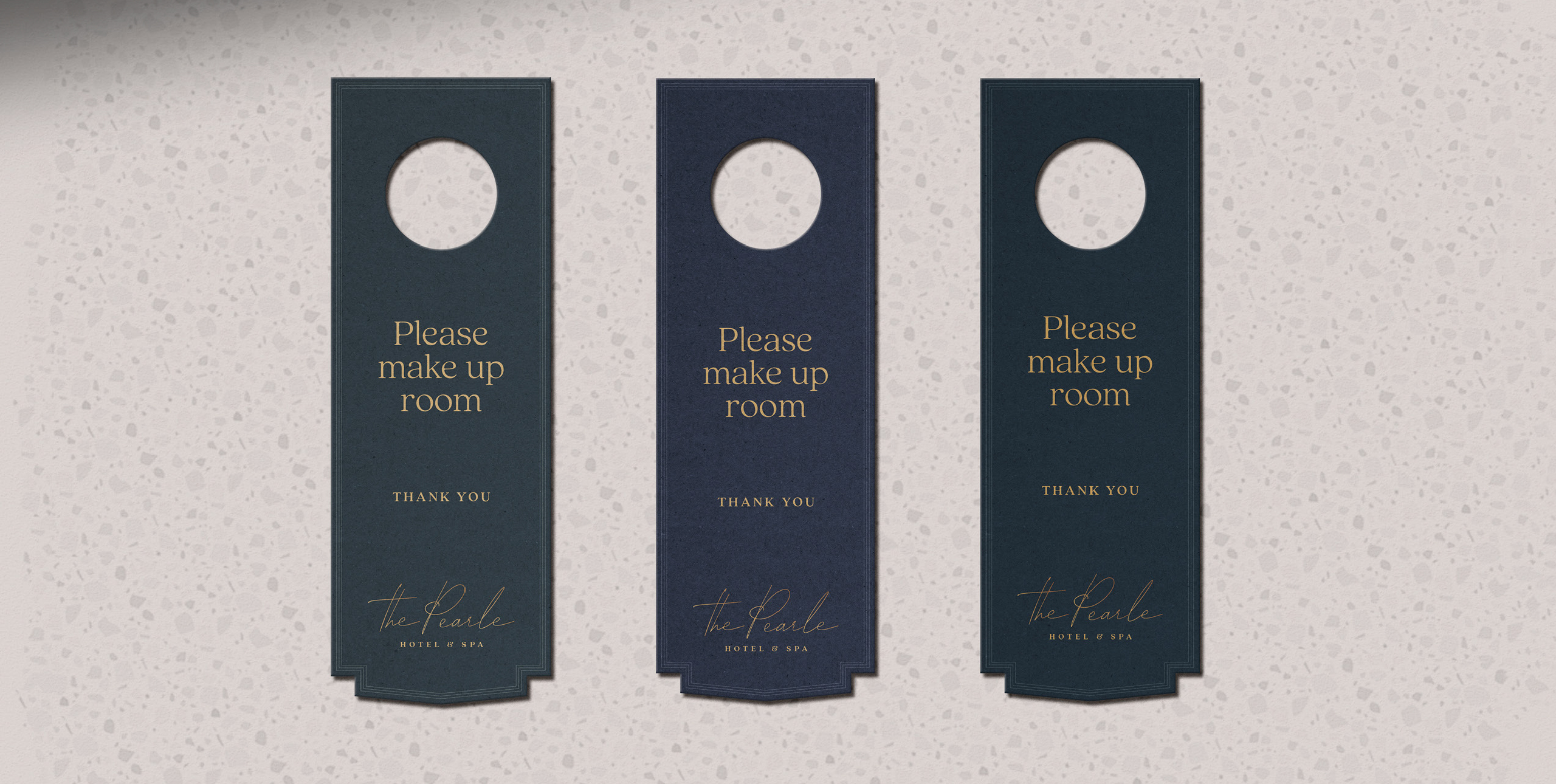
Designed by Studio Munge, this hotel belongs to the Marriott Autograph Collection — a series of independent hotels designed to leave a unique and lasting imprint on guests. Our challenge was to design a brand identity and story that was elevated, personal, and remarkably unlike anything else.
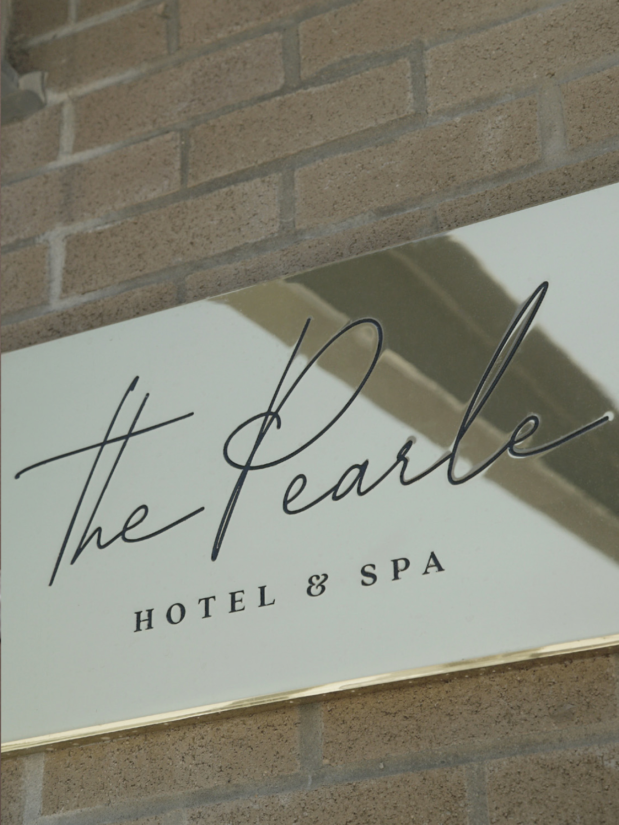
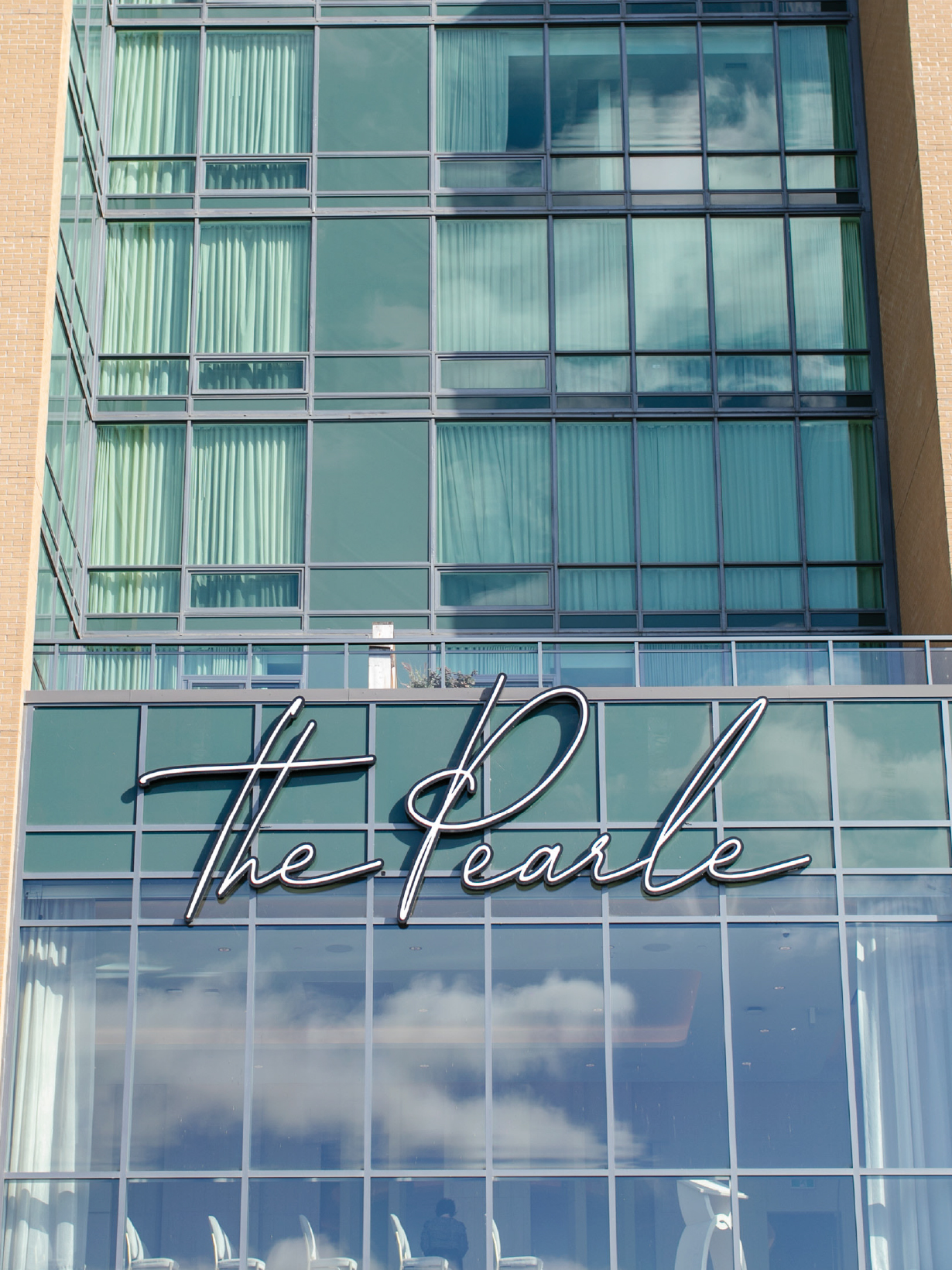
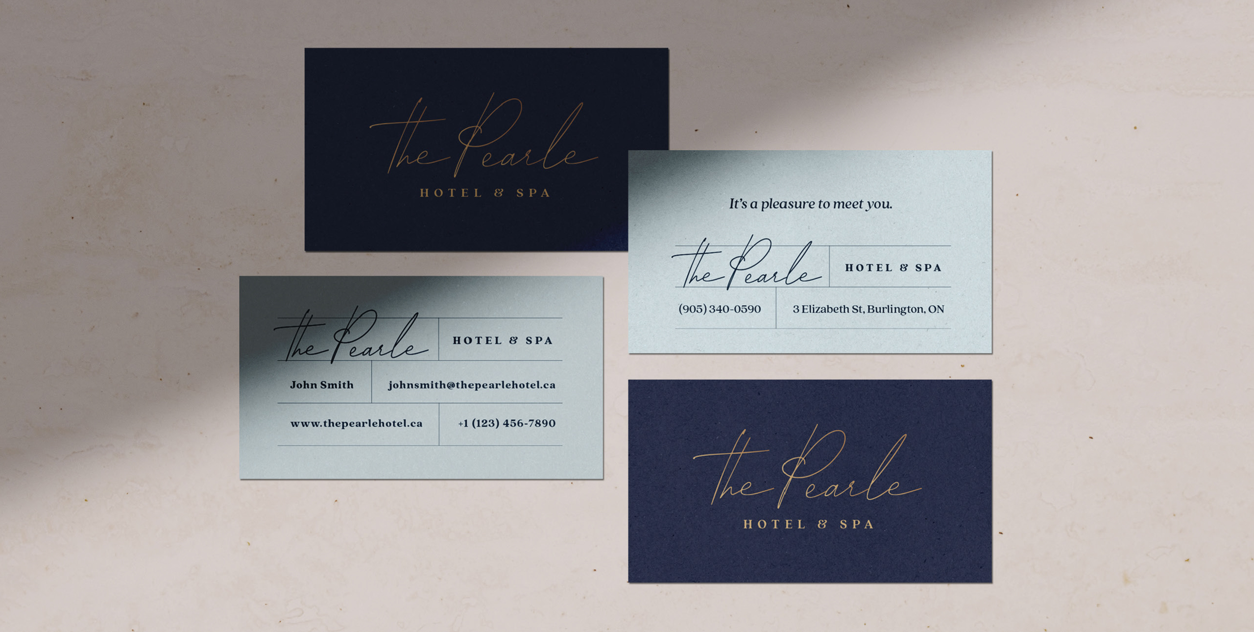
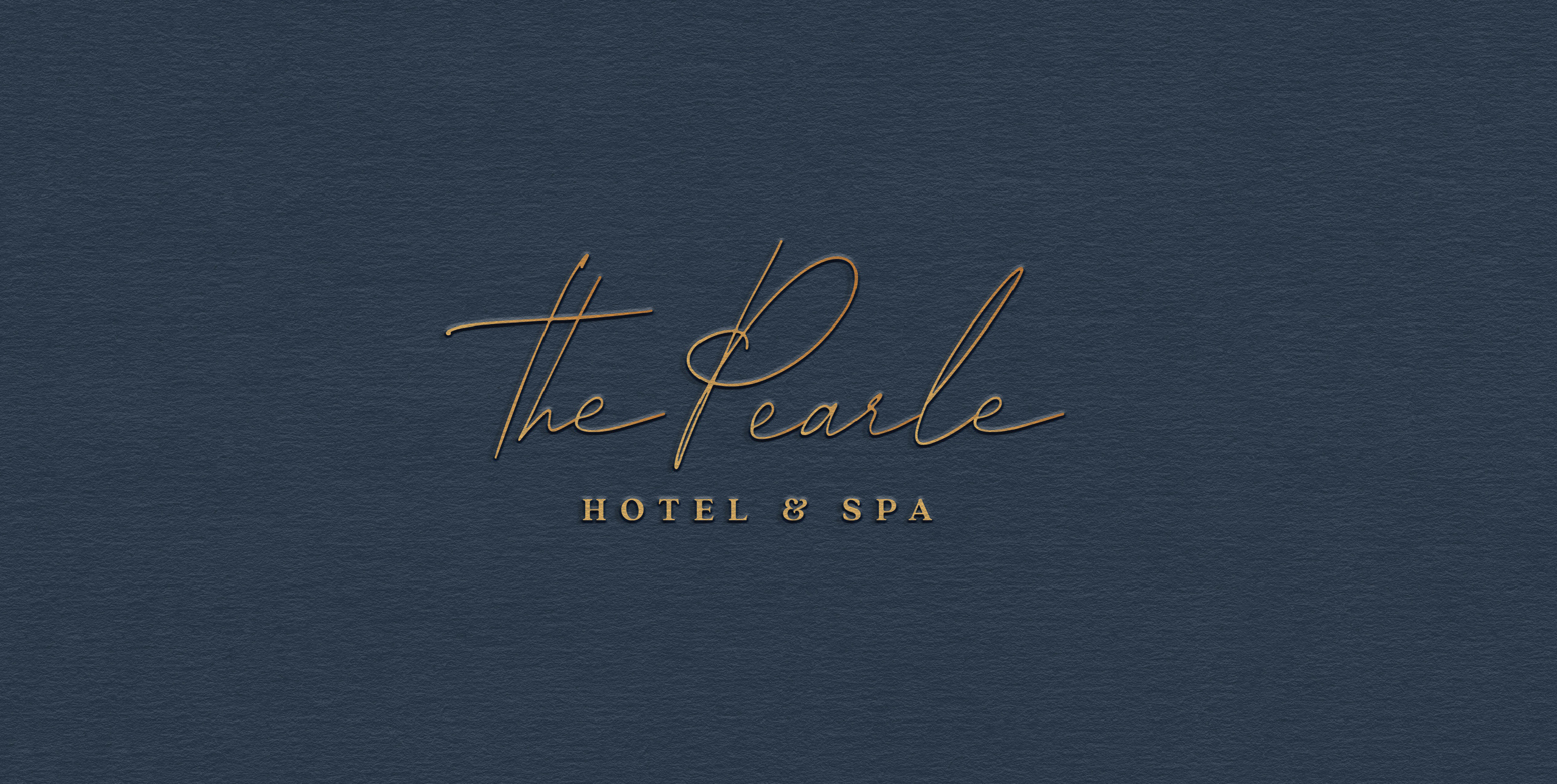
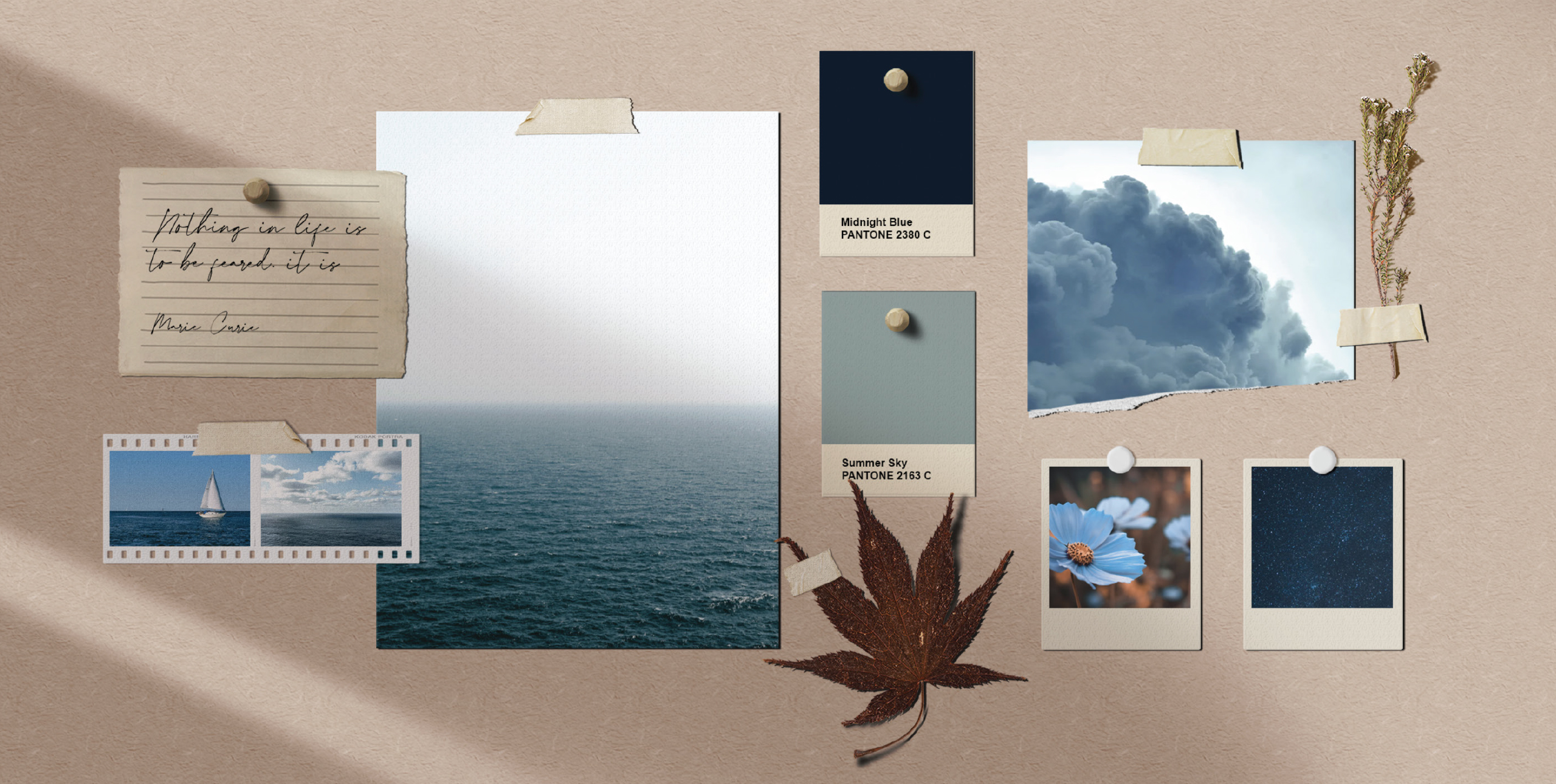
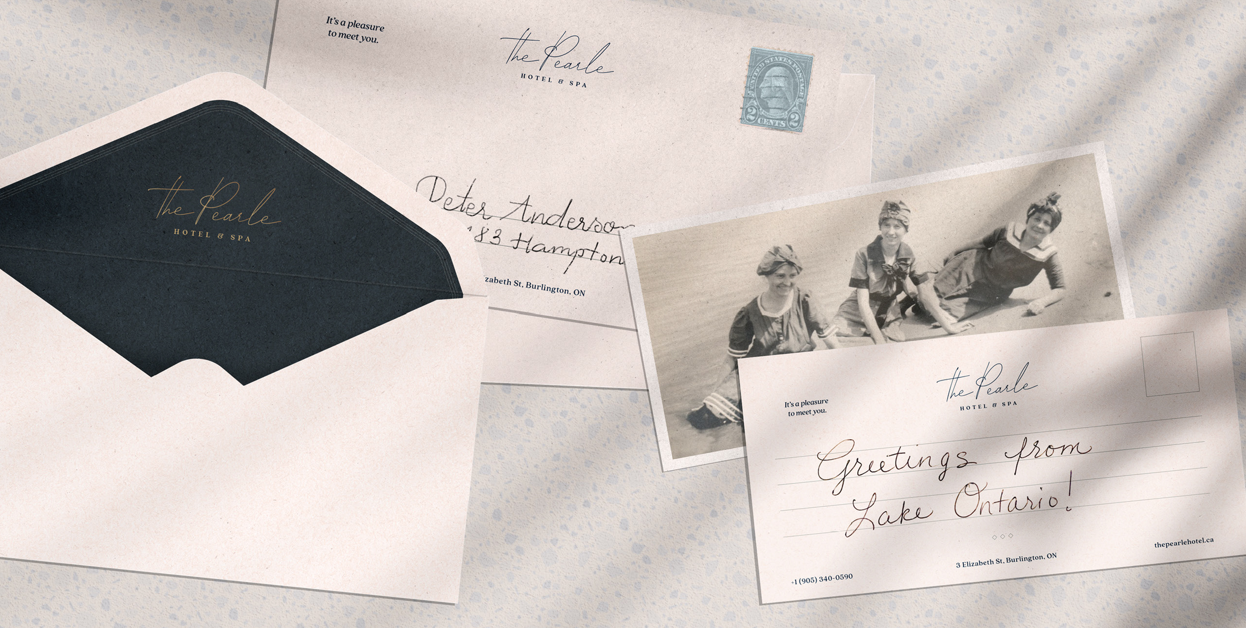
The Pearle Hotel & Spa pays homage to the grandmother of this family-run business, Pearle herself. The logo is based on the handwriting of this remarkable woman; in the letters she would write to loved ones and grandchildren. Situated on the shores of Lake Ontario, this body of water became the backbone for the colour palette. Blue tones of the sky and water are anchored with natural shades of sand.
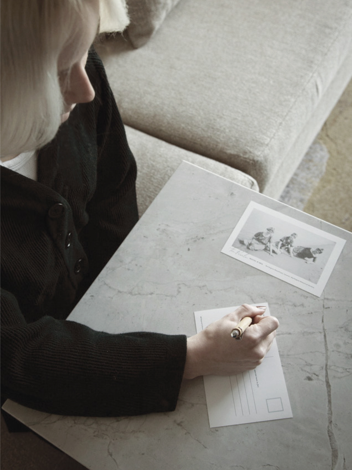

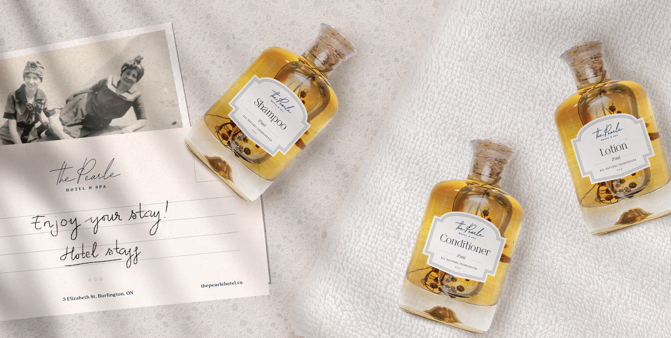
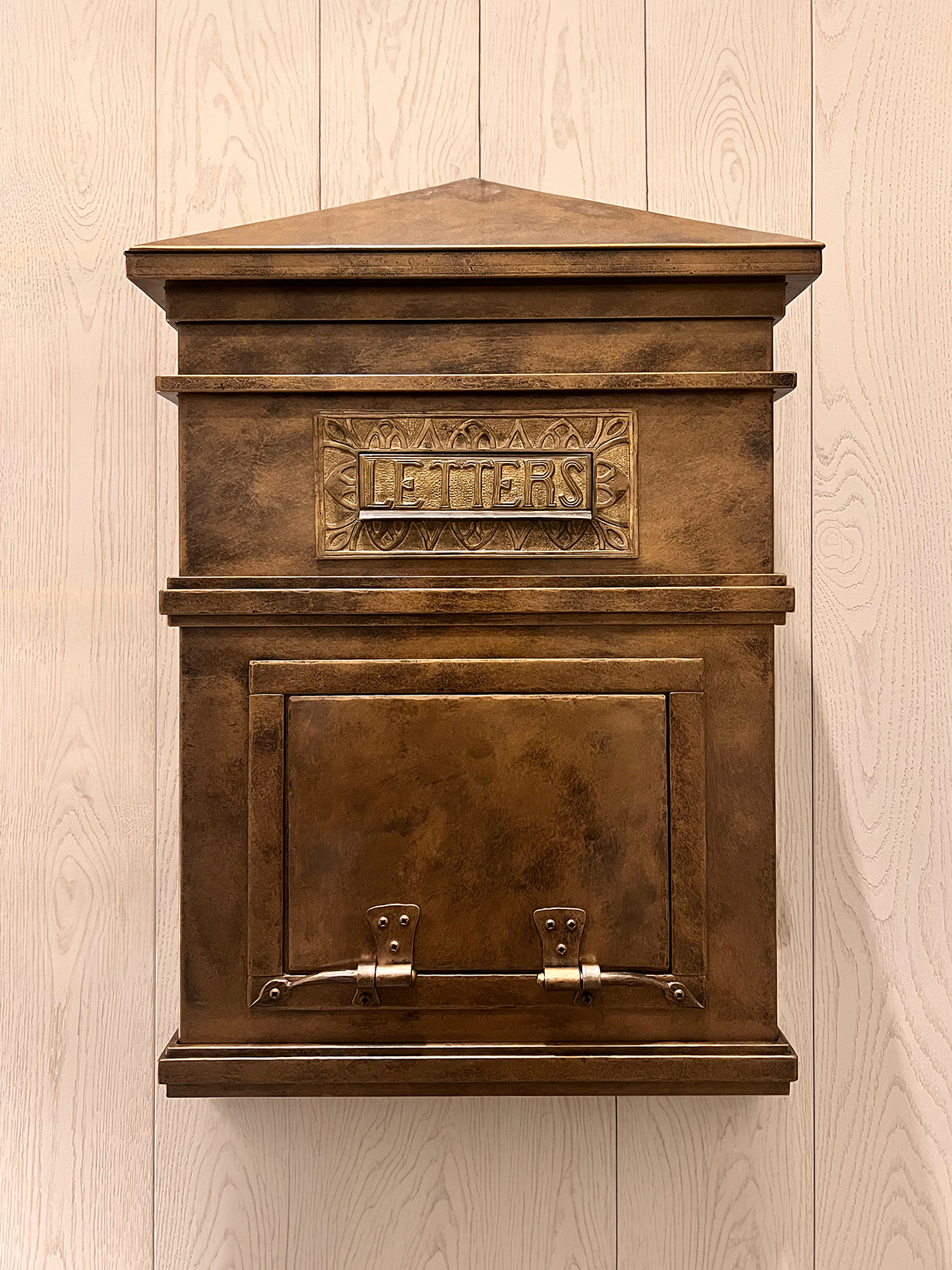
In every guest room of The Pearle Hotel & Spa, guests are greeted with stamps and postcards. These are intended to encourage guests to slow down, reflect and surprise friends with an unexpected note. In the lobby of the hotel, a custom mailbox provides the perfect spot to mail these thoughts and letters to loved ones.

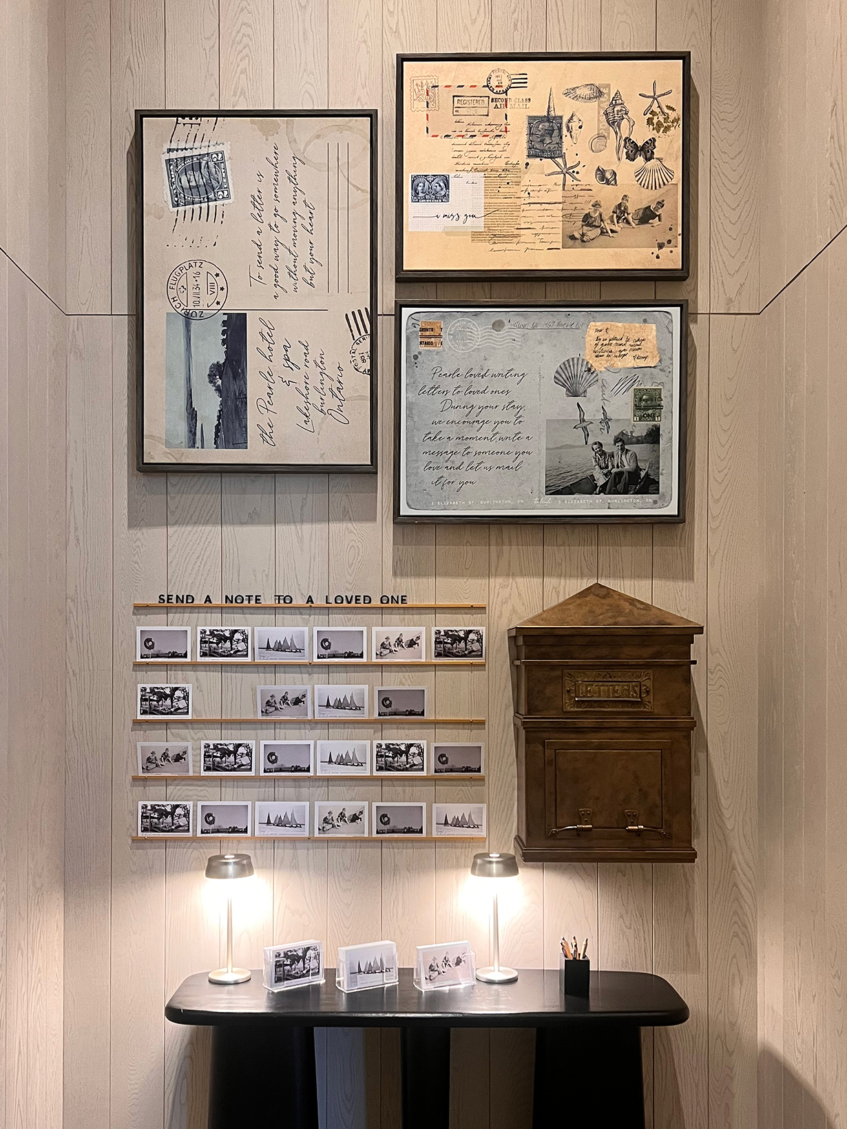

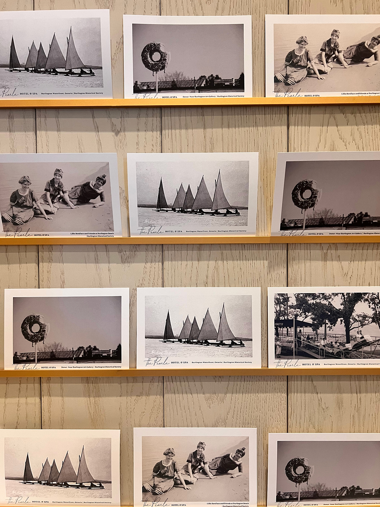
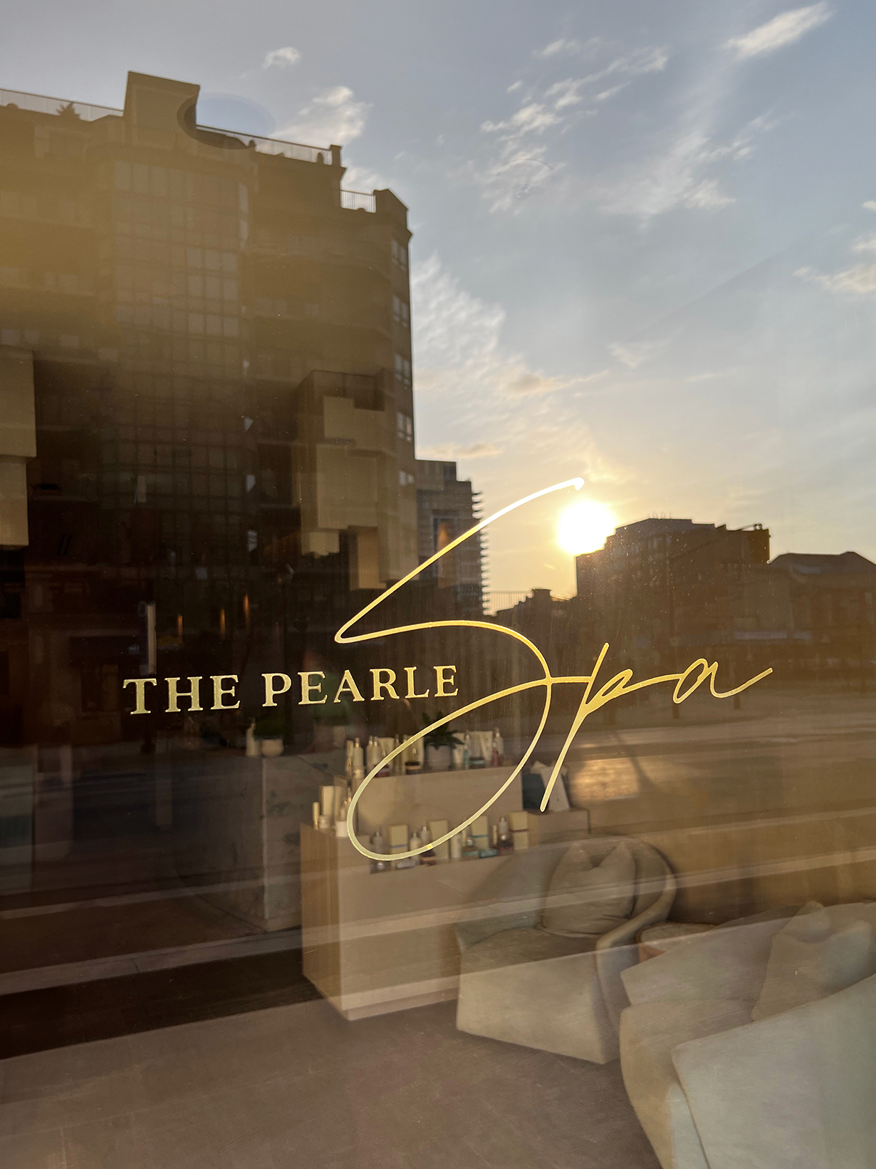
Consistent typography and colour palette treatments were carried through signage, packaging, marketing collateral and social media.
