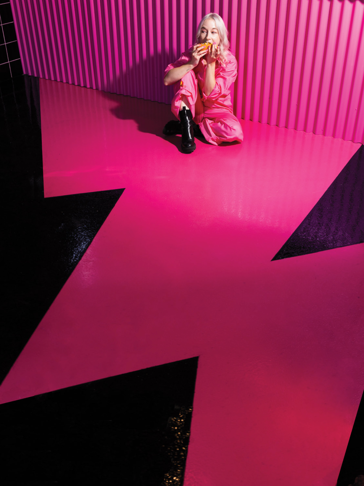
From the outset, we were all aligned on creating an interior space that was a photo backdrop first, and retail space second.
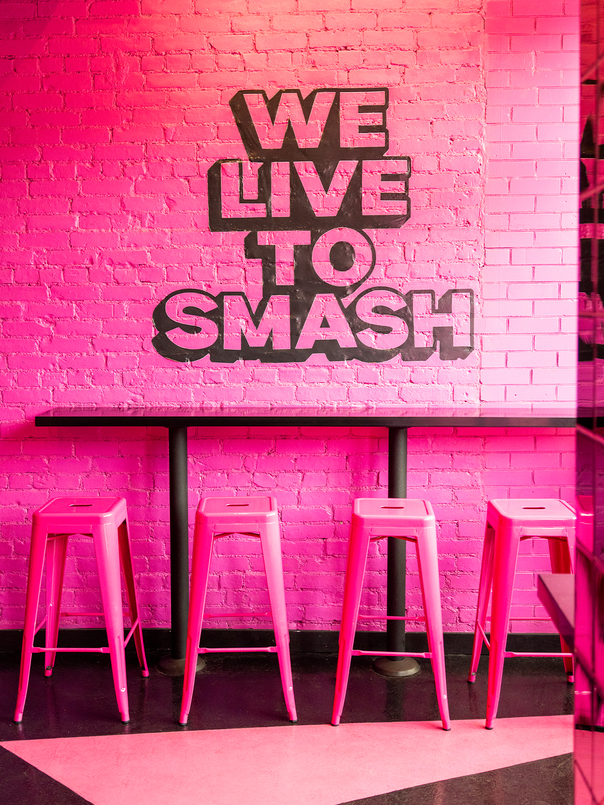
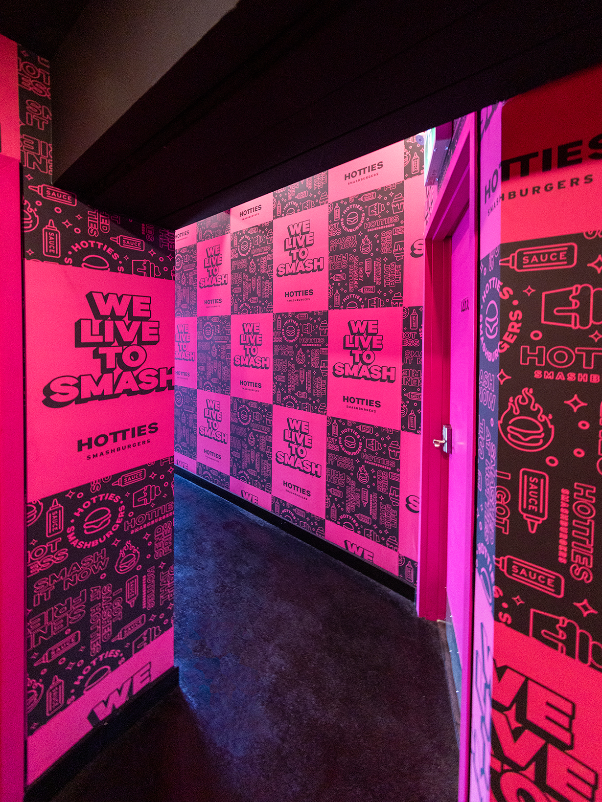
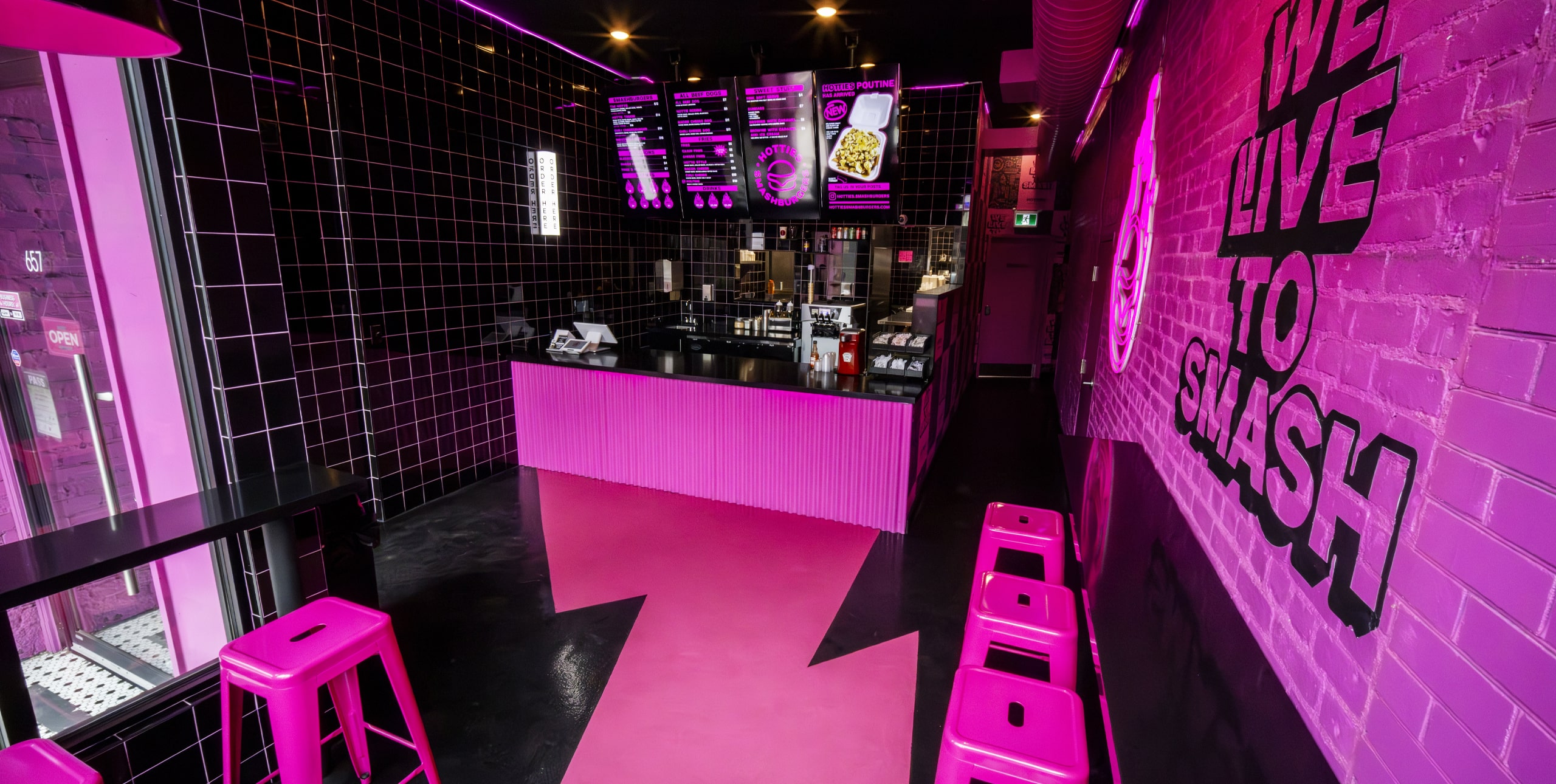
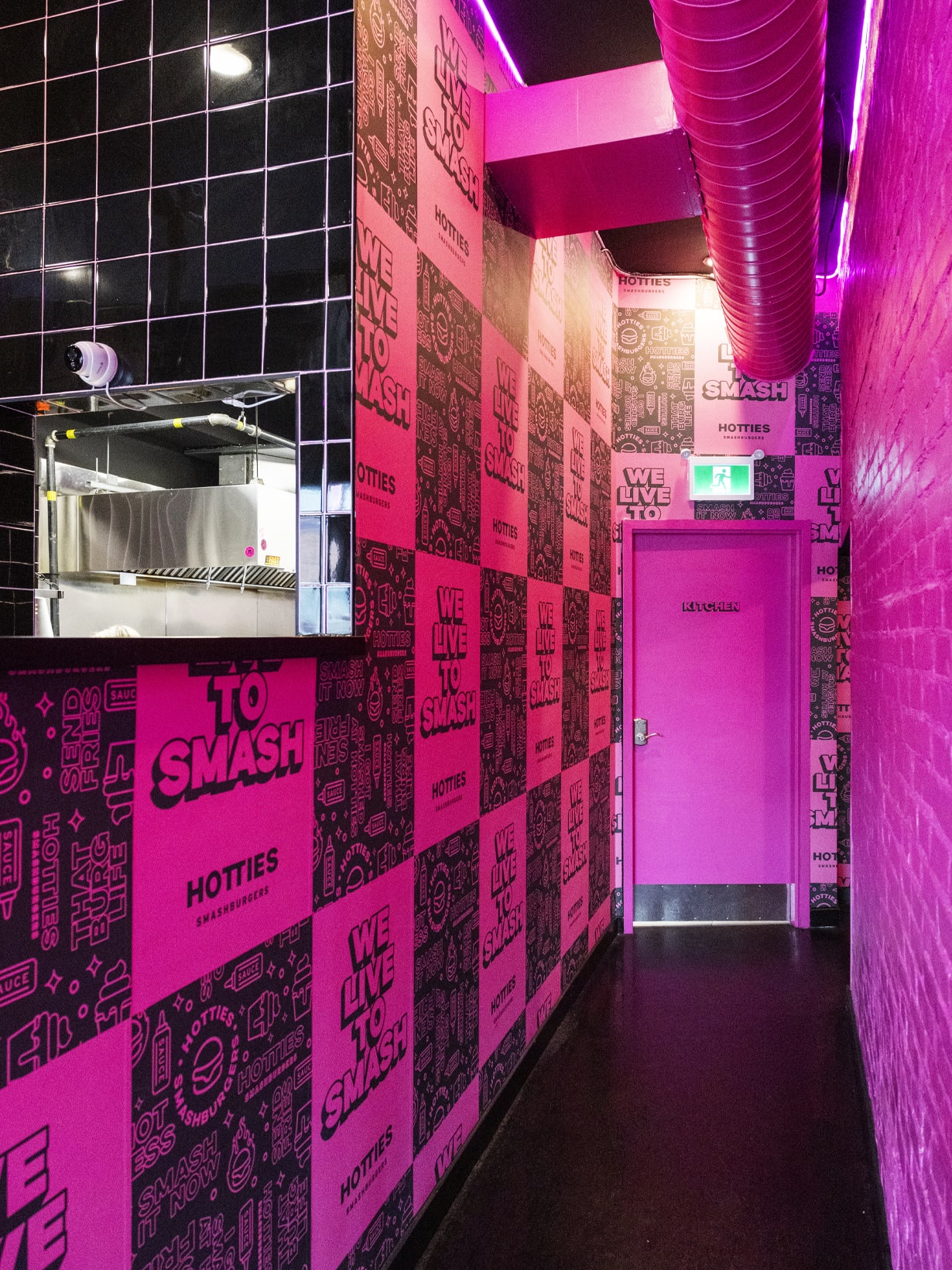
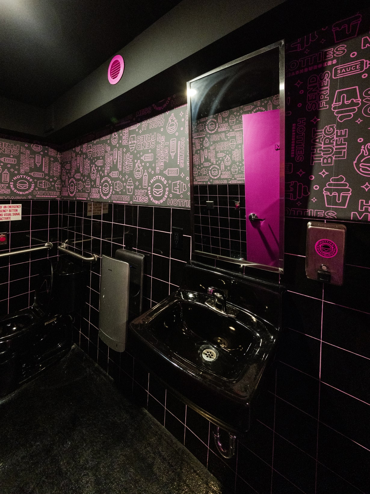
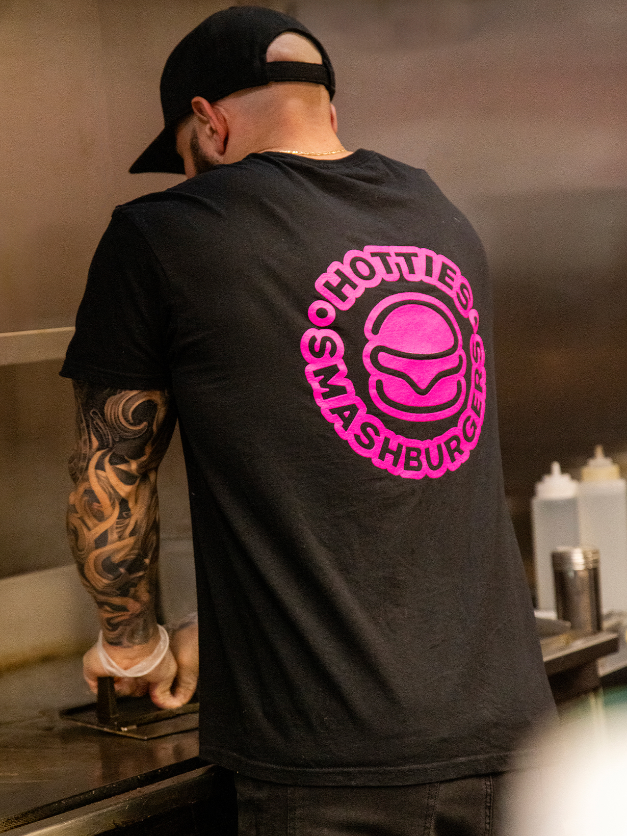
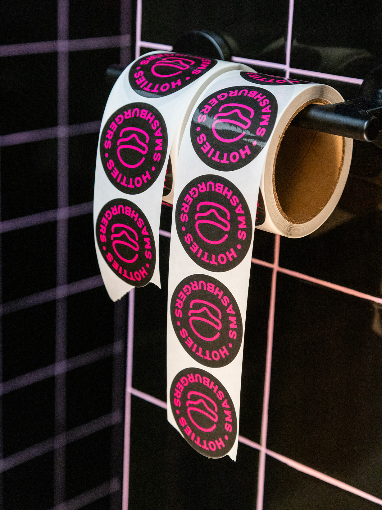

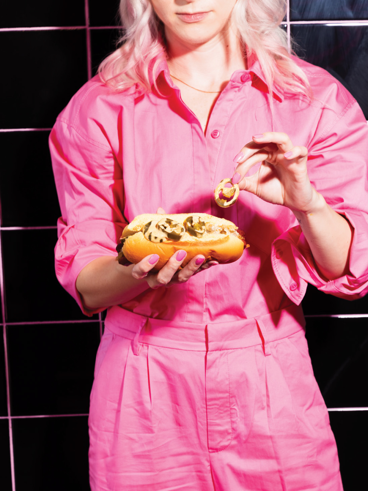
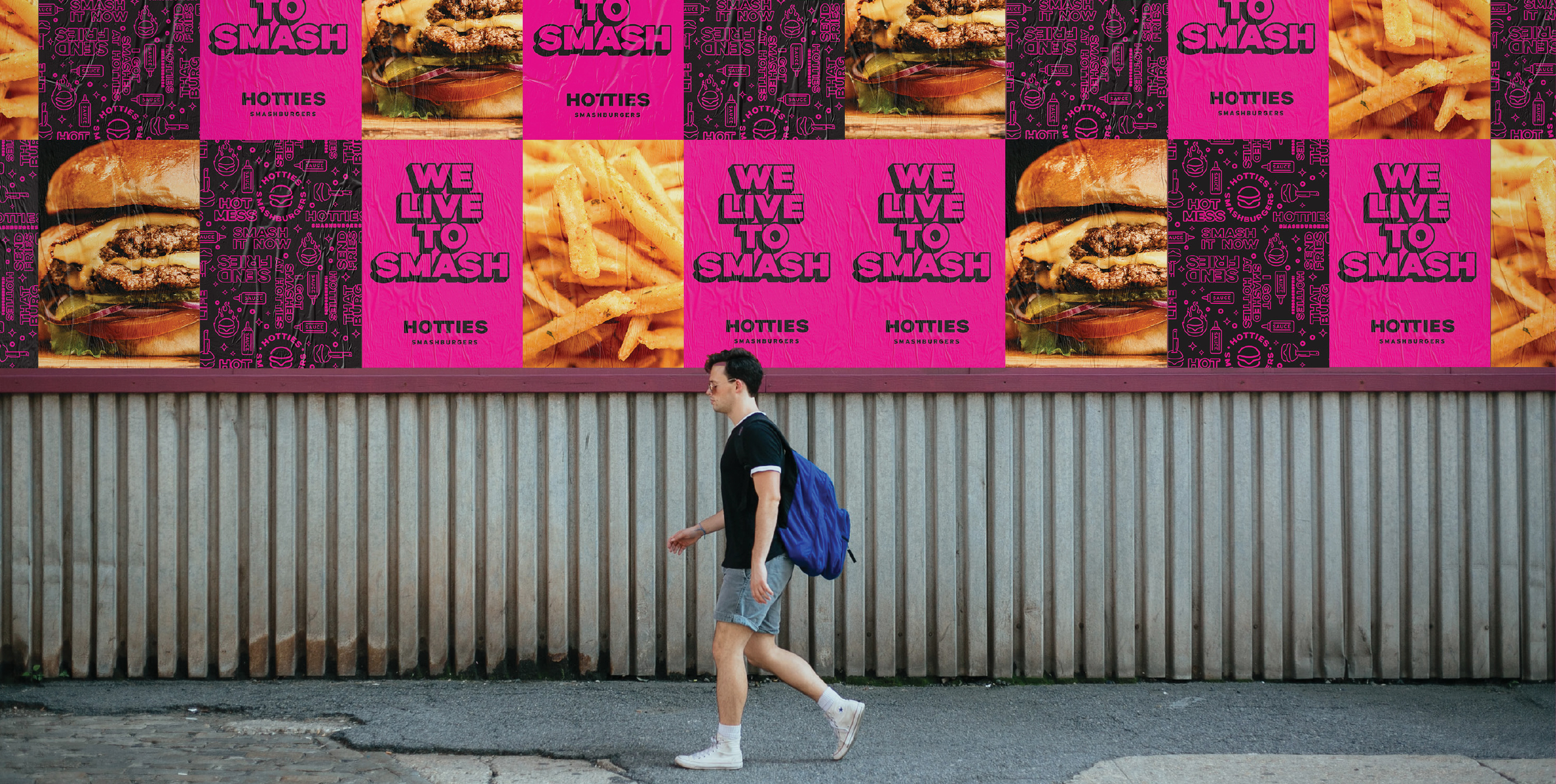
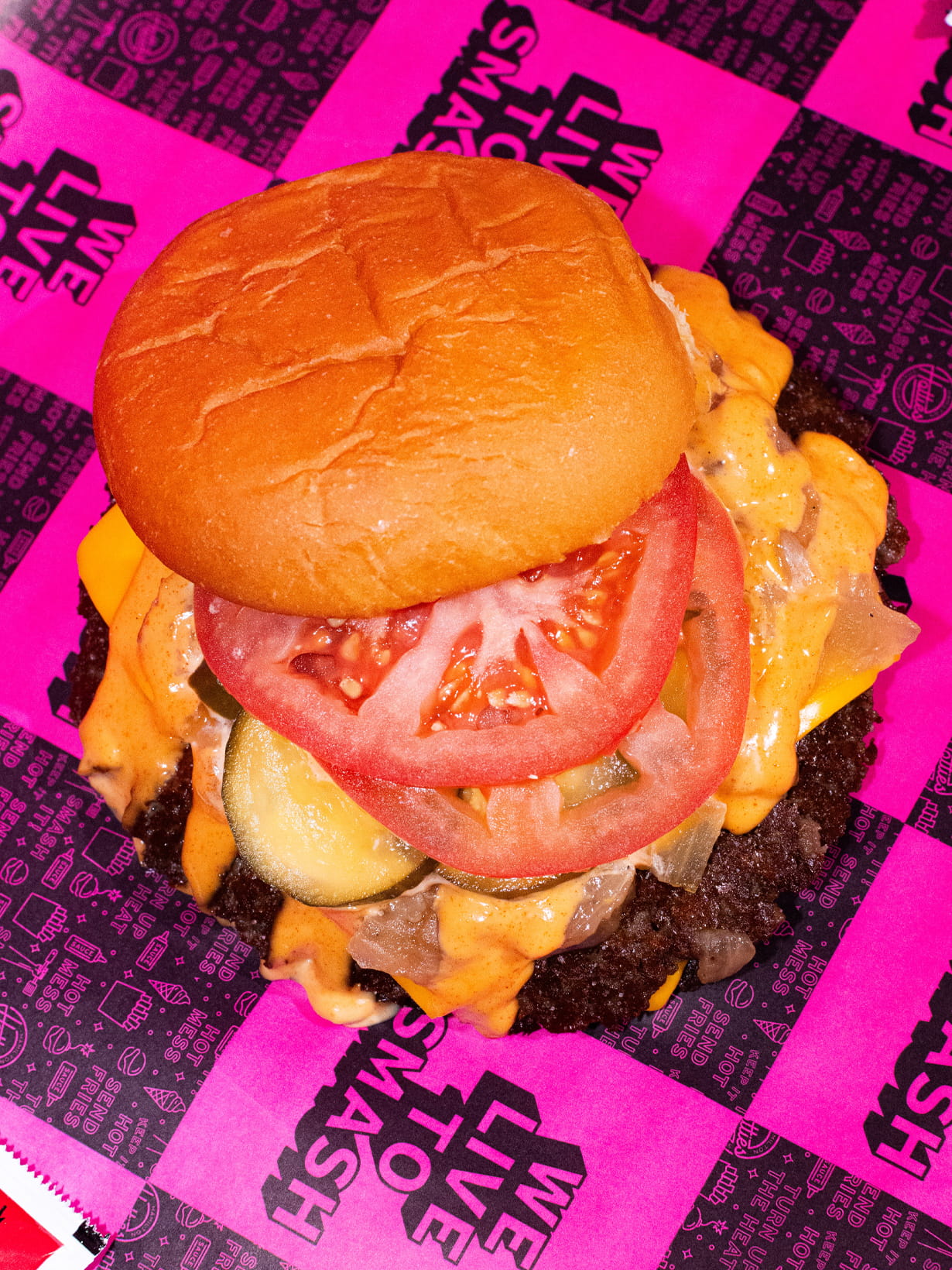
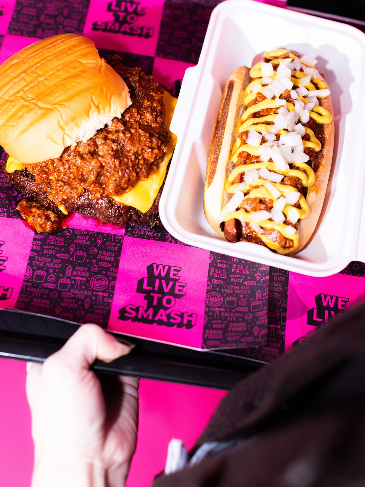
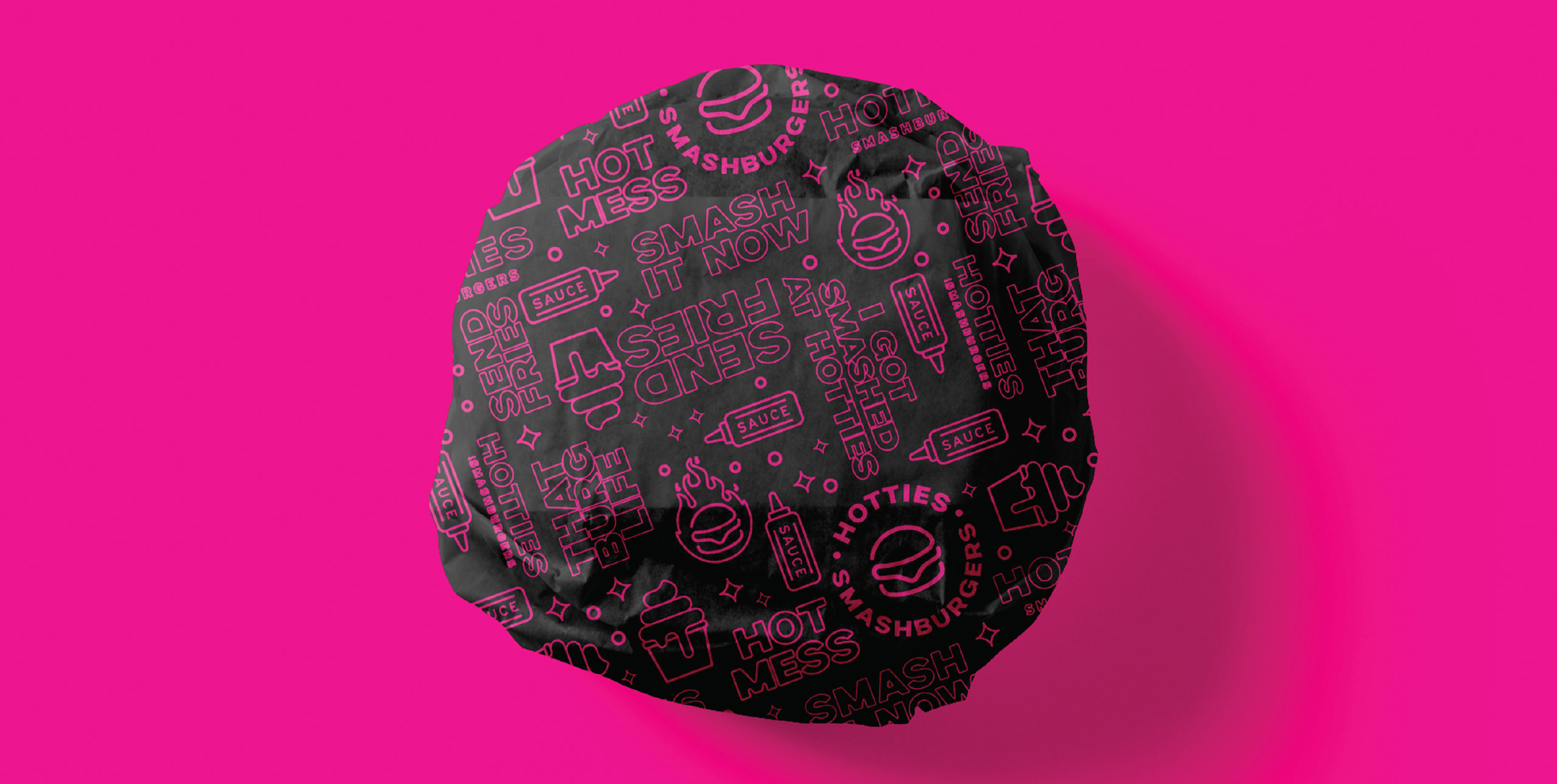
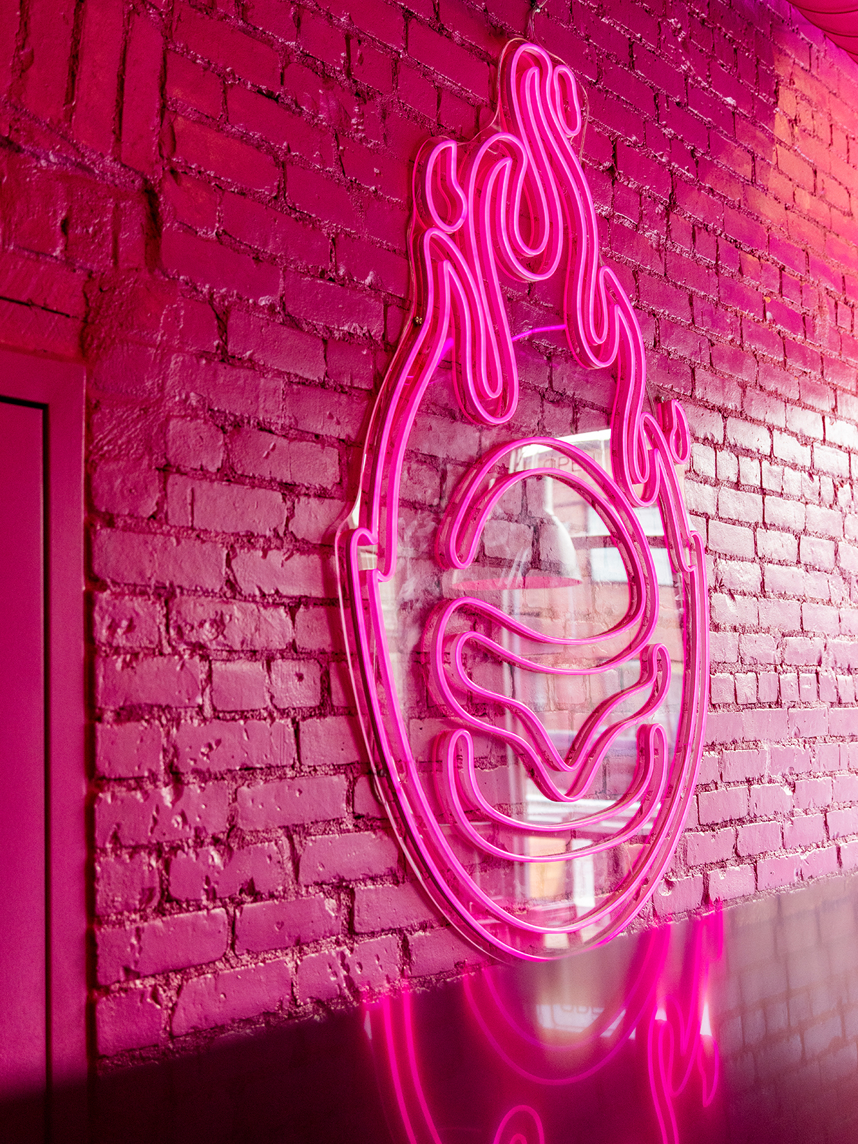
This bold and simple colour palette was carried consistently through the entire brand experience. By consistently, we mean there is not a single colour other than black and pink used in the packaging, signage or interior — even the grout between the black tile is pink.
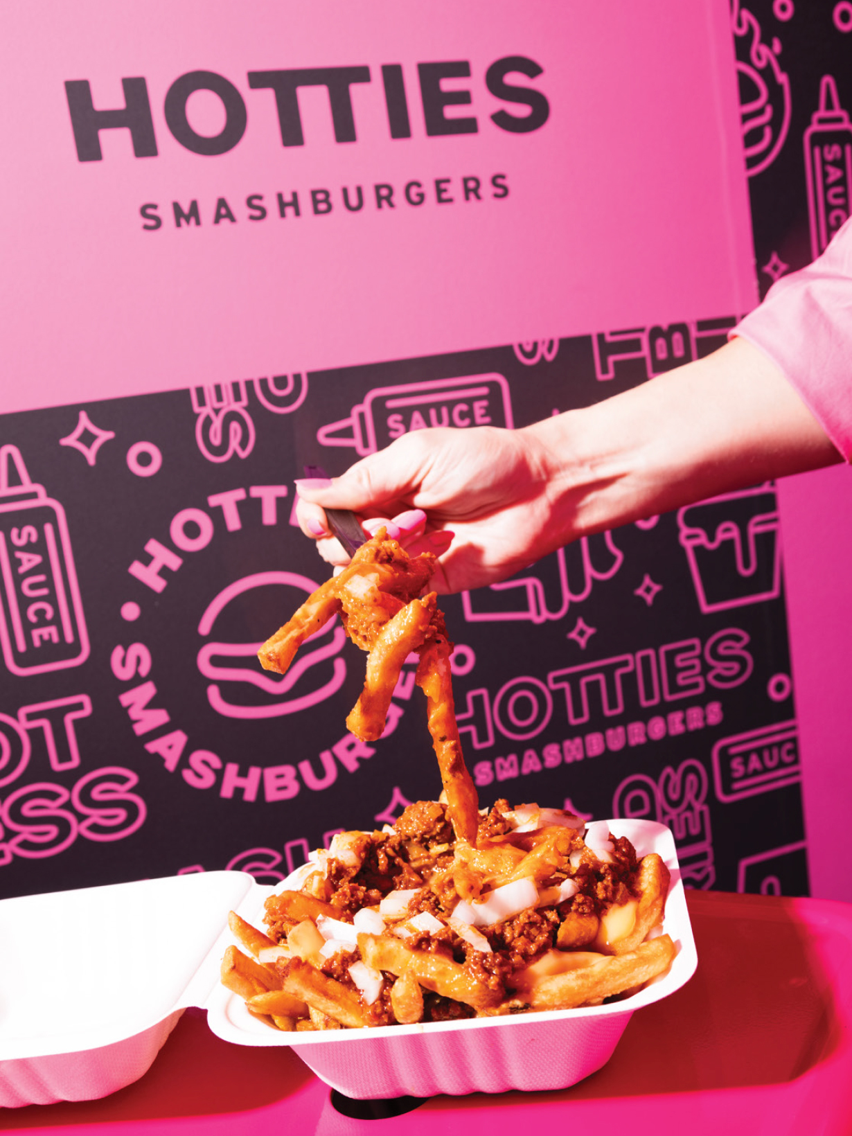
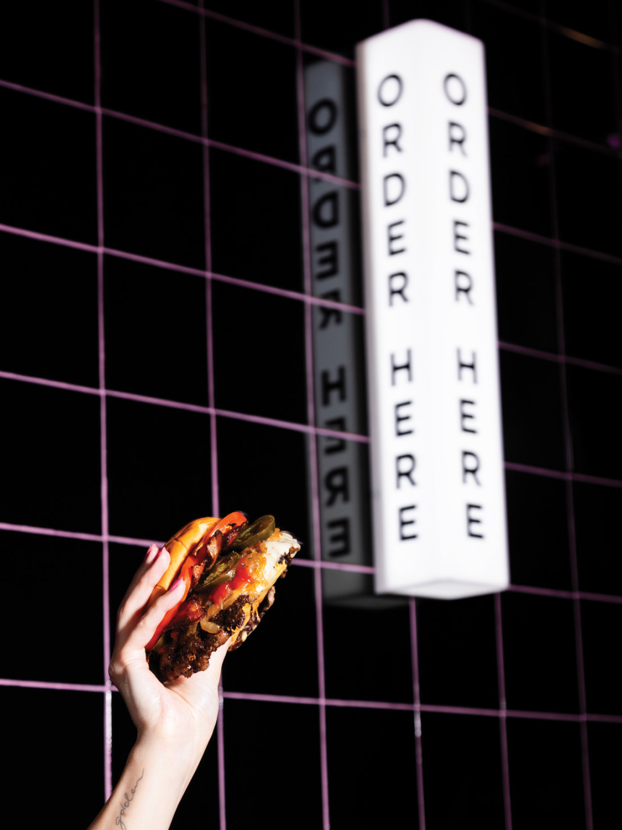
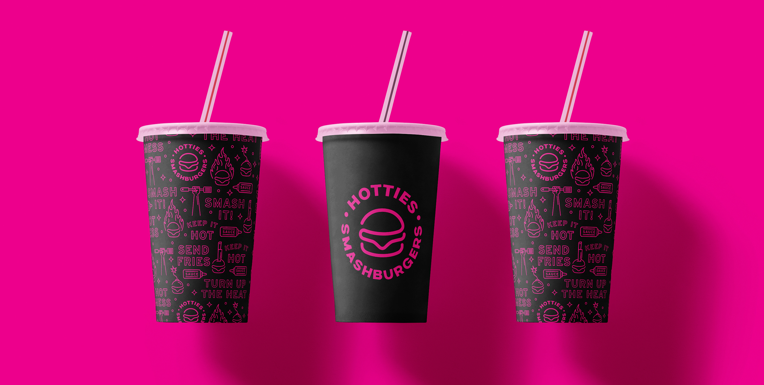
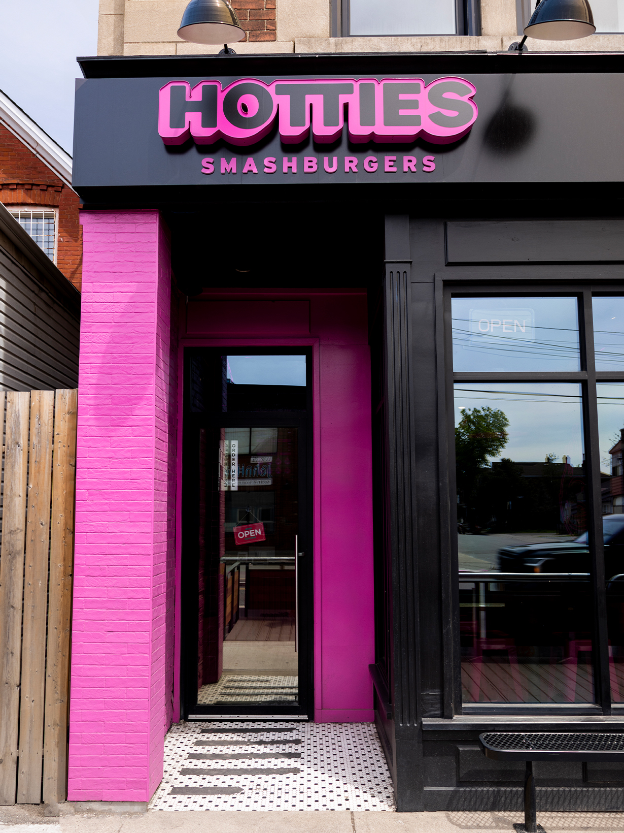
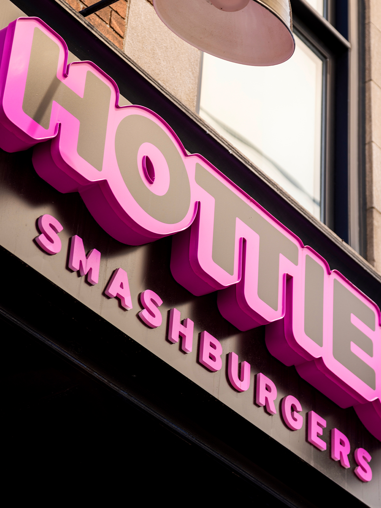
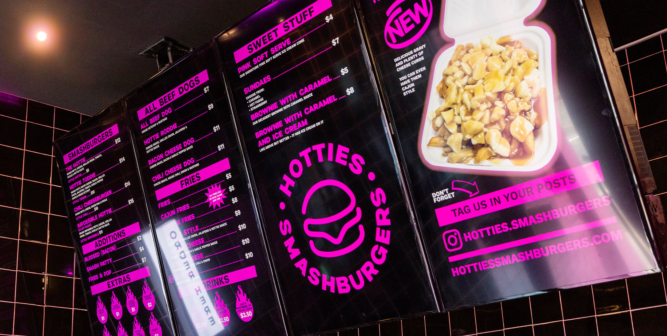
Every inch of the Hotties restaurant is designed to make an impact. Regardless of where a guest is in the space, it is almost impossible to take a boring photo.
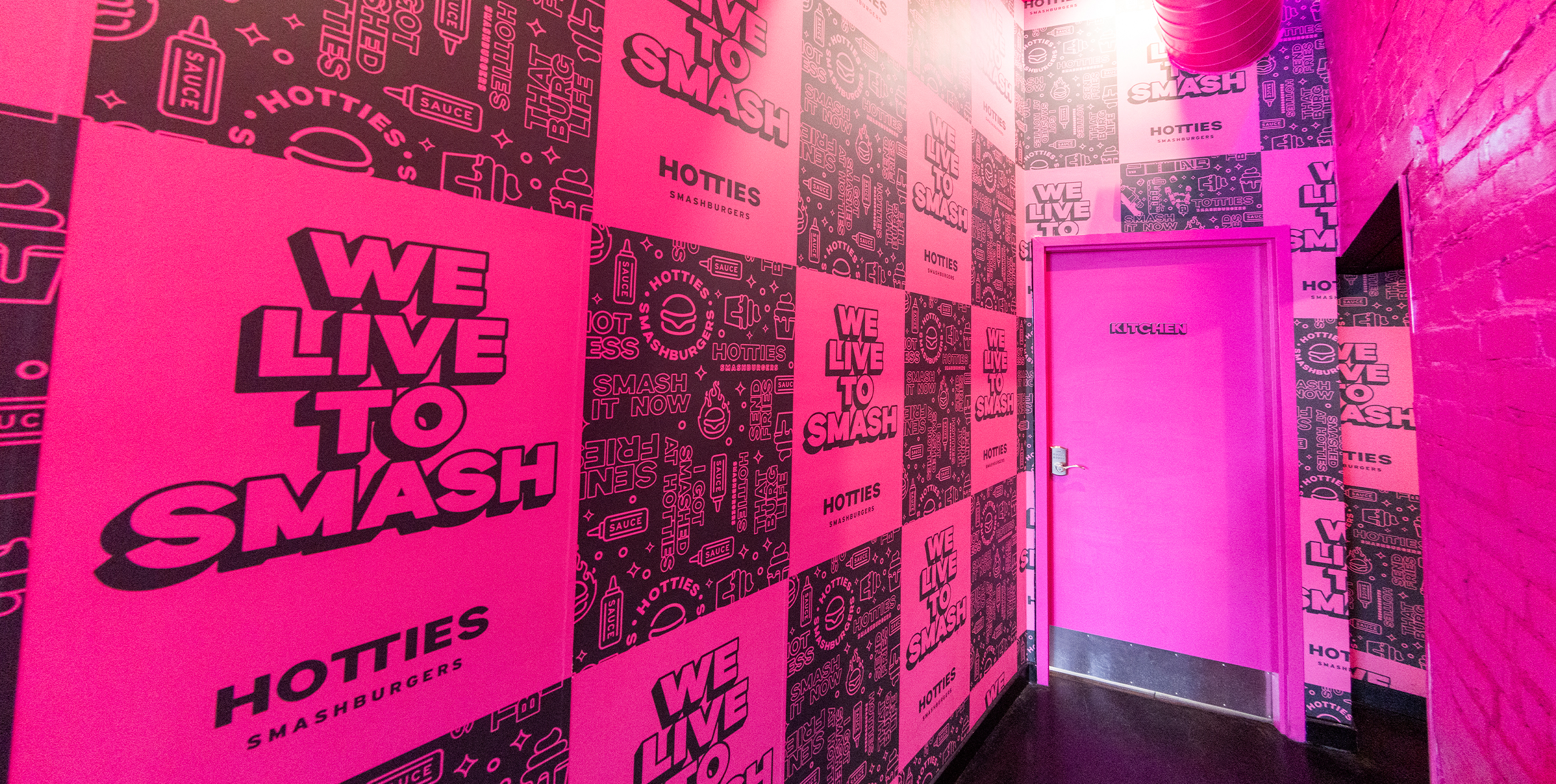
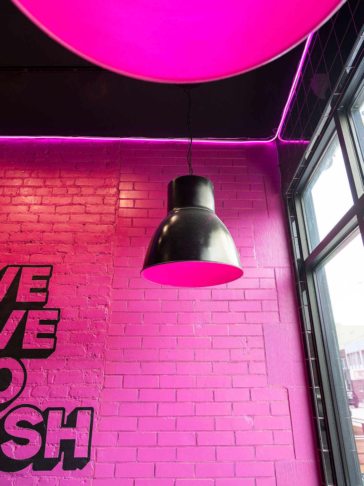
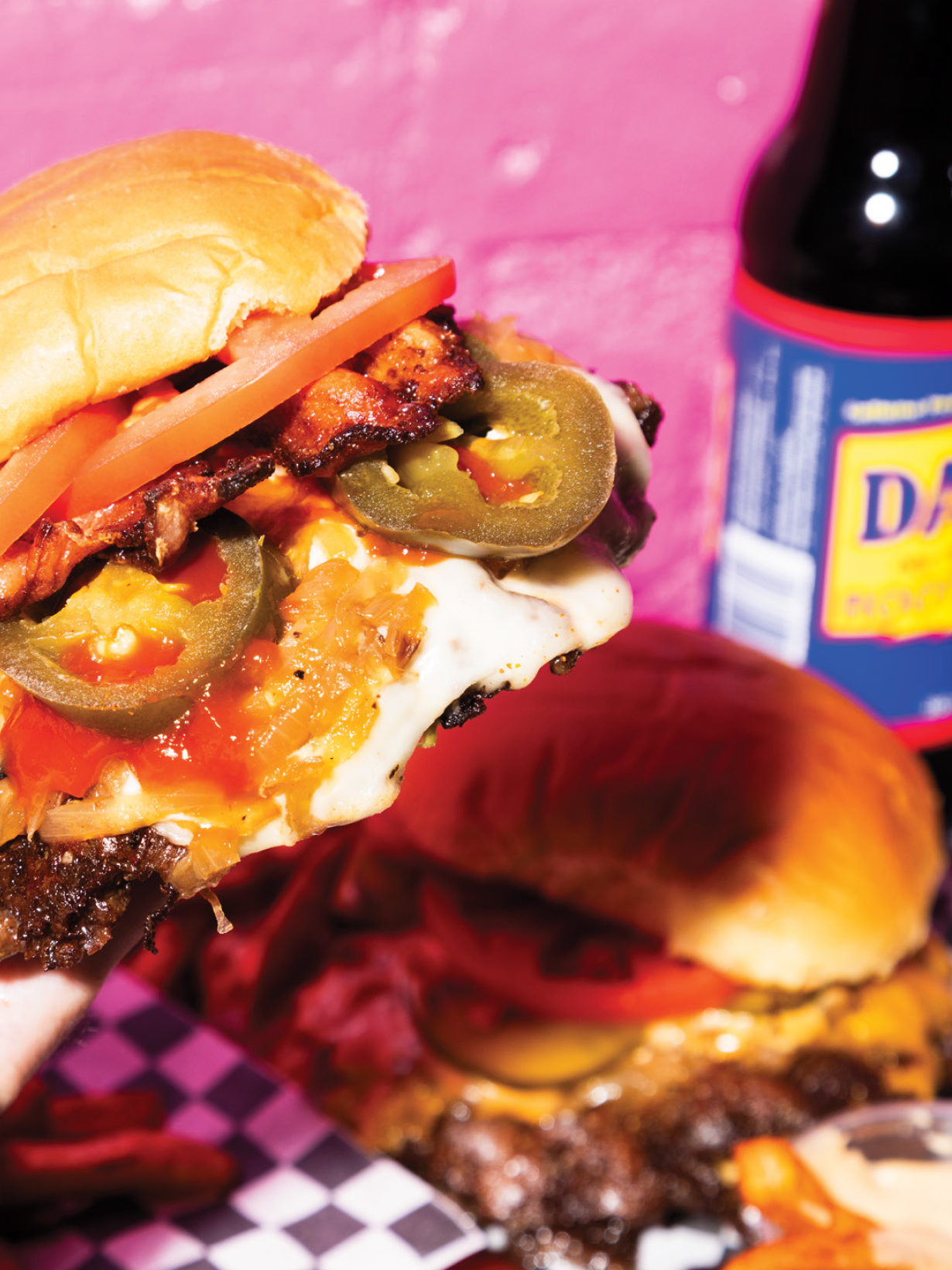
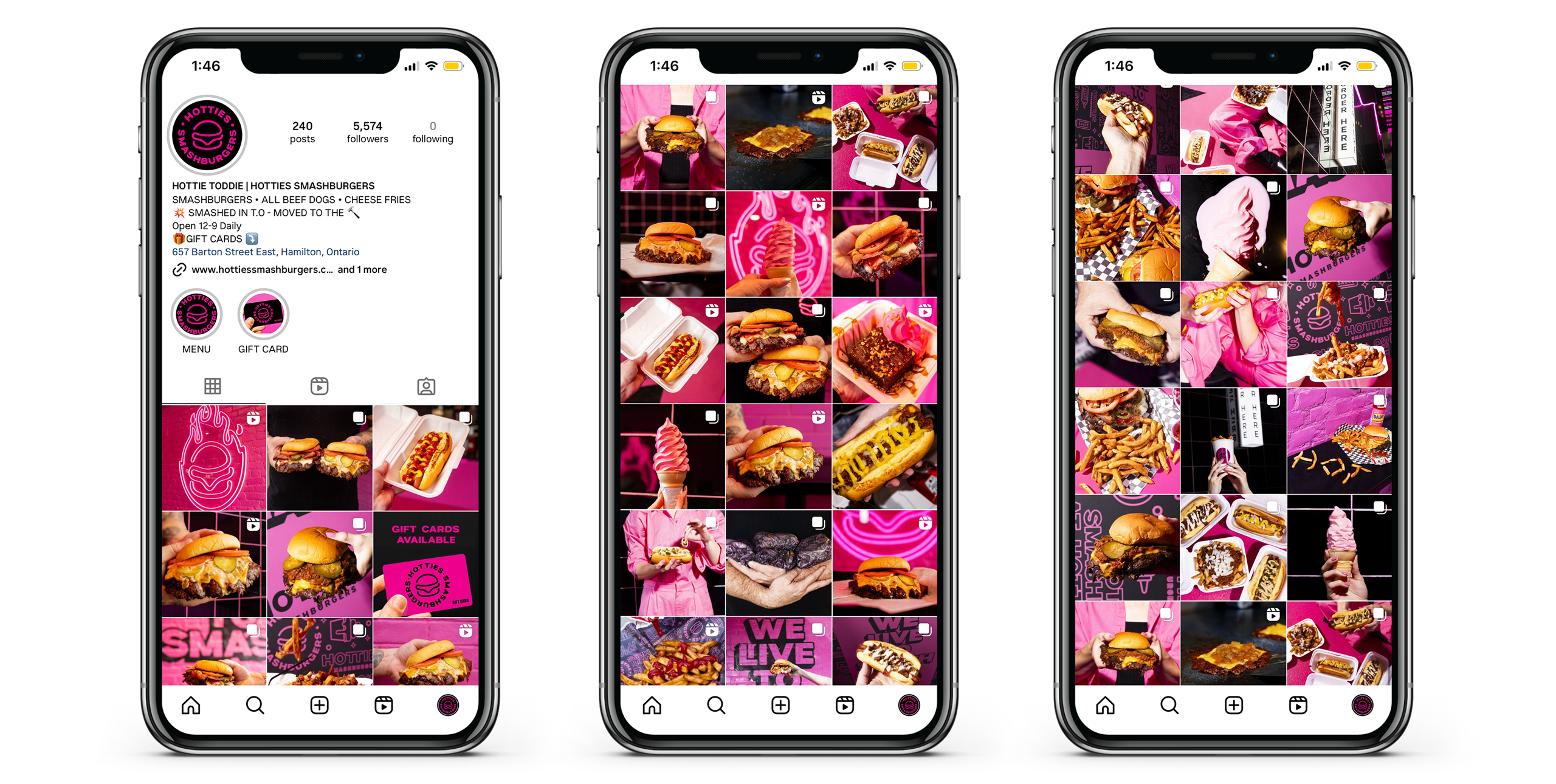
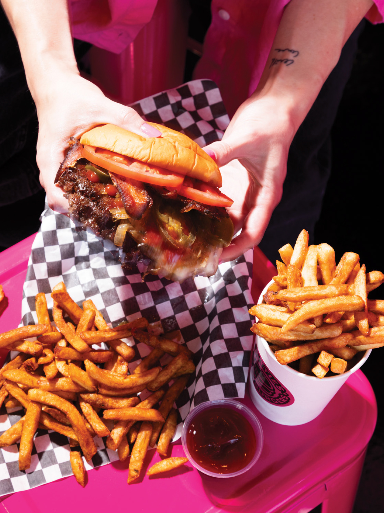
This careful and controlled use of colour is carried through food photography and social media presence. High-contrast lighting and flash photography adds to the youthful vibe of the brand online.
