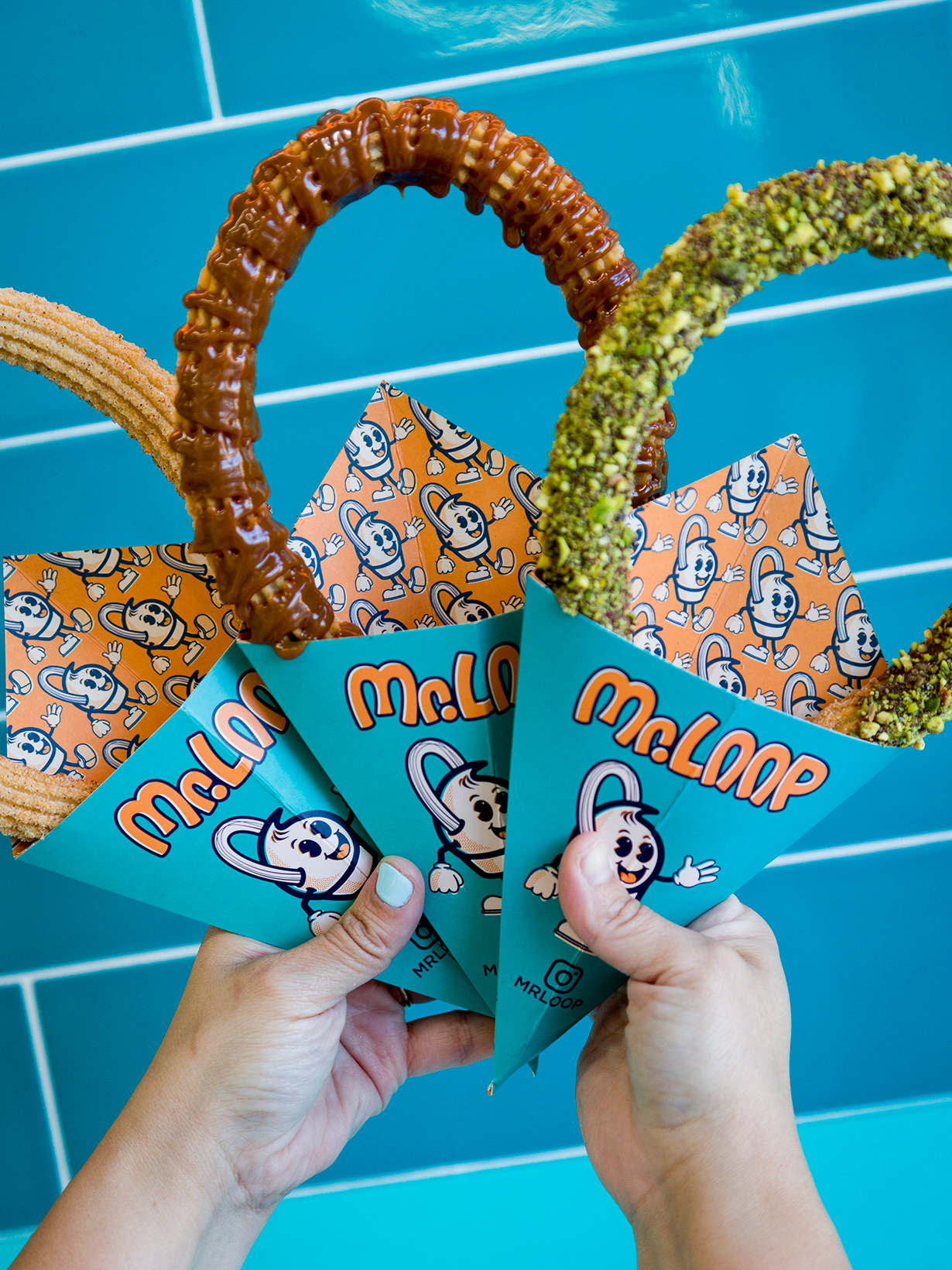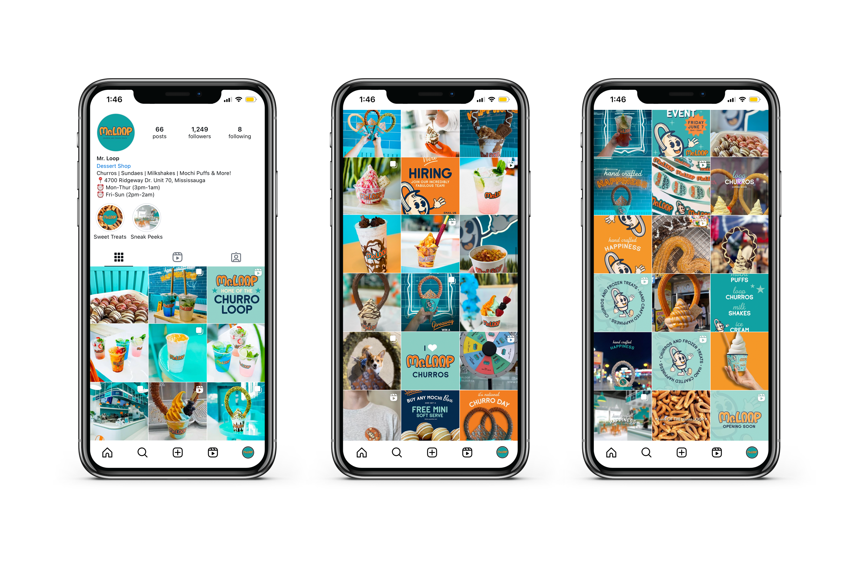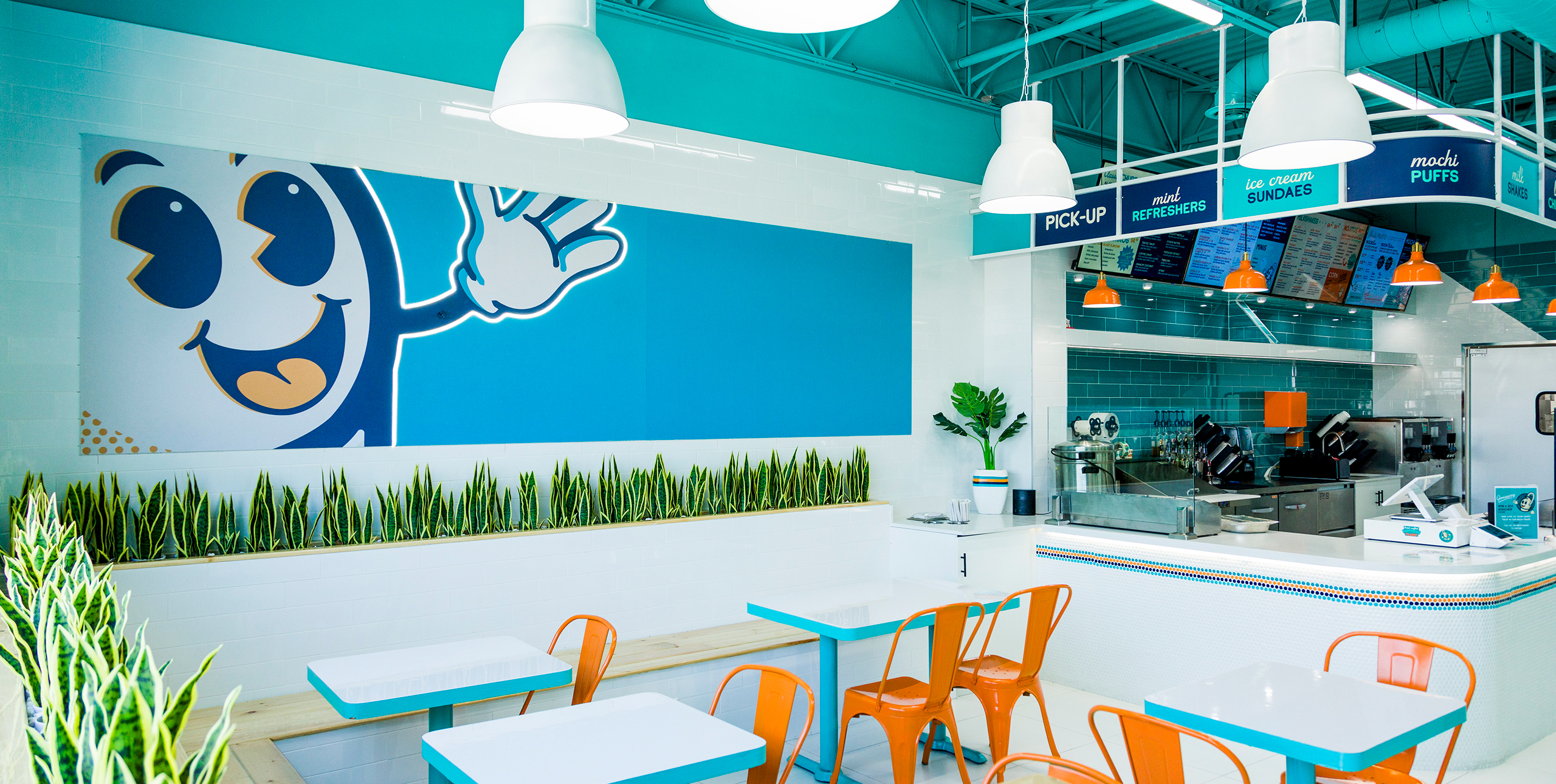
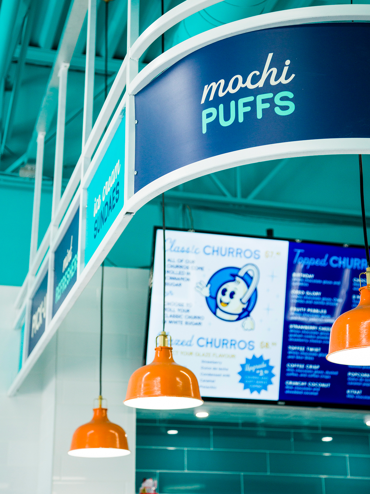
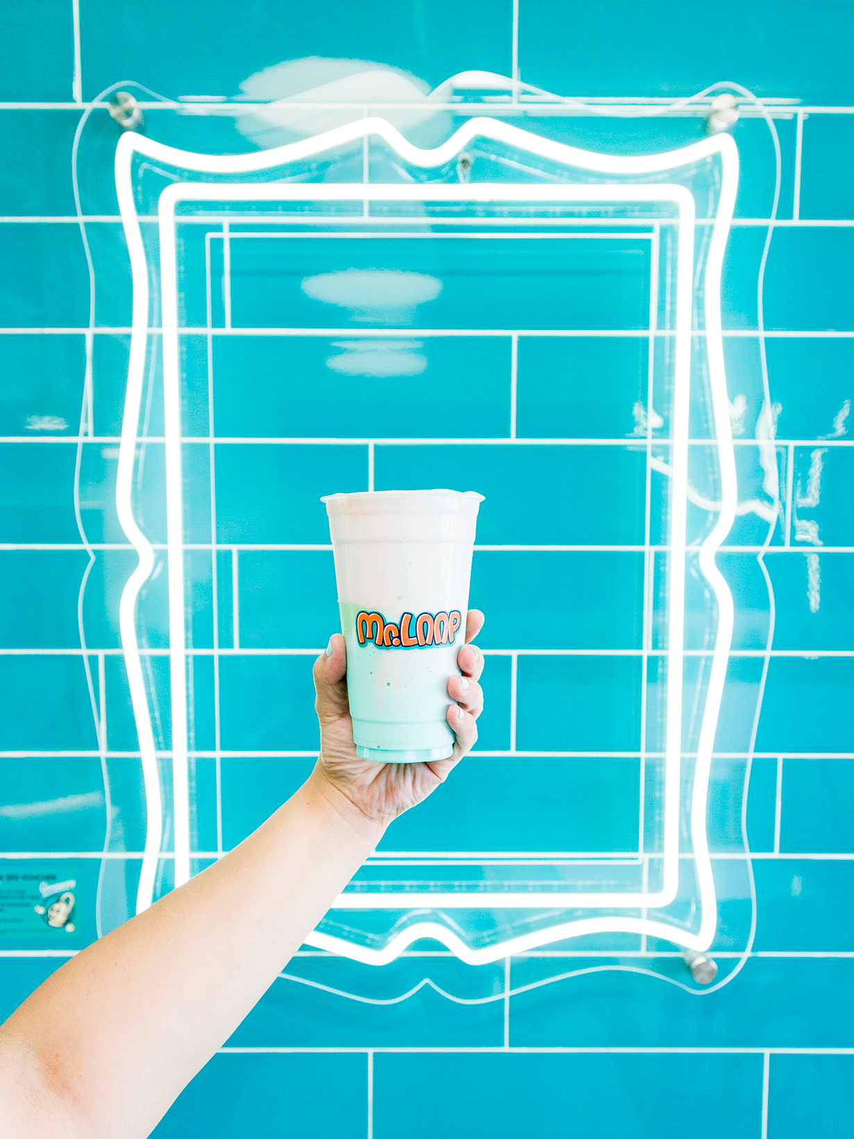
A vibrant colour palette was established through the initial brand strategy and is the calling card of the brand. The space needed to be Instagrammable for the desired demographic, and the distinctive wash of colour throughout the space helps pull customers inside.
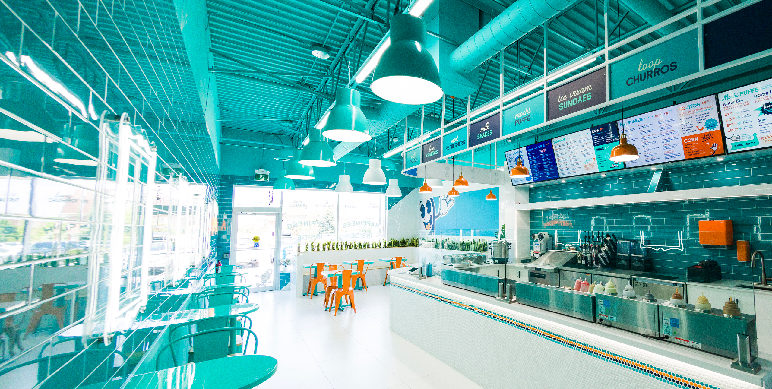
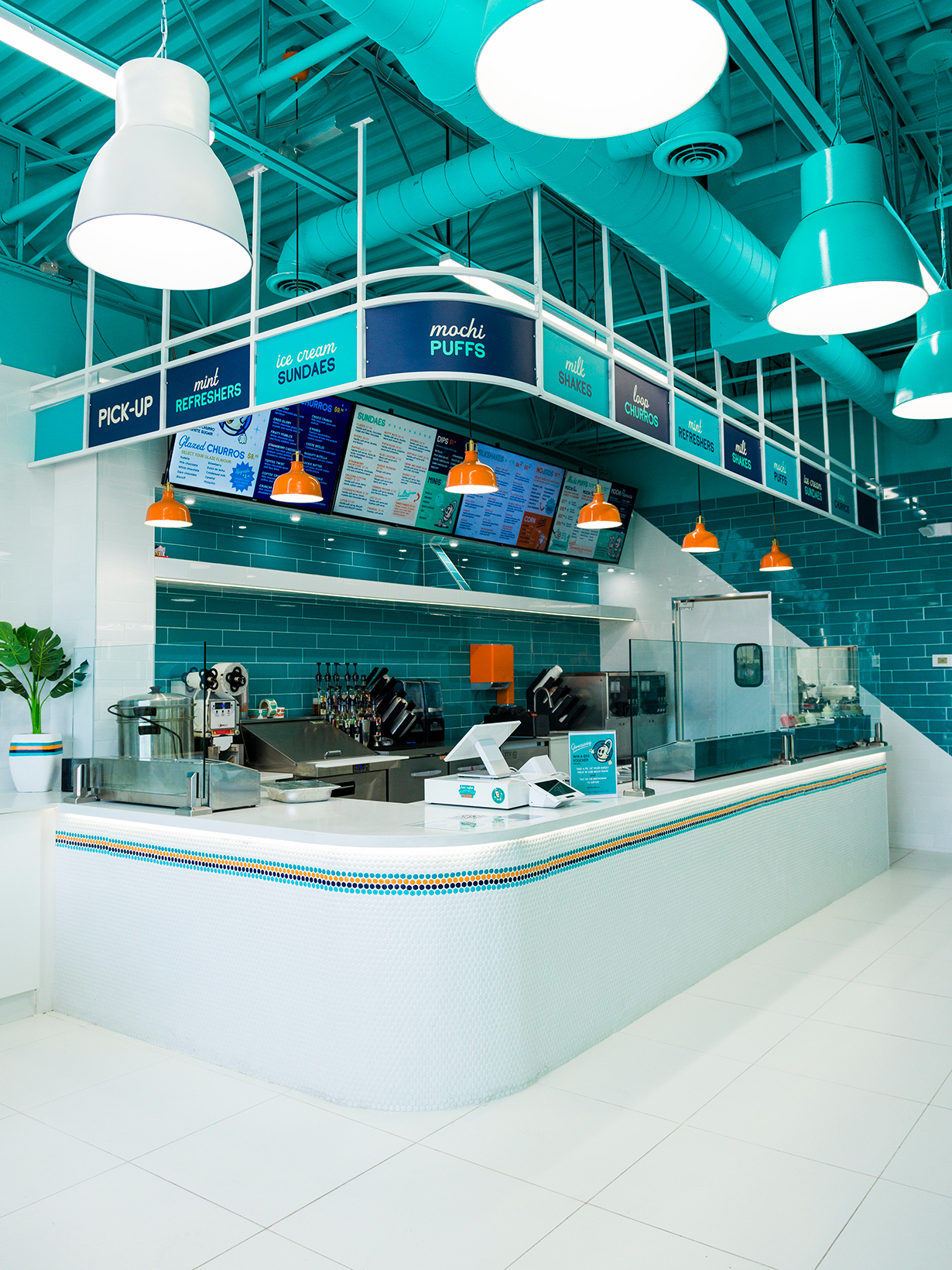
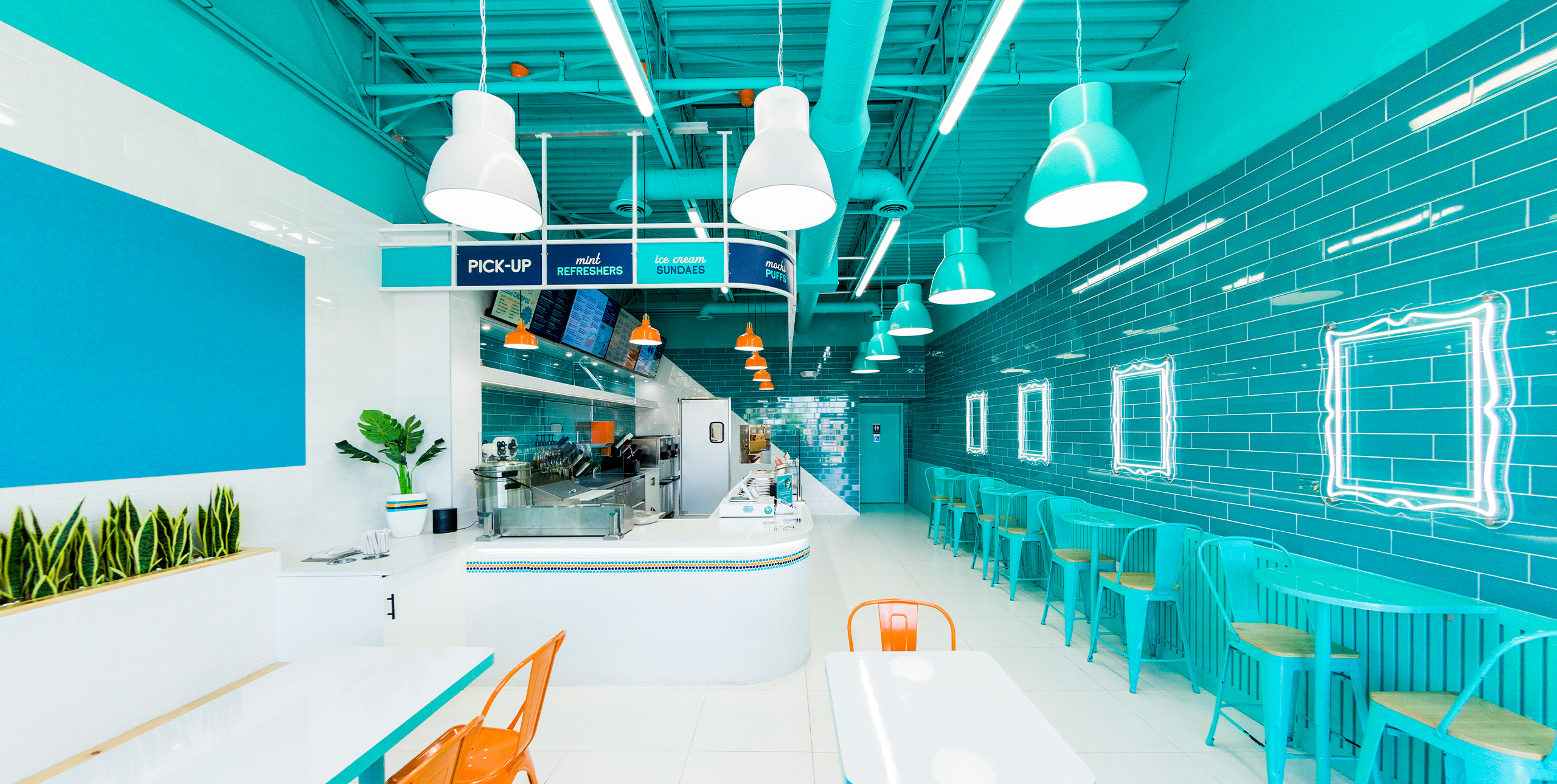
LED frames throughout the space are meant to provide a backdrop for Insta-worthy moments, while the on-brand tile works to provide a unique and shiny sense of nostalgia.
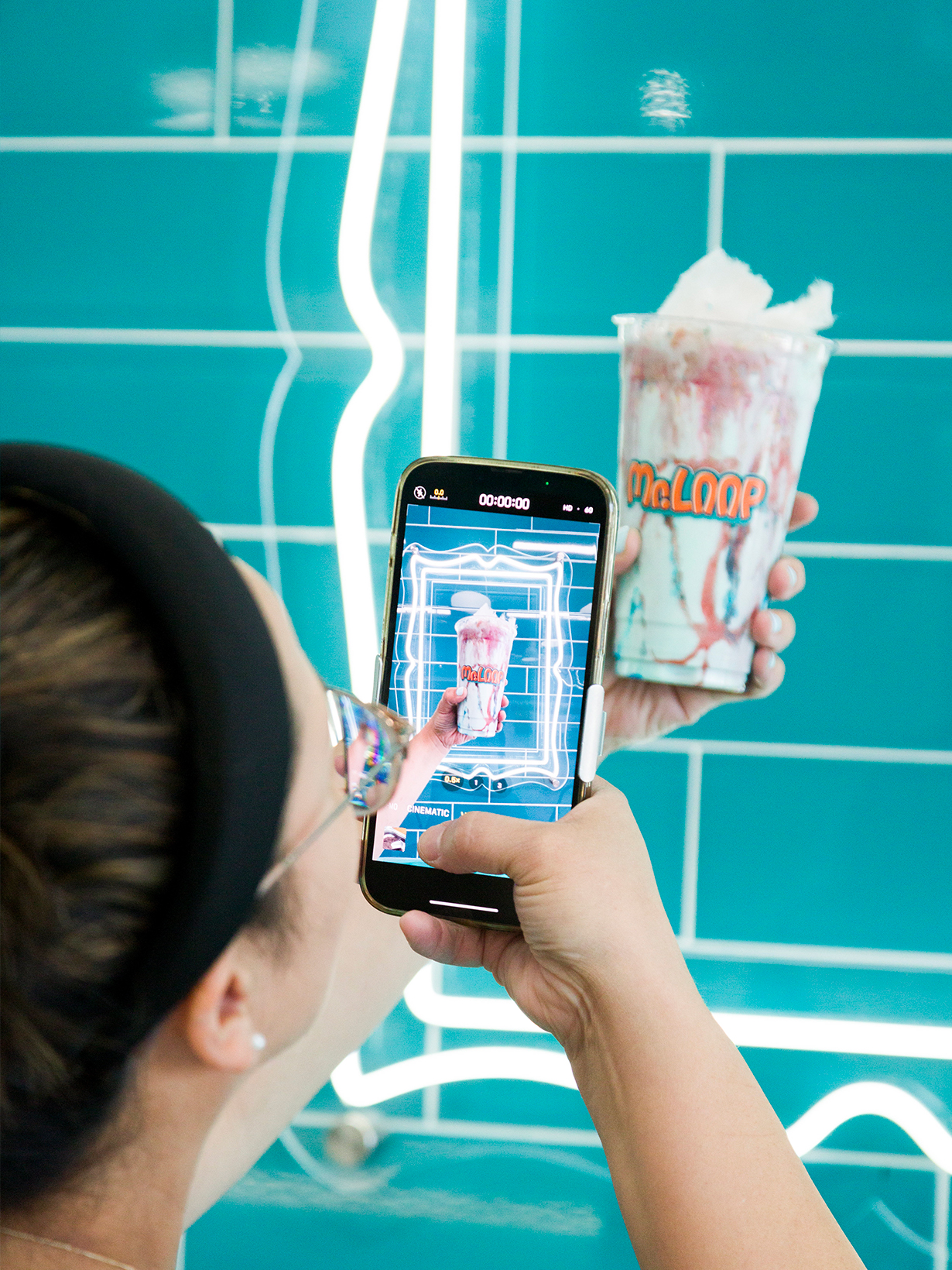
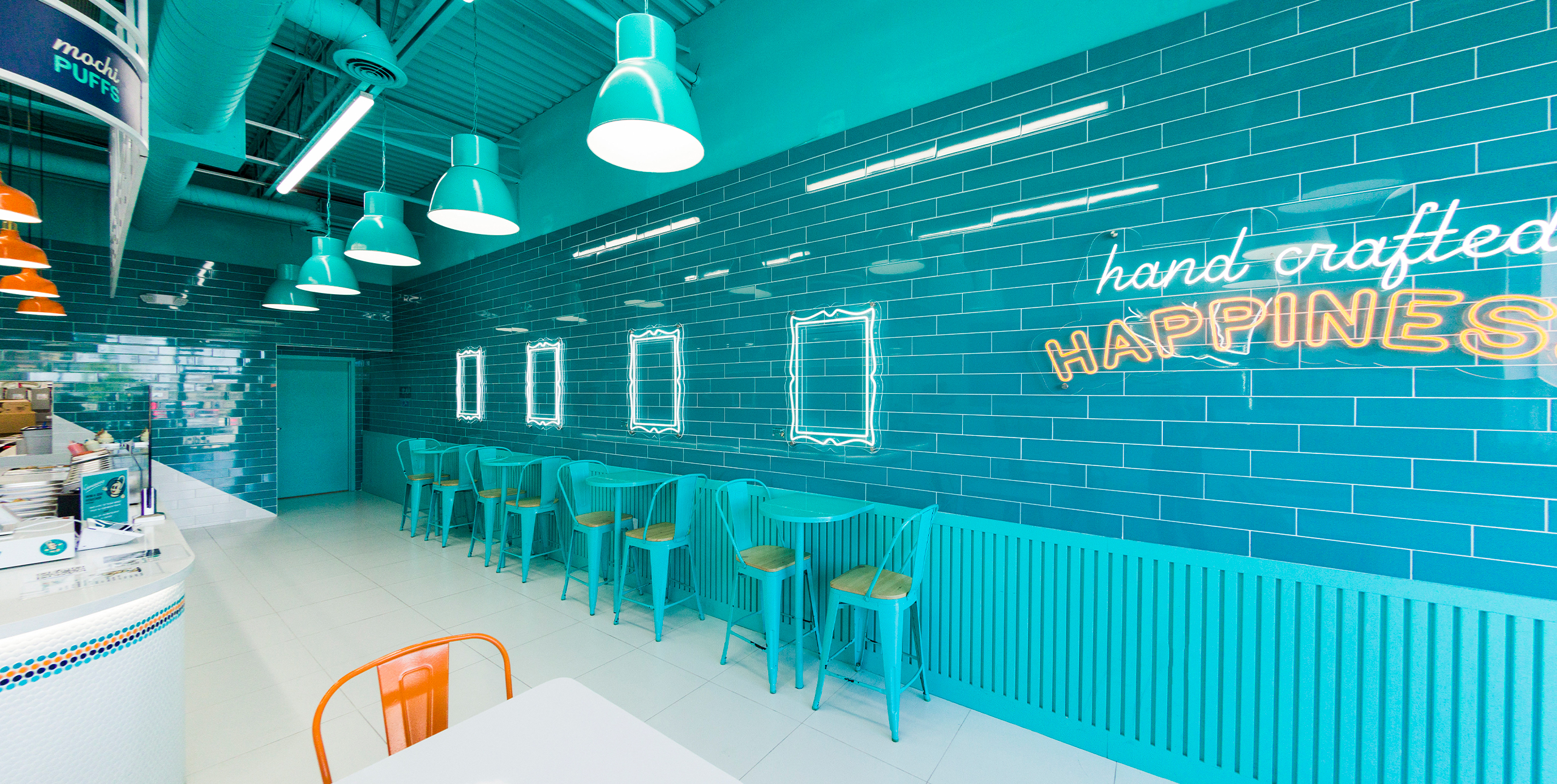
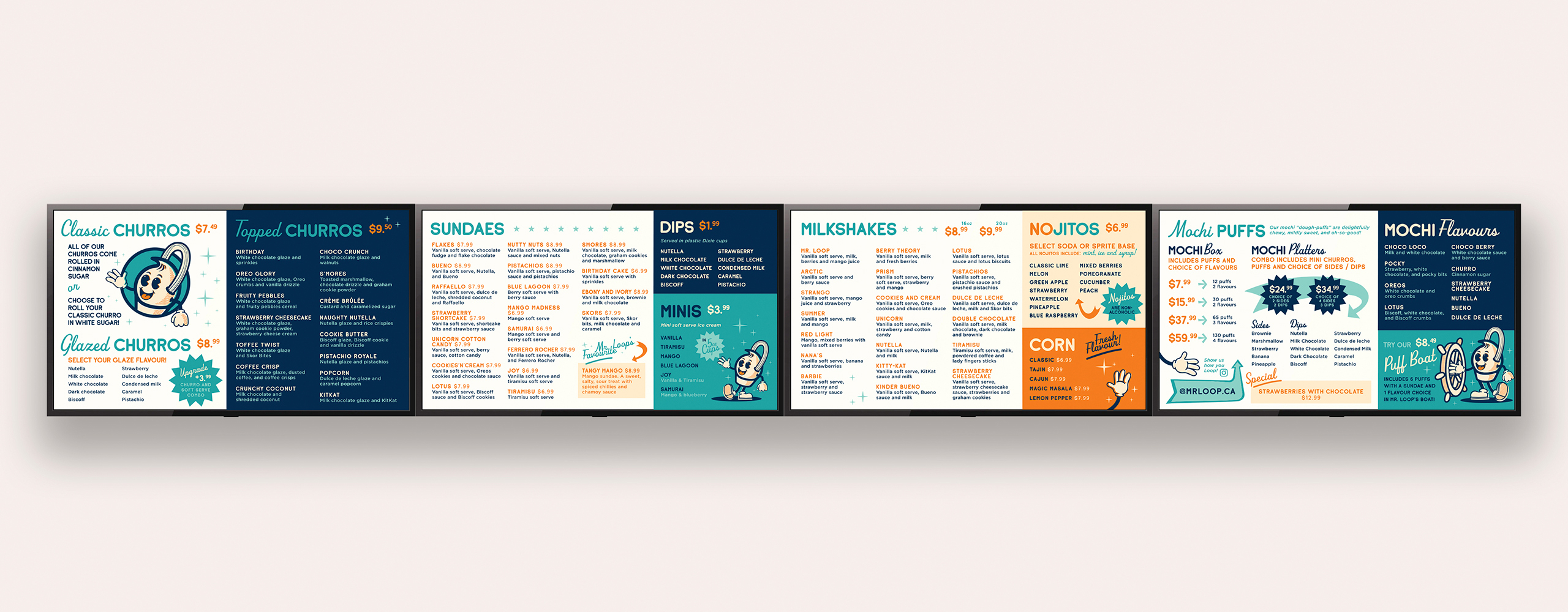
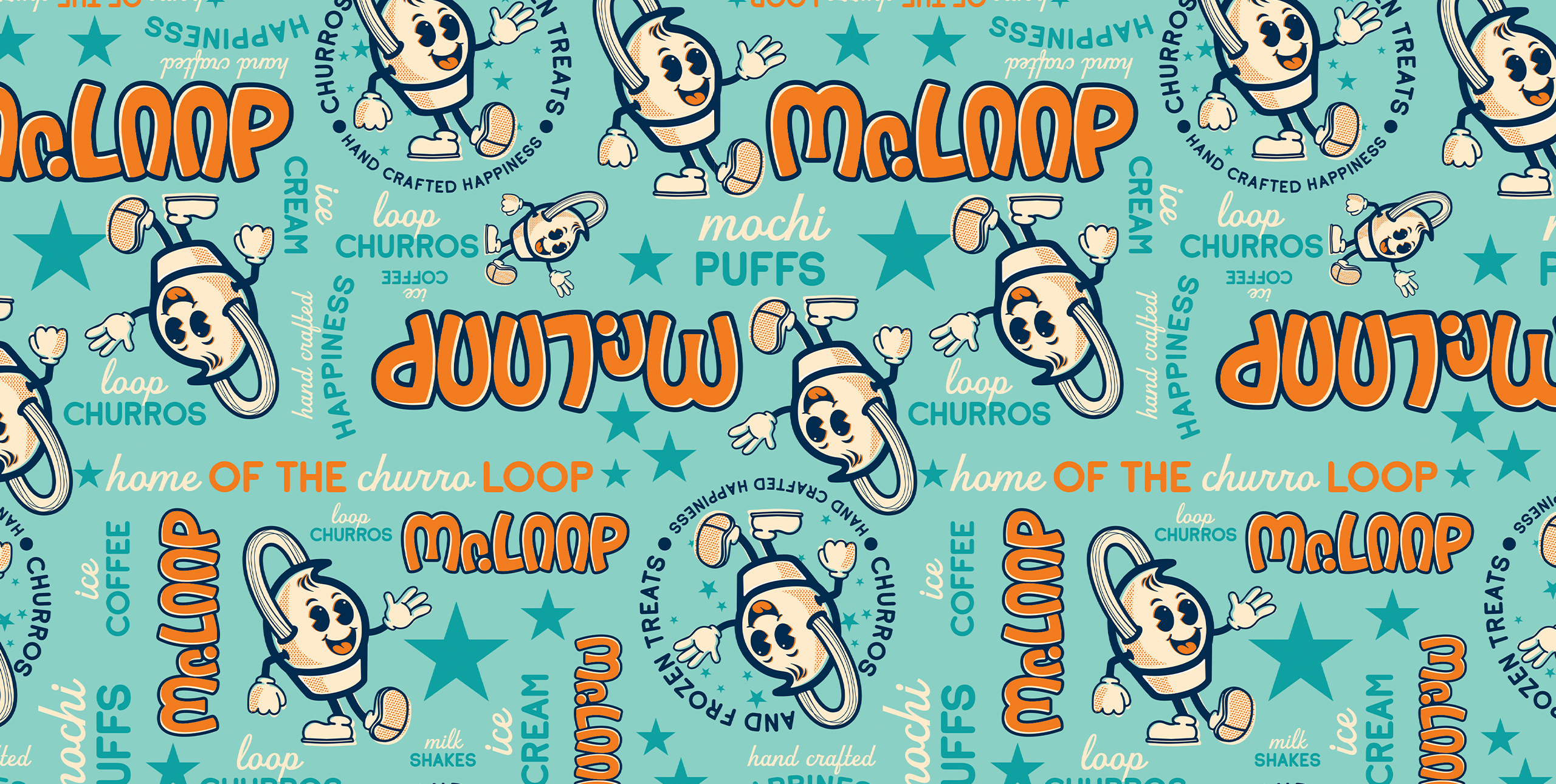
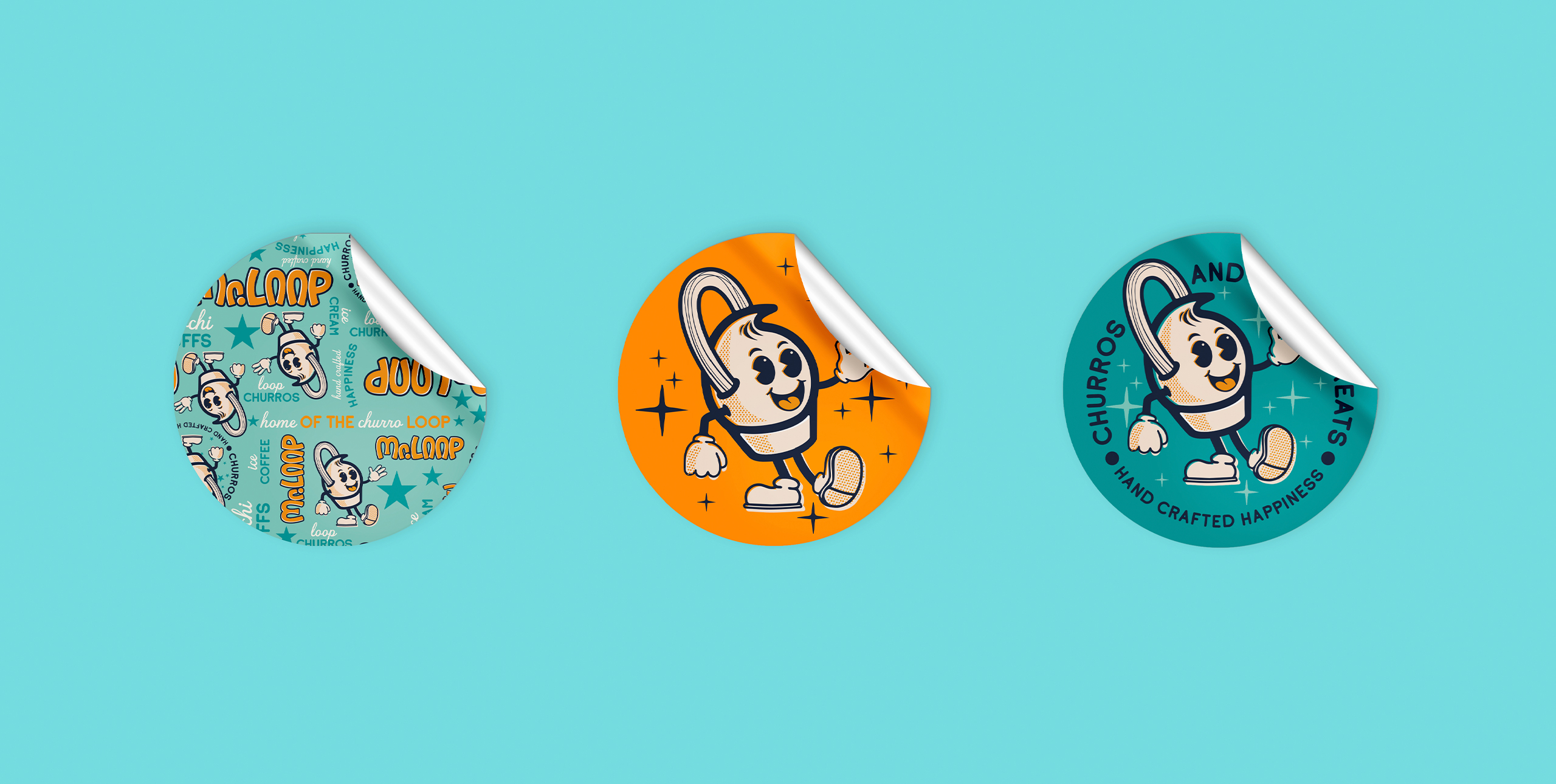
The branded elements used in all the packaging became wall treatments that help portray the brand. We wanted the customers to feel like they were in a modern version of a classic soda joint — clean, friendly, and somewhat familiar while feeling fresh and new.
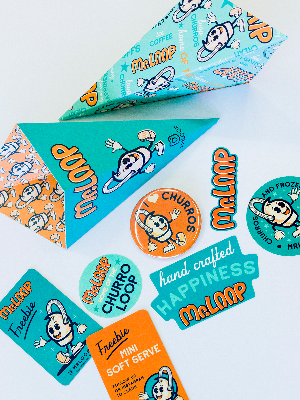
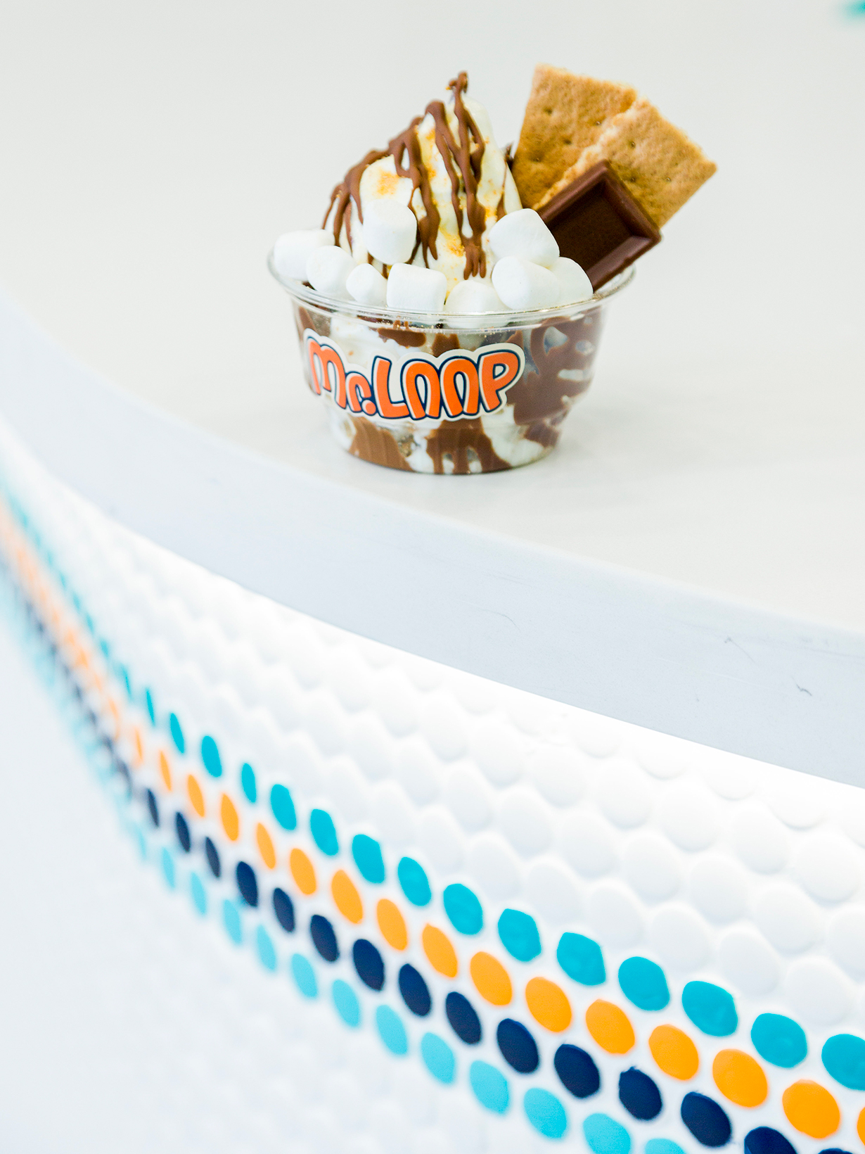

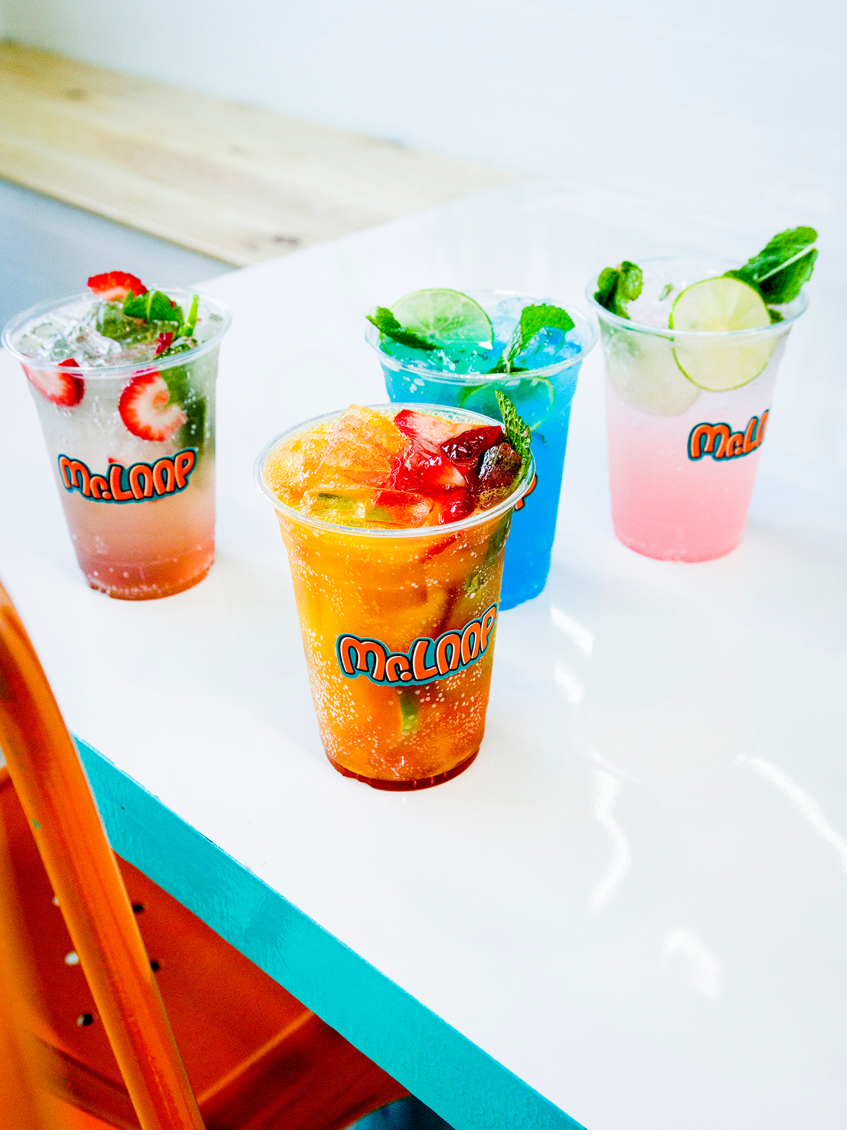
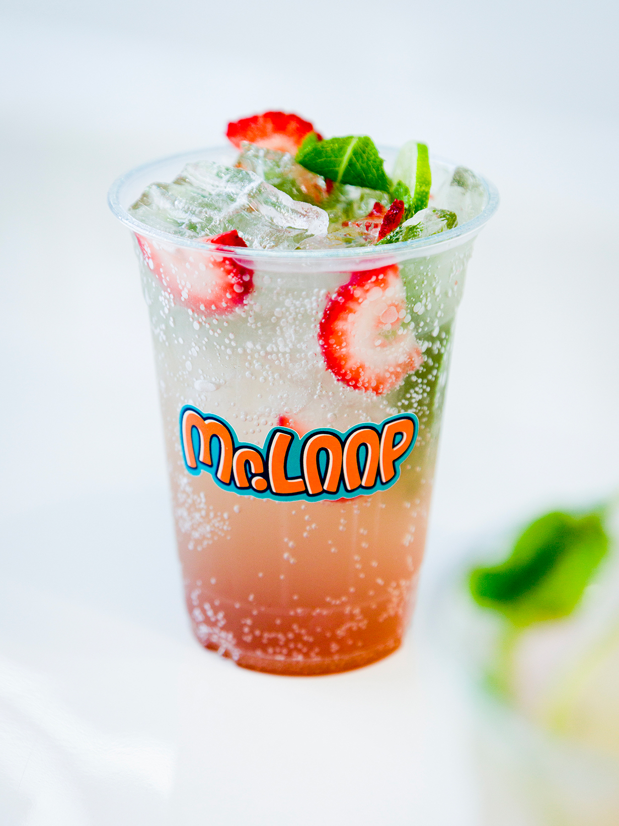
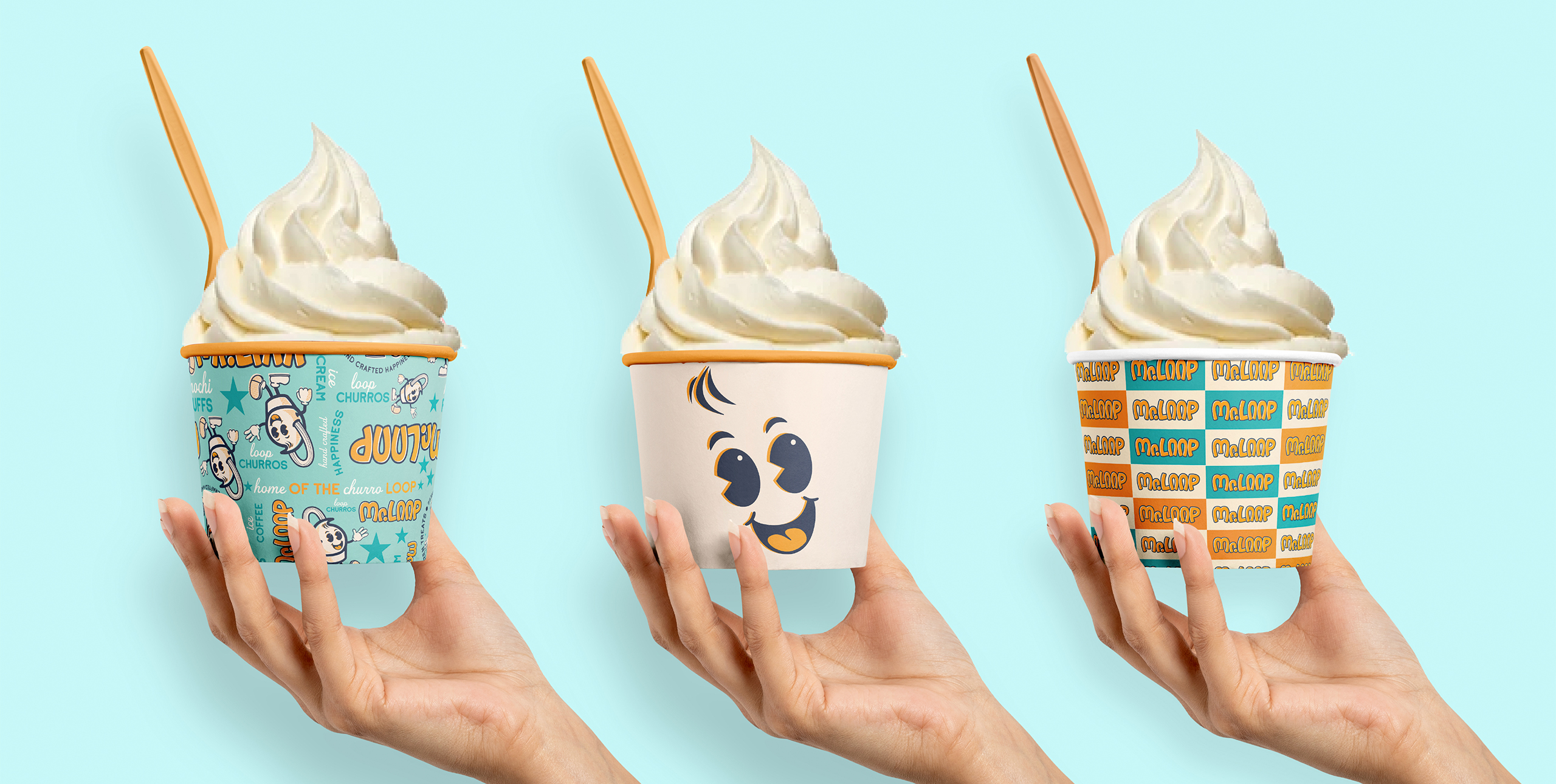
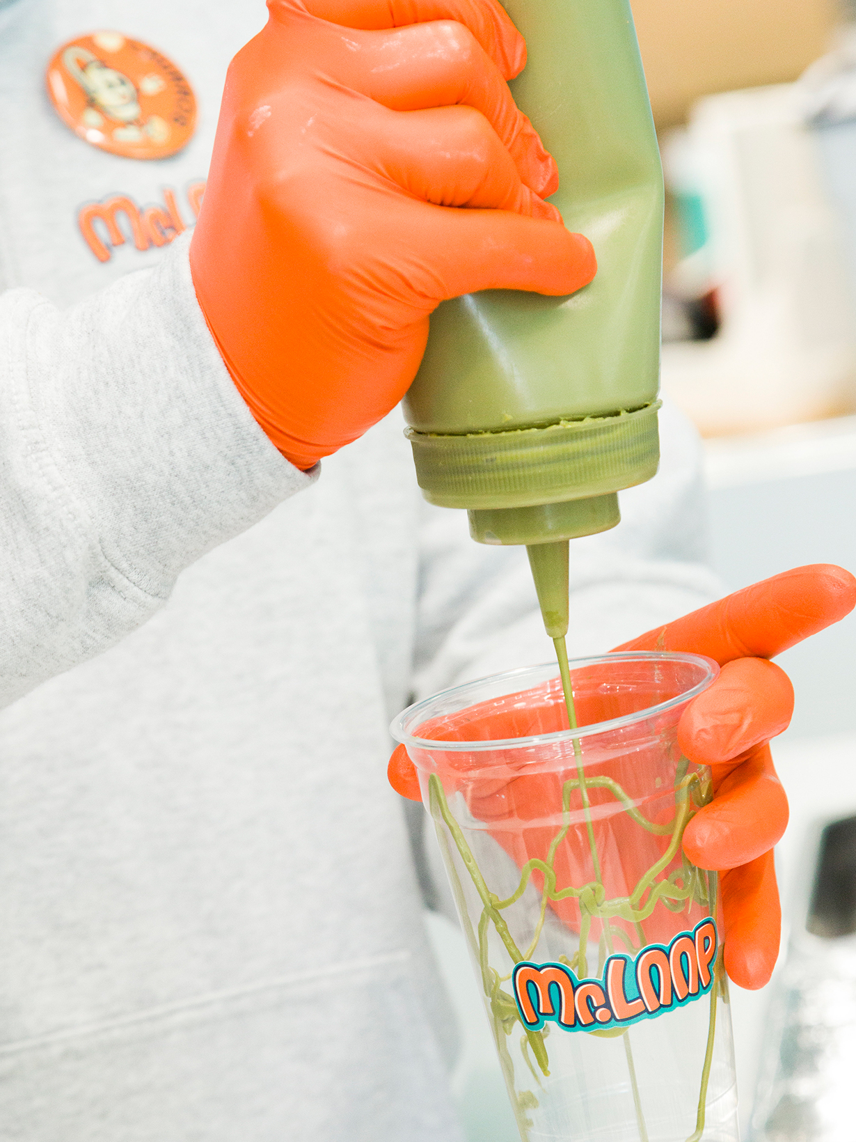
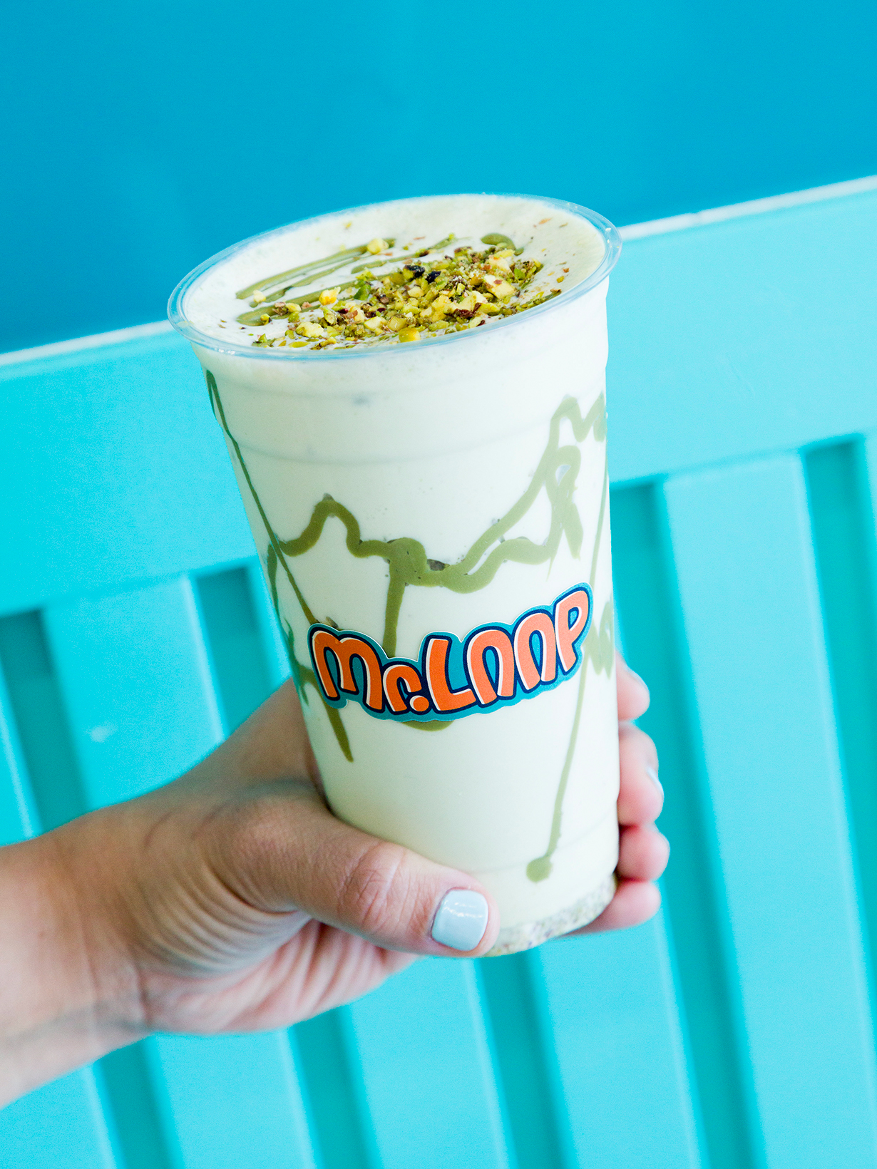

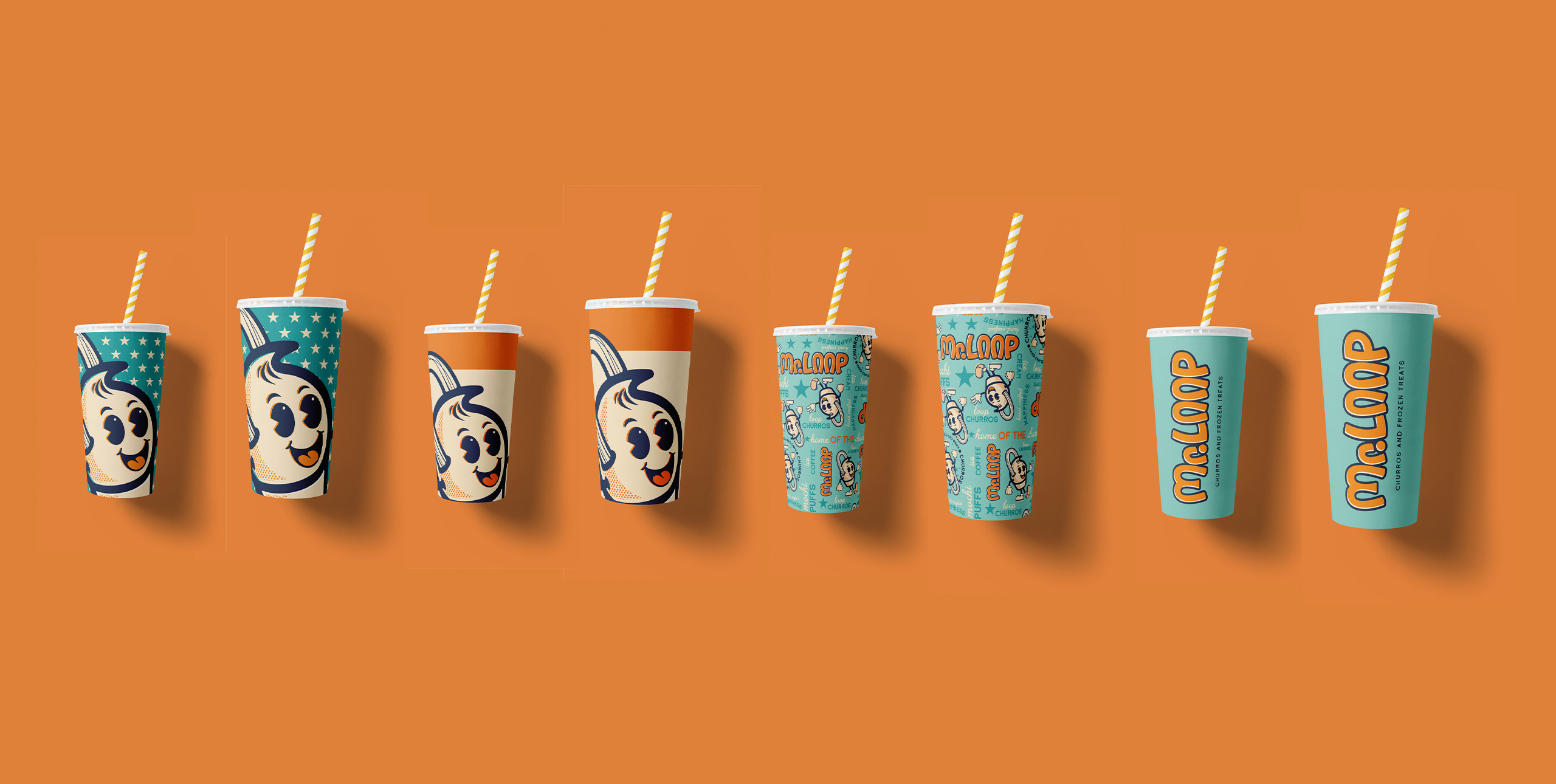
A robust brand system with many graphic elements allows the brand to be versatile, yet consistent. Playful patterns and bold colour instantly invites consumers to let loose, smile and enjoy some sweet treats.
